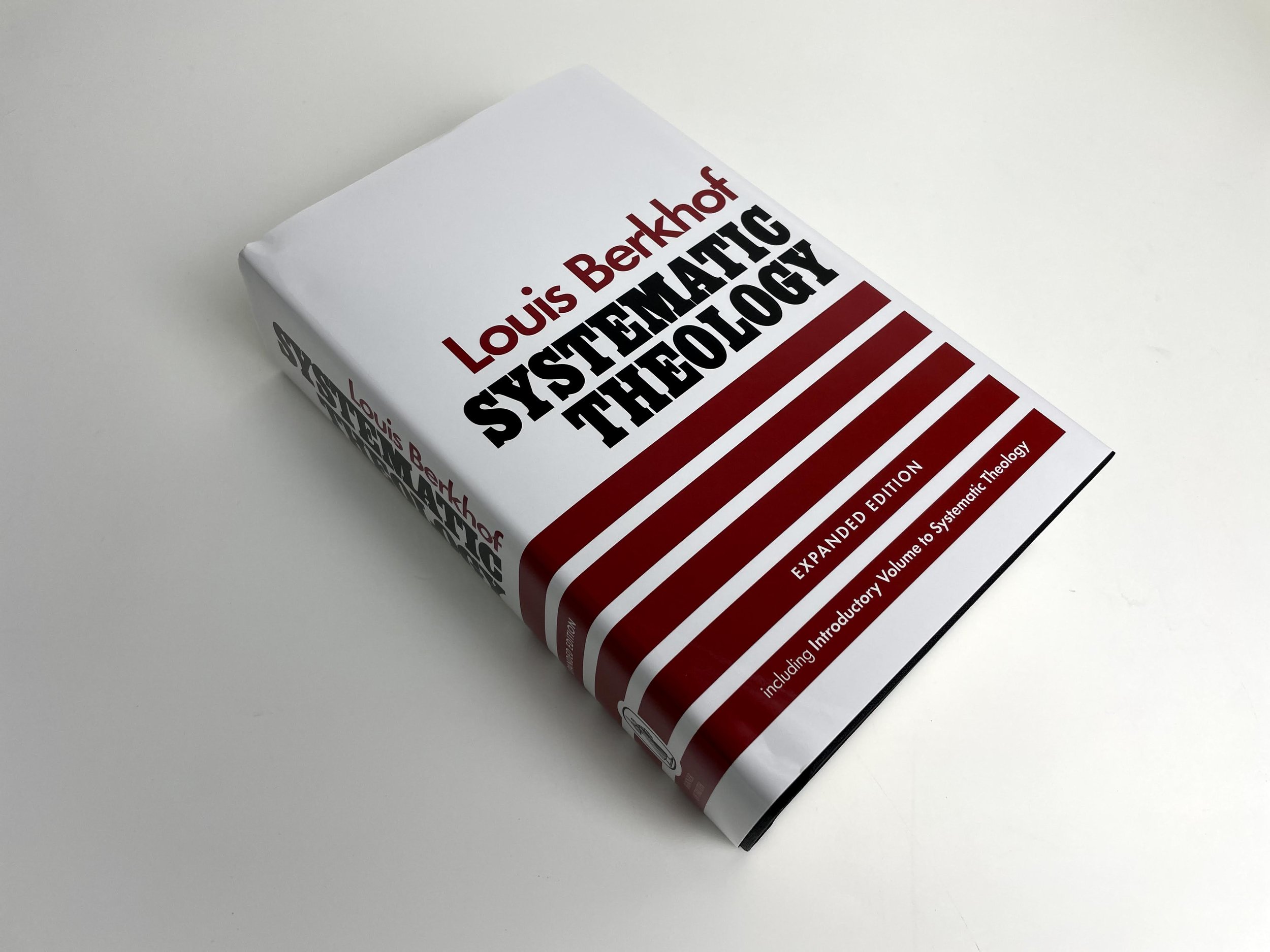

The NASB95 Heritage Bible Passagio Setting
The new Passagio Setting has been met with some controversy and criticism. This setting is a single column format with poetry appearing in a double column setting. While some have critiqued it, I personally love it. Let’s talk about why.
I’m reviewing the Zondervan NASB Heritage Bible in the Passagio setting with a blue buffalo leather. I think this Bible is great both on the inside and the outside.
First, it comes in a brown clamshell box. When you open the box it reveals this beautiful blue Bible. What makes this Bible beautiful is it’s simplicity. The buffalo leather feels great. It’s a pale blue color that is understated and sophisticated.
The spine has five raised hubs. In gold are written the words, “HOLY BIBLE”, “NASB”, and “ZONDERVAN”. I love that they decided to go with such a simple spine. It’s not too busy and looks really clean.

There are blue head and tail bands. The page edges are a blue under gold art gilt. My particular copy did seem to miss a little gold gilt on one corner, but I’d imagine this is not the norm. There are two nice, long double-sided satin ribbon bookmarks. One is navy and the other is gold. There is simply no one doing ribbons better than Zondervan.

Inside is a navy synthetic liner with gold perimeter gilt line. There are also navy end sheets. I love that Zondervan kept the blue theme throughout this whole Bible. That will tie into a huge feature I mention below. This Bible is also Smyth-sewn and edge-lined for durability.

Inside you’ll find 36 gsm premium European paper. The paper is smooth and the ghosting is minimal. The text is line matched to help eliminate show through. The text is a 10 point in Zondervan’s NASB Comfort Print typeface. I love the font size in this Bible. I’m a fan of larger fonts and I feel like Zondervan gave a really generous size for this Bible and I’m a huge fan.

Something I love in this Bible is that the text is blue. Yes, you read that right. It’s blue. This isn’t an average black letter Bible, it’s blue! From a design perspective, I love this choice. It looks great, it’s consistent, and it’s different. Way to take a chance Zondervan! You nailed it!

I also love the gold-ish accent color they decided to go with. Page headings, section subheadings and page numbers are all in this gold accent color. The page headings indicating chapter and number also run vertically in the outer top corner of each page. I also found this to be a really cool design choice that sets this Bible apart.

This is a verse-by-verse layout, but what has drawn a lot of attention is the Passagio setting. Several have expressed distaste because of short poetry sections where the single column transitions to double for maybe two lines, which breaks up the reading experience. I personally have no problem with this. Is it novel? Yes. Is it interesting? I also think the answer is yes. I love how it clearly indicates sections of poetry where one may have not recognized them in a regular single or double column setting.

In the back, you’ll also find some helpful tables including “The Miracles of Jesus” and “Prayers of the Bible.” There are also several full color glossy maps, which I could gladly do without.

All in all, I think this Bible is a home run and I applaud Zondervan for doing something different. From the fine materials to the unique type setting and font color, the NASB Heritage Bible in the Passagio Setting has quickly become a favorite for me.
You can pick up your copy of the NASB Heritage Passagio at Amazon (affiliate).
Disclaimer: I received a complimentary copy of this Bible from Zondervan in exchange for a fair and honest review.