

The Zondervan NASB Preacher's Bible (Premier Collection) Review

It’s no secret that I’ve been raving about the new NASB Premier Collection from Zondervan. If you haven’t already, check out my review of the NASB Single Column Reference Bible (SCR). In this post, I’m reviewing the other Bible in the new Premier Collection, which I would call the perfect companion for the SCR. It’s also made in China and it’s an impressive Bible from Zondervan.
The NASB Preacher’s Bible is almost the polar opposite of the SCR and that’s a good thing. With these two Bibles, Zondervan is giving you two Bibles that have very different uses, which means they compliment each other quite nicely. It would truly be hard for me to recommend one over the other. Let’s talk about what makes this such an awesome Bible.
The Outside
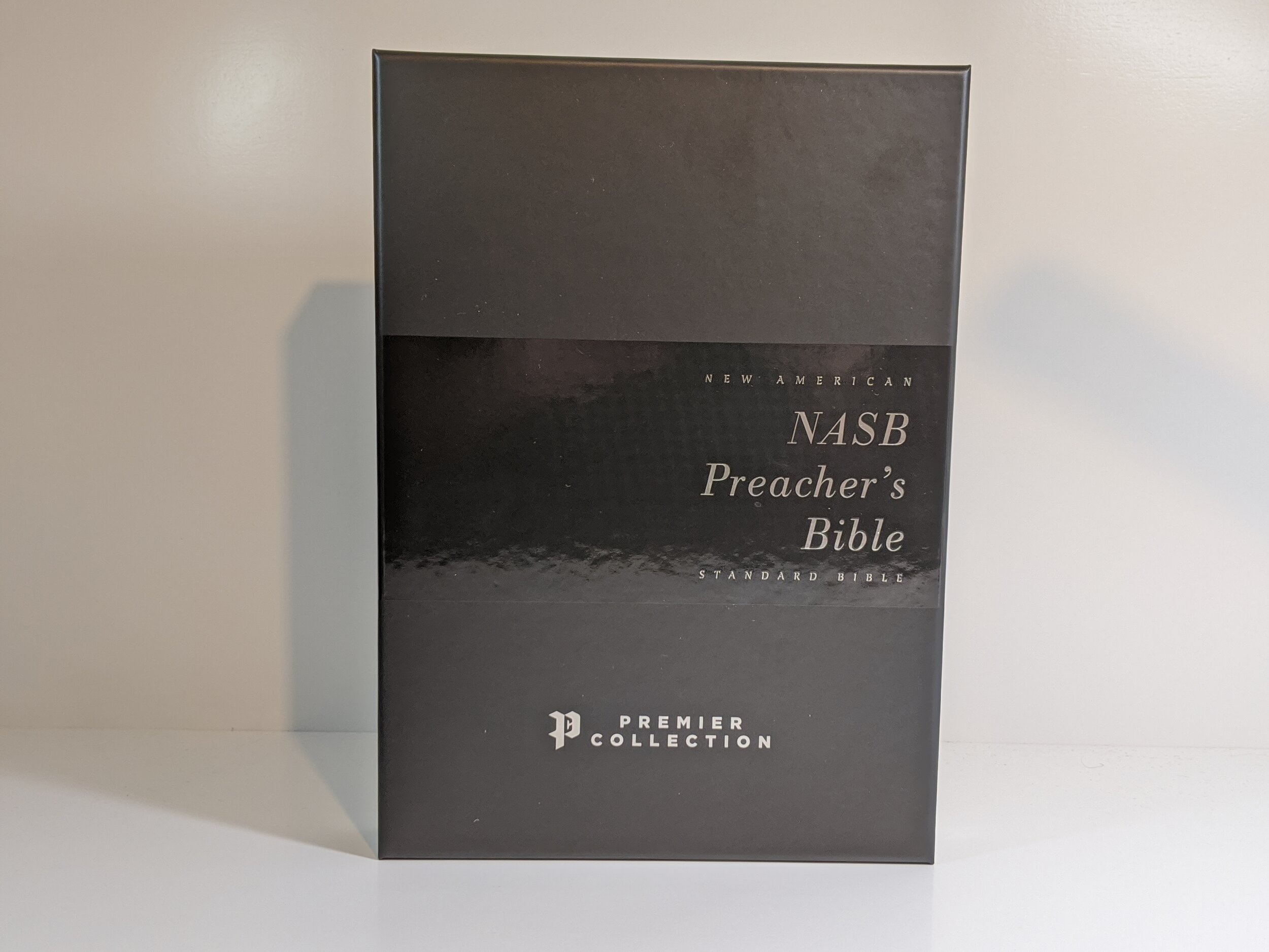
I think presentation goes a long way. I don’t say it enough, but I think the packaging that Zondervan and Thomas Nelson have been using for their Premier Collection Bibles is some of the sleekest and most attractive out there. The glossy silver, greys, and blacks they are using on their boxes look really classy. I also enjoy that each Bible has a bit of a different design on the box. When you open it, you find the Bible wrapped in a black construction paper with a silver Premier Collection sticker and you have to break the seal to get to your Bible. I really think this is a nice tough and I shouldn’t overlook it.
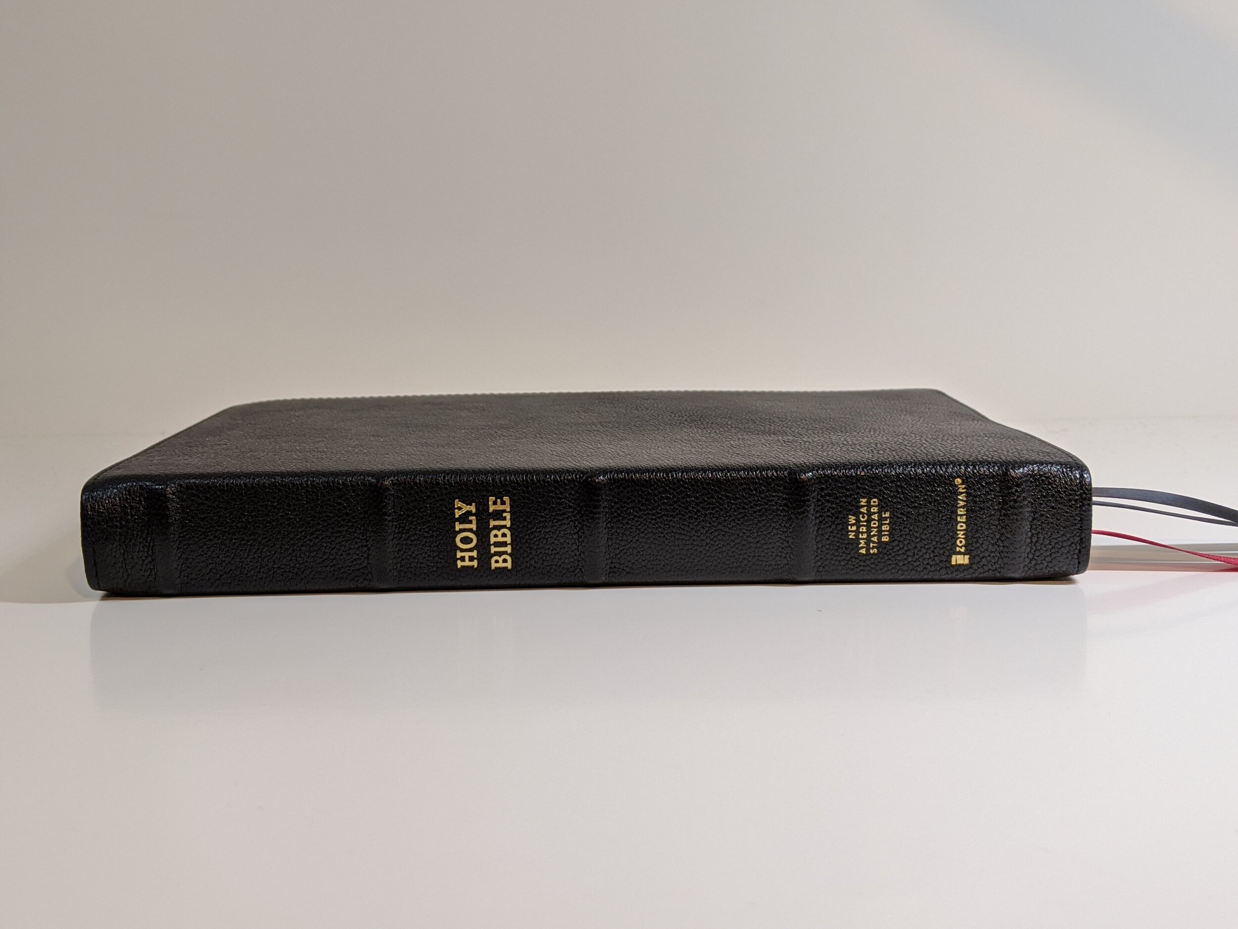
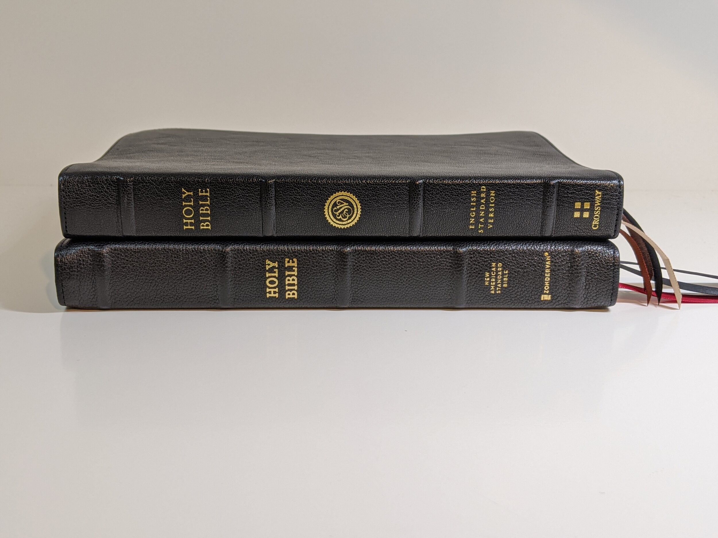
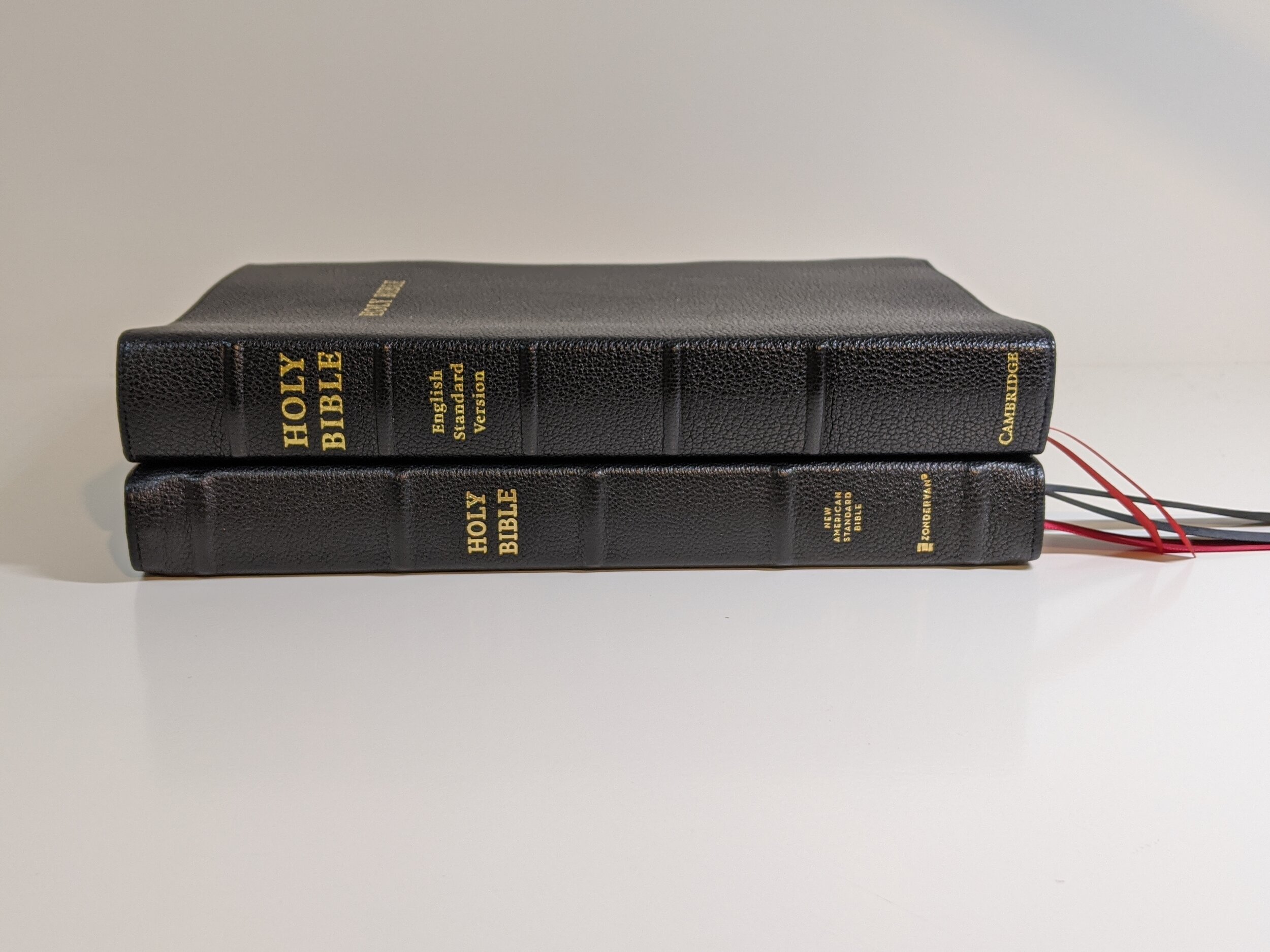
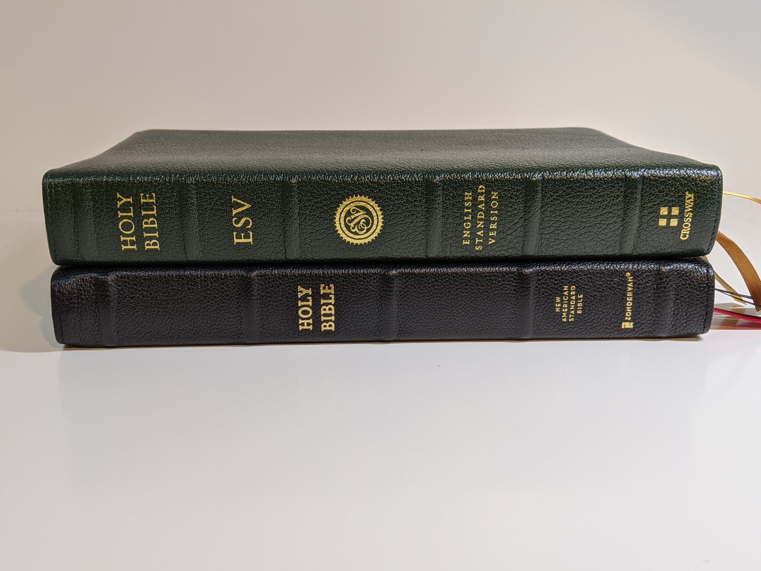
I love the size of this Bible. That’s one thing that really attracts me about it. It is slim and portable. If you’ve ever held an ESV Omega, it’s almost exactly the same size. It feels great in the hand and is very portable.
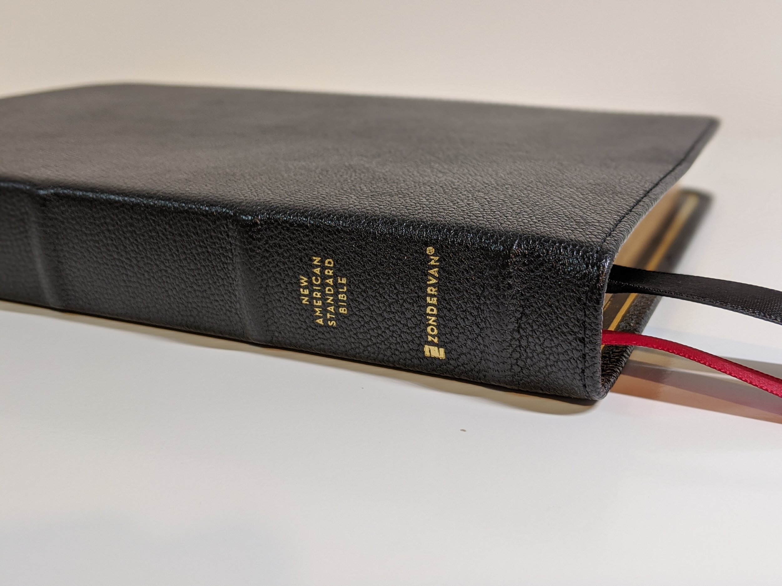
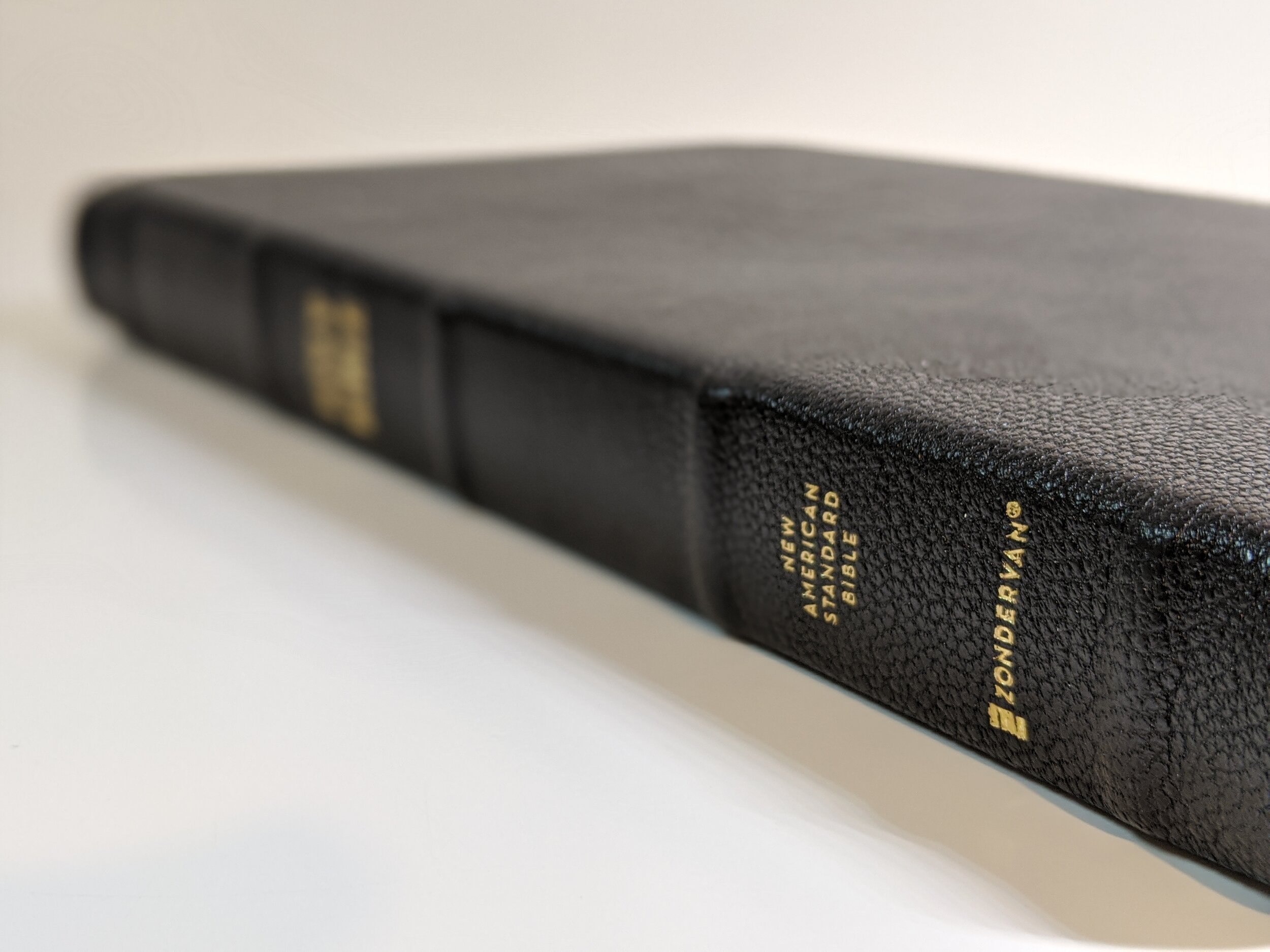
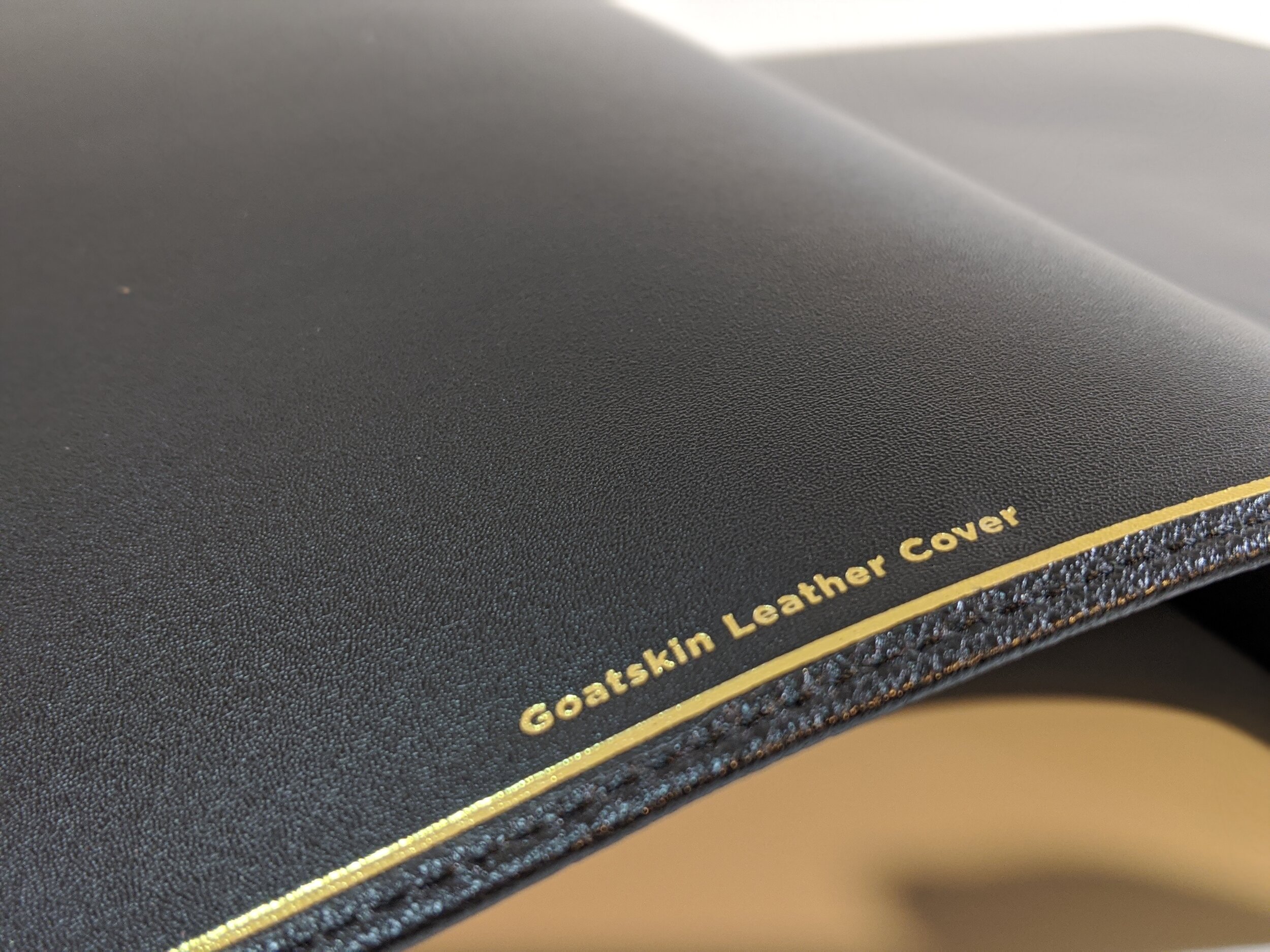
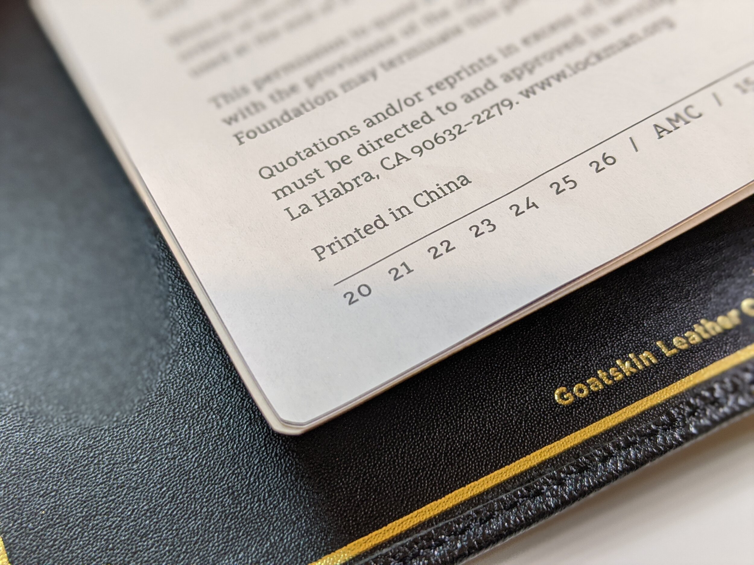
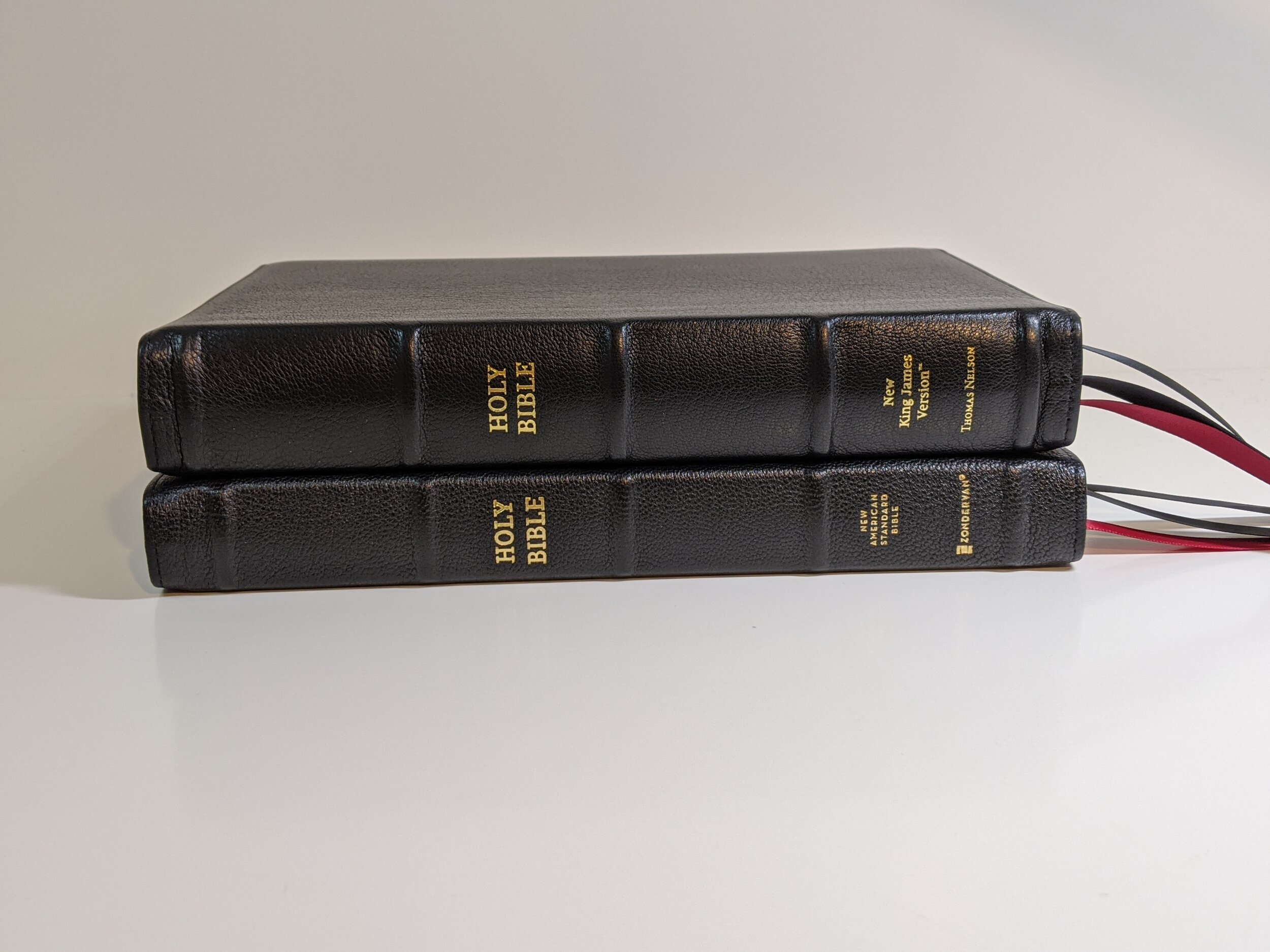
The Bible itself is a black goatskin that I personally think is the nicest goatskin I’ve seen coming out of China. It really is hard for me to believe that’s where these Bibles are being produced. They are really close to that Jongbloed quality. The cover has what Zondervan calls a generous yapp. I still don’t think the word generous is right, but if you were set on it, there probably is enough to train.
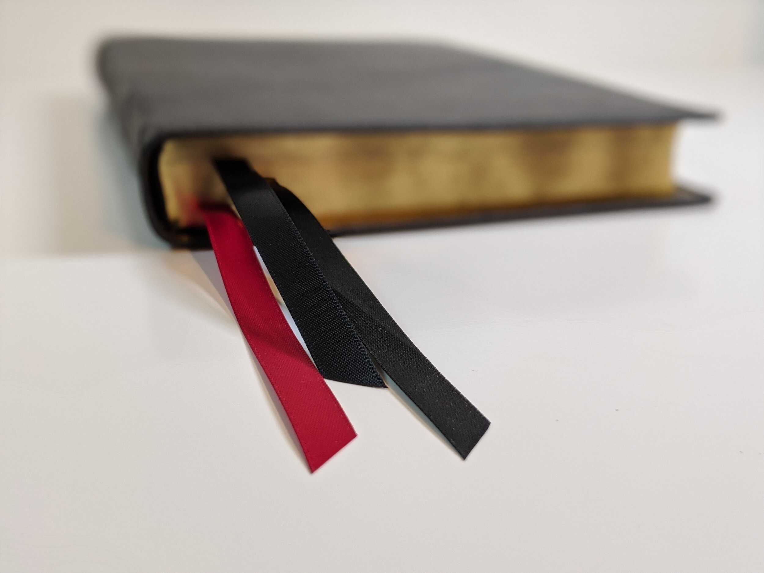
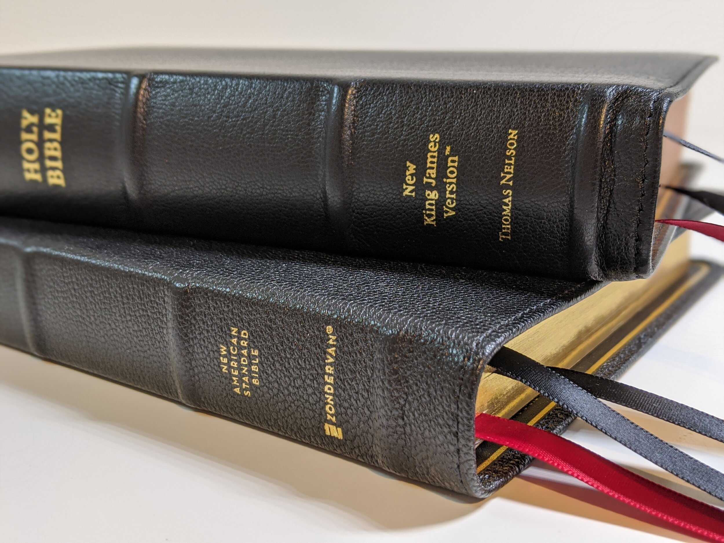
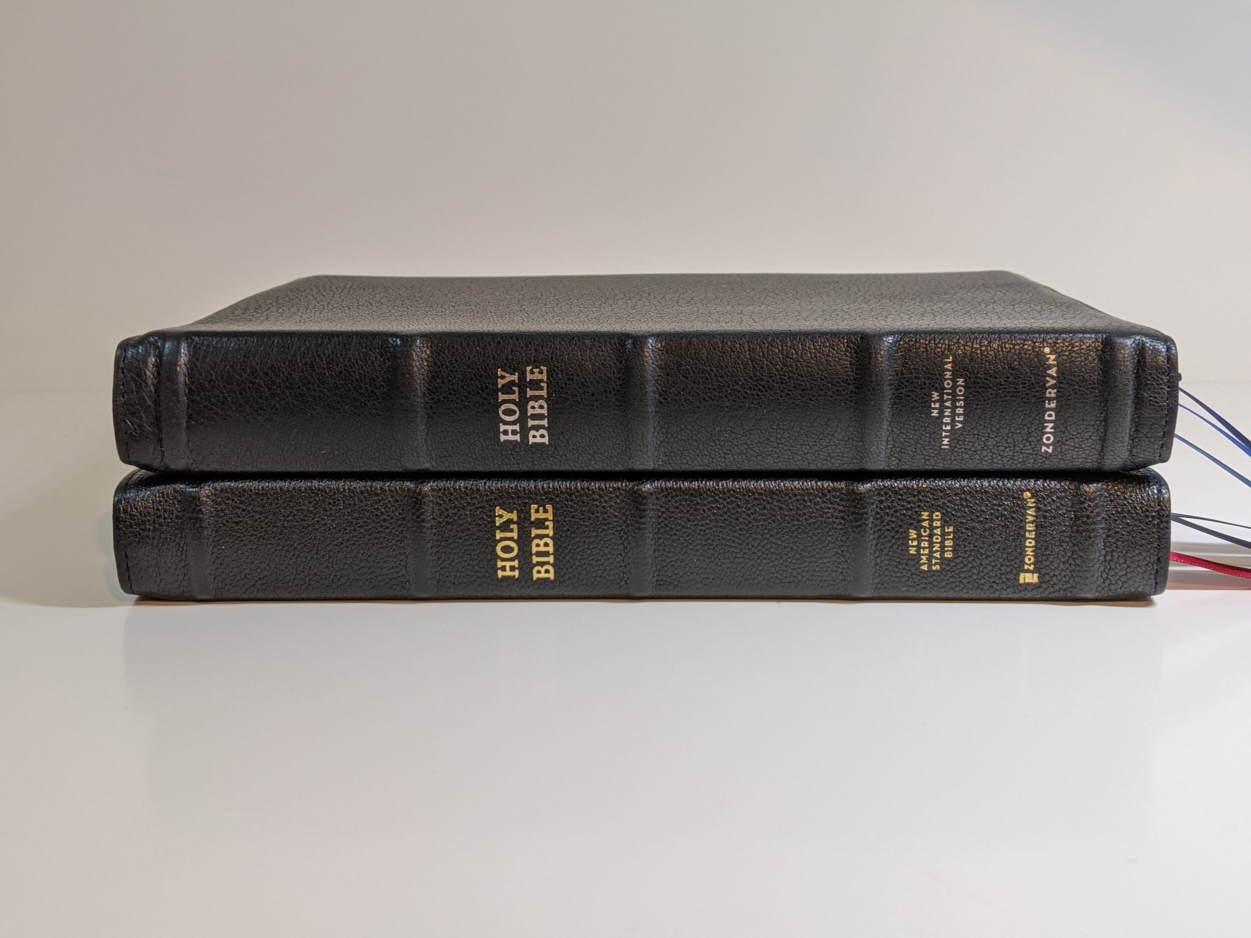
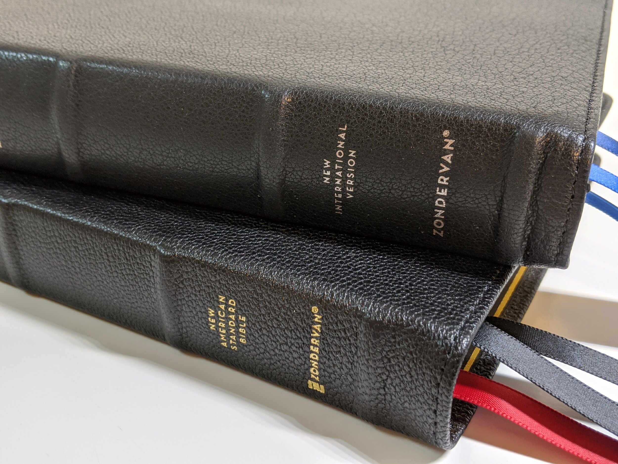
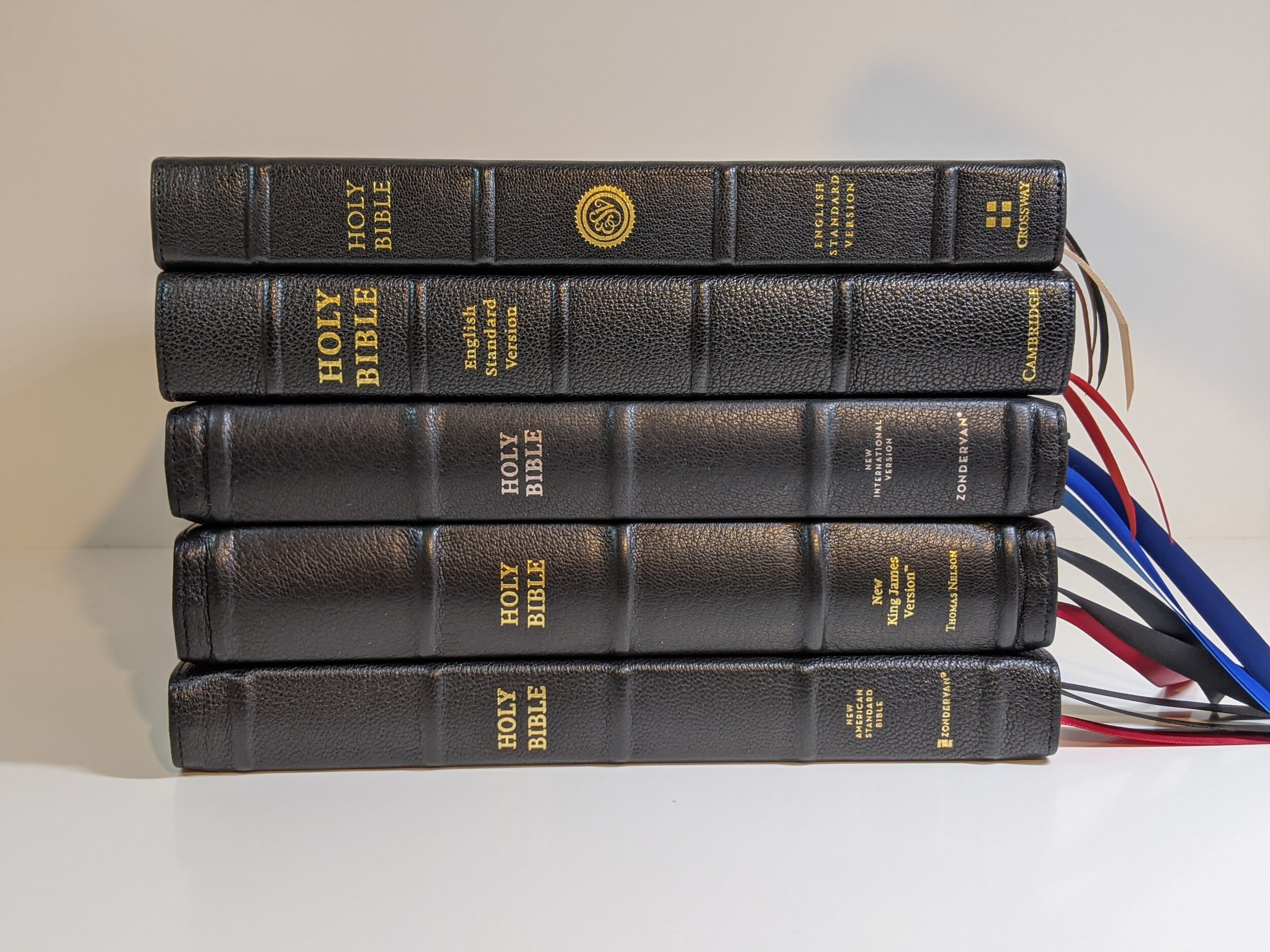
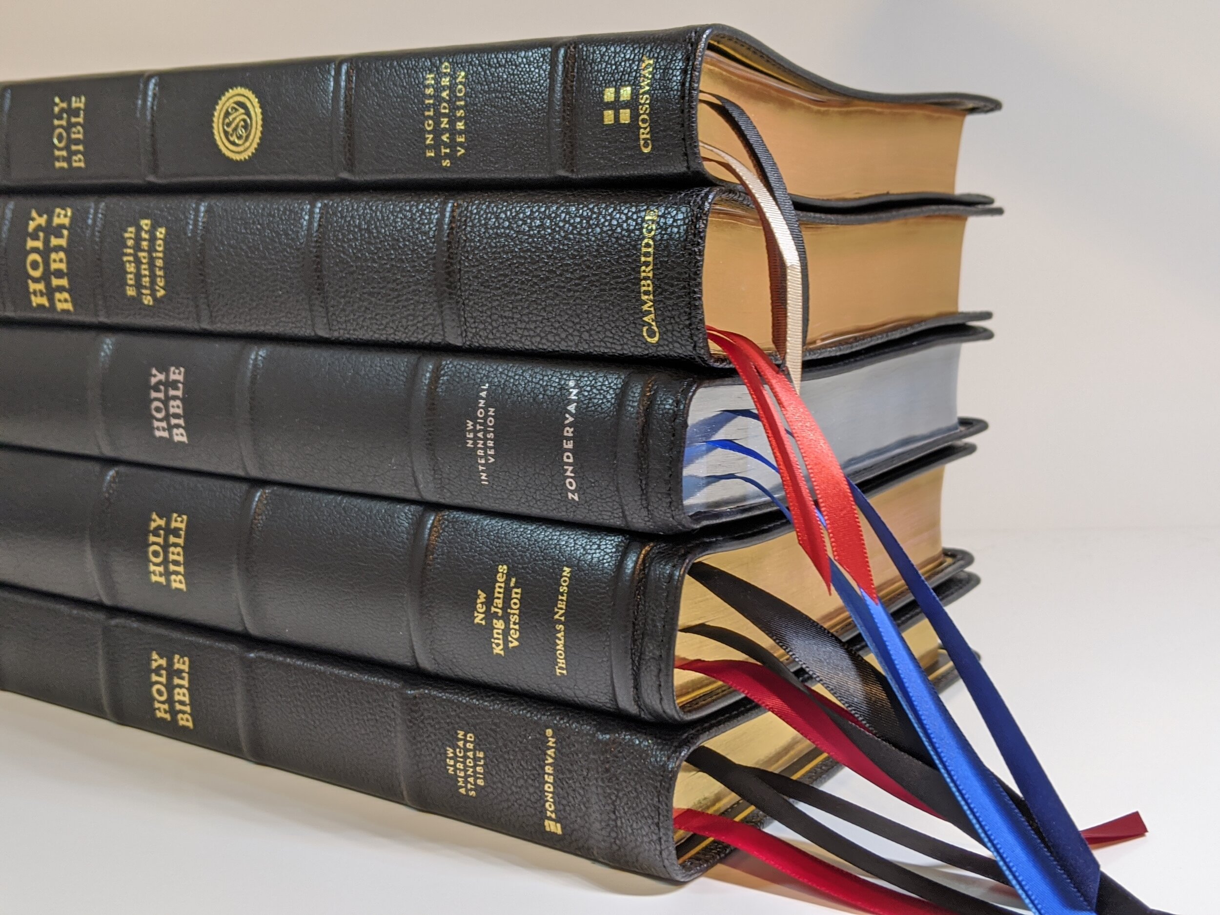
The spine has five ribs with the words “HOLY BIBLE”, “New American Standard Bible”, and “Zondervan” in gold. The page edges are a red under gold art gilt. The bible has three ribbon bookmarks, which I love. Many Bibles this size will only come with two, but I love Zondervan’s choice to include three. There are two black and one red, but I do find myself wishing that had used three different colors for quick passage location purposes. They are double-sided satin and ⅜-inch wide. I really love the width and length of the bookmarks Zondervan is using. The width looks perfect in my opinion and the length is longer than most other premium Bibles. I often think the ribbons are too short in Bibles, but Zondervan’s are nice and long and I really like that touch.
The Inside
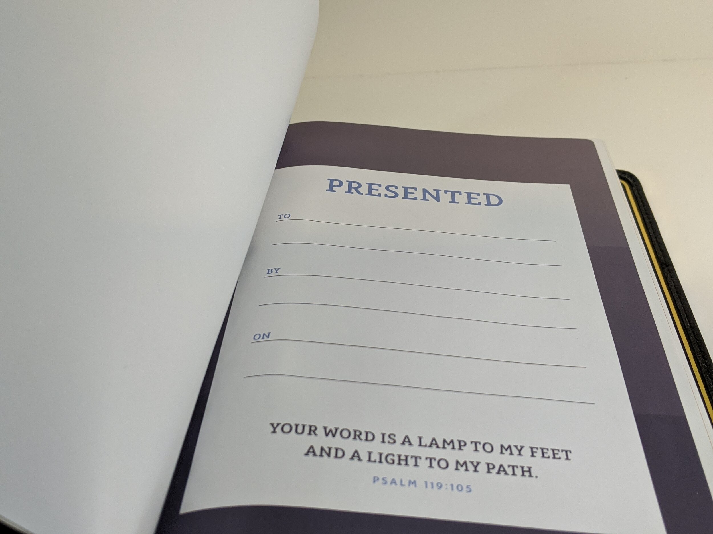
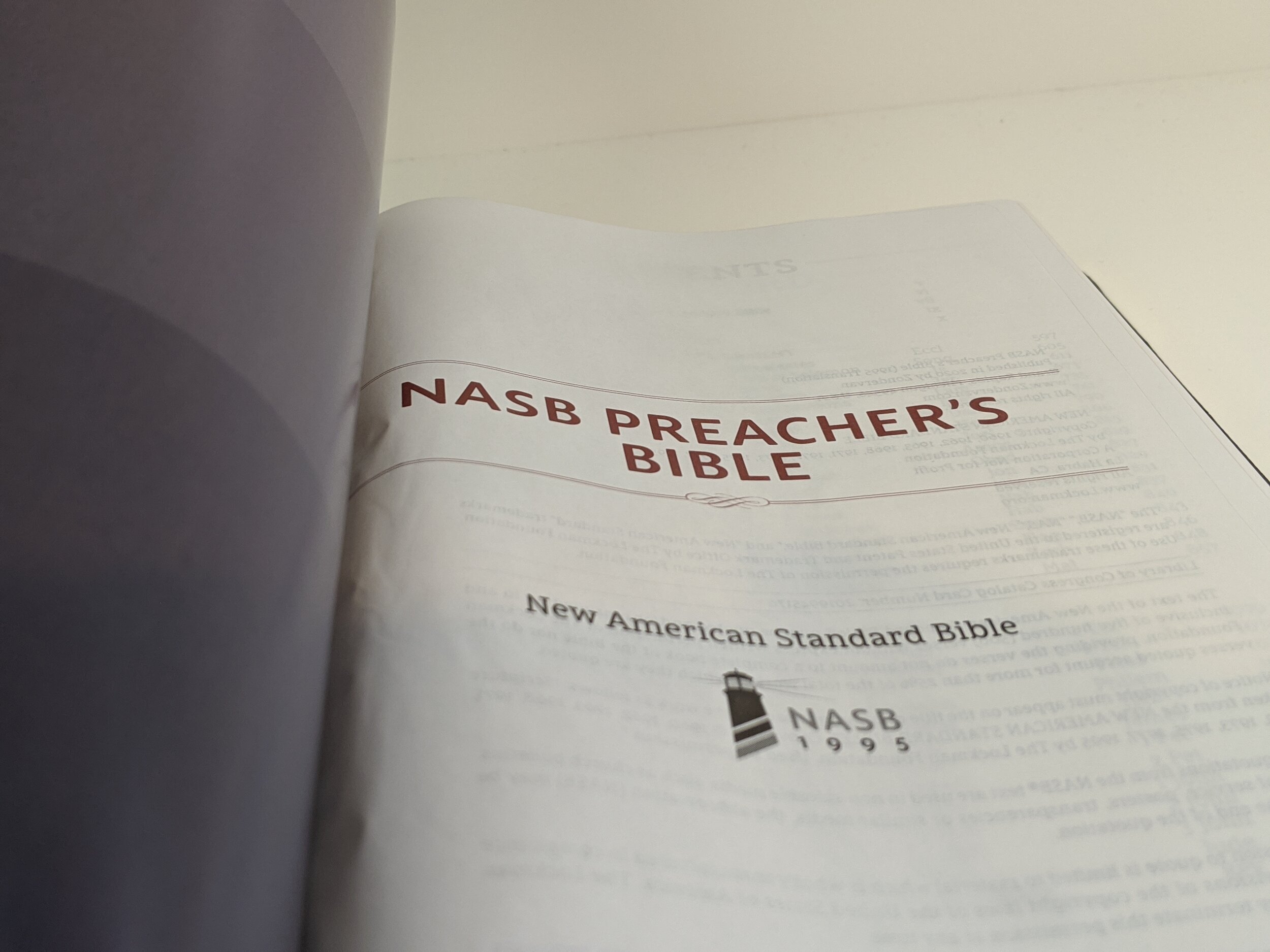
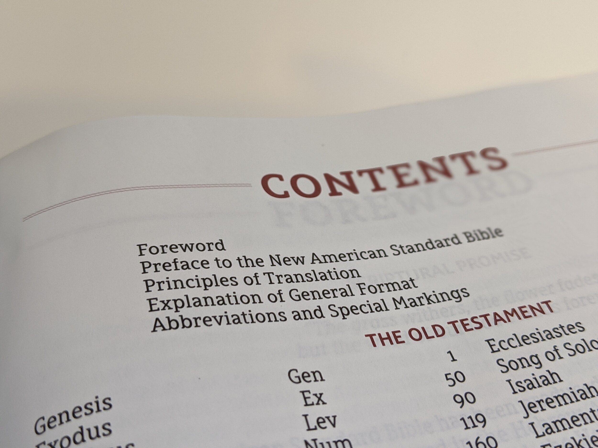
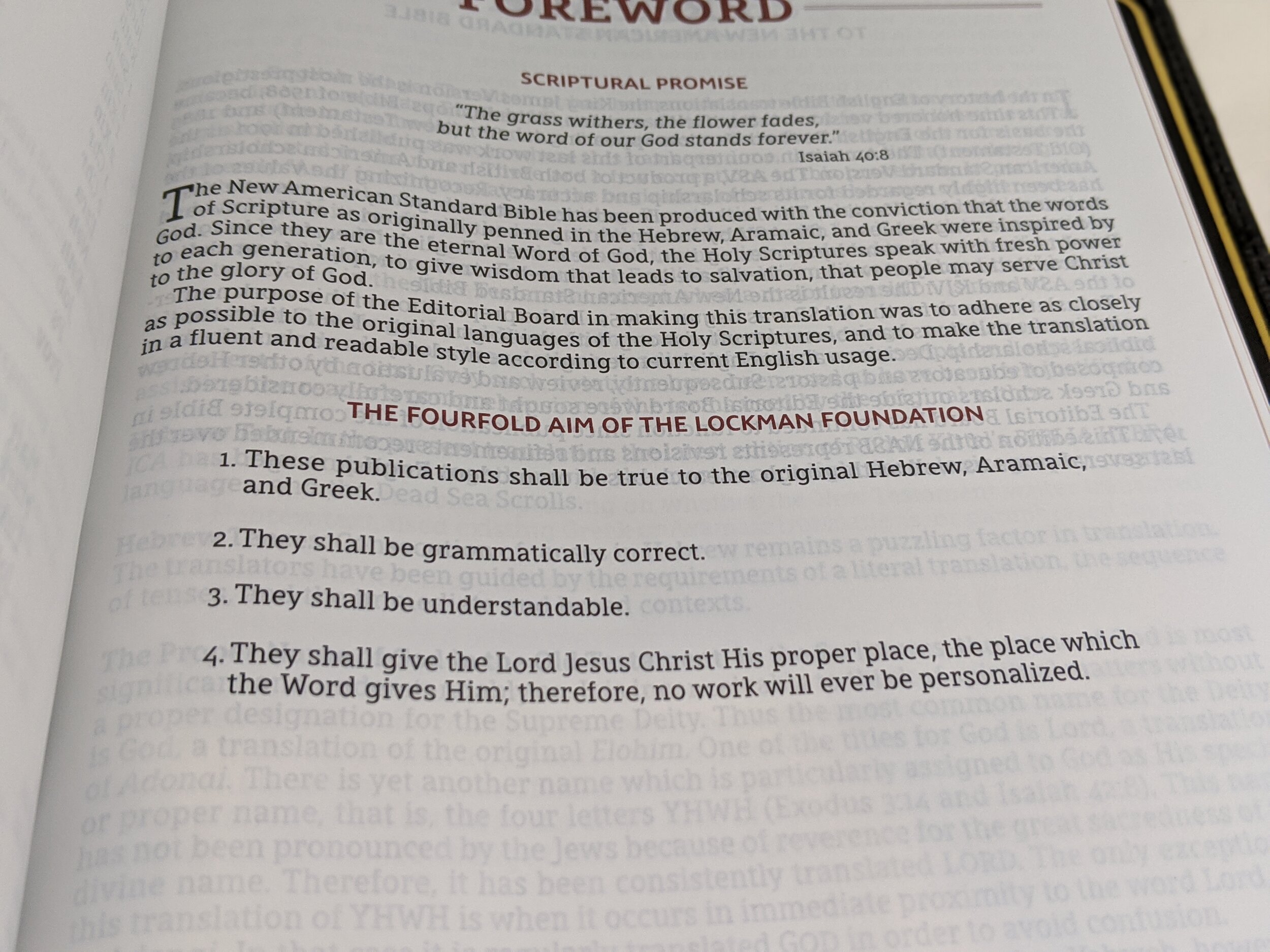
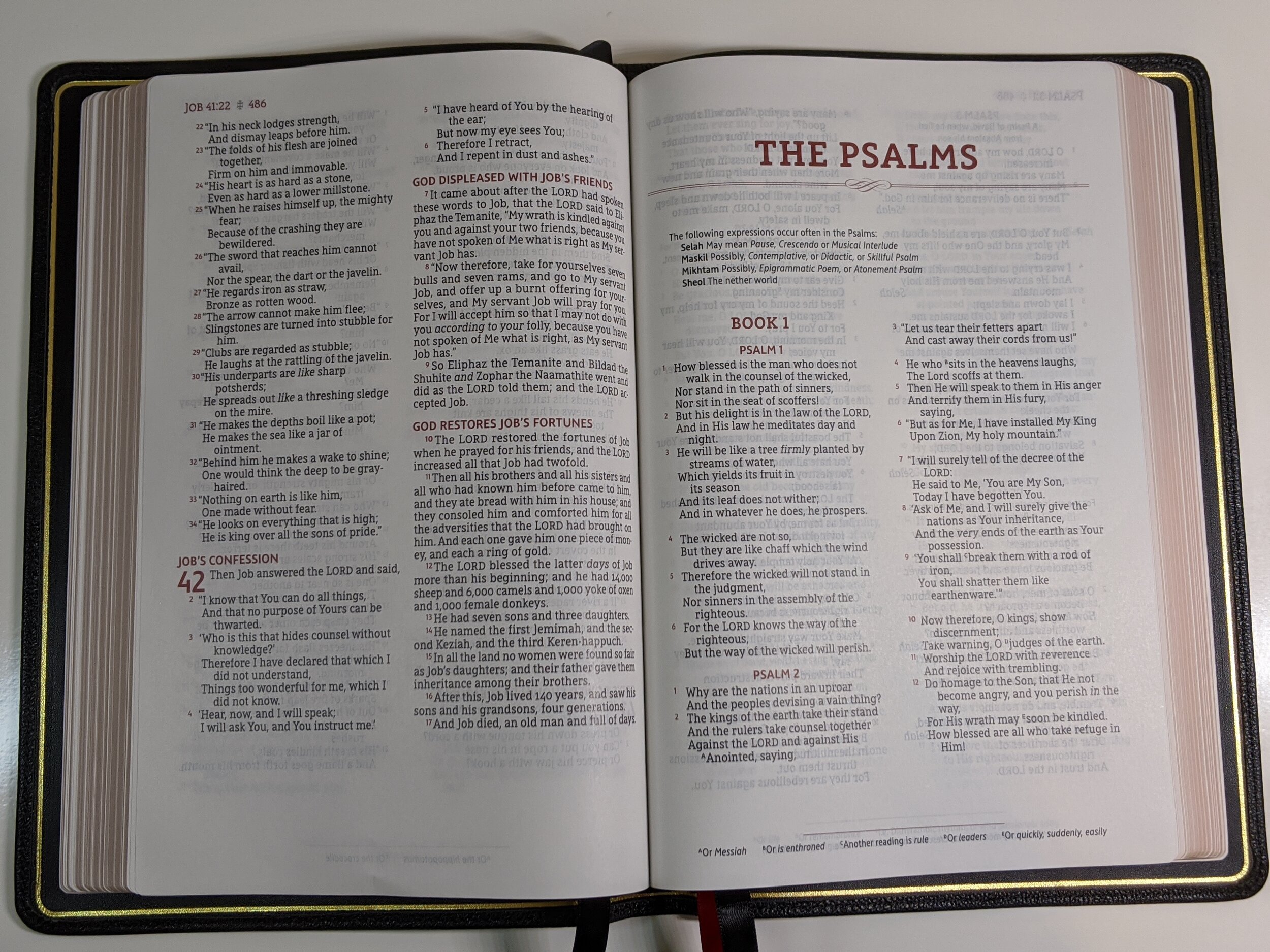
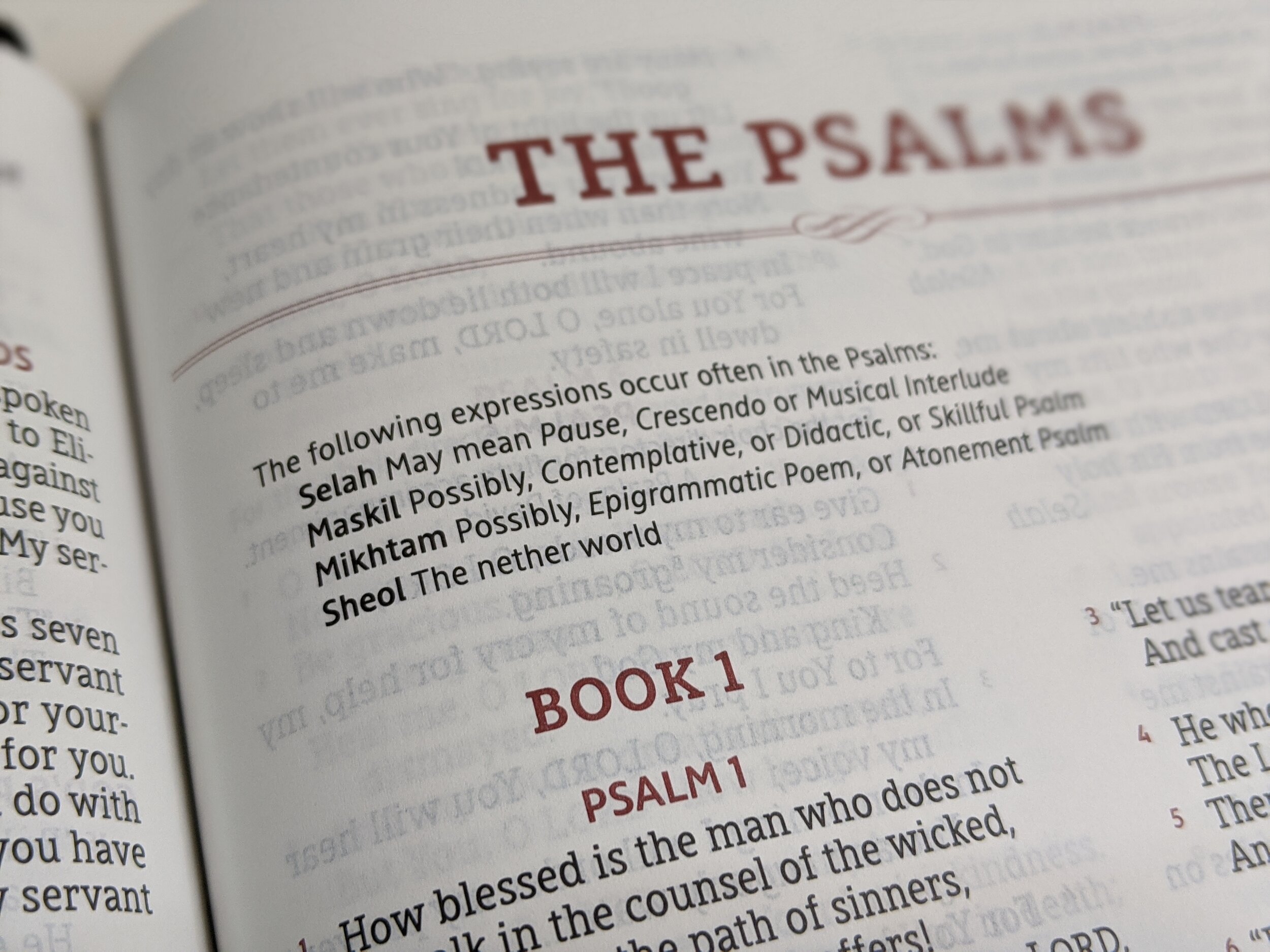
When you open the bible, you’ll notice it’s edge lined and has a perimeter gold gilt line. The inside liner feels and appears to be calfskin. The Bible has a full color presentation page that I don’t find quite as attractive as the one included in the SCR. As you continue turning pages there is a table of contents, a forward, a preface, principles of translation, an explanation of the general format, and abbreviations. I like the inclusion of all these pages. I think they are often ignored, but really will help the reader get the most out of this Bible.
This is going to sound crazy to say, but one of the best features about this Bible is it’s lack of features. You’re not going to find a lot of bells and whistles here, but that’s because this Bible is designed to do one thing very well and that is to read and locate the text of Scripture you’re looking for.
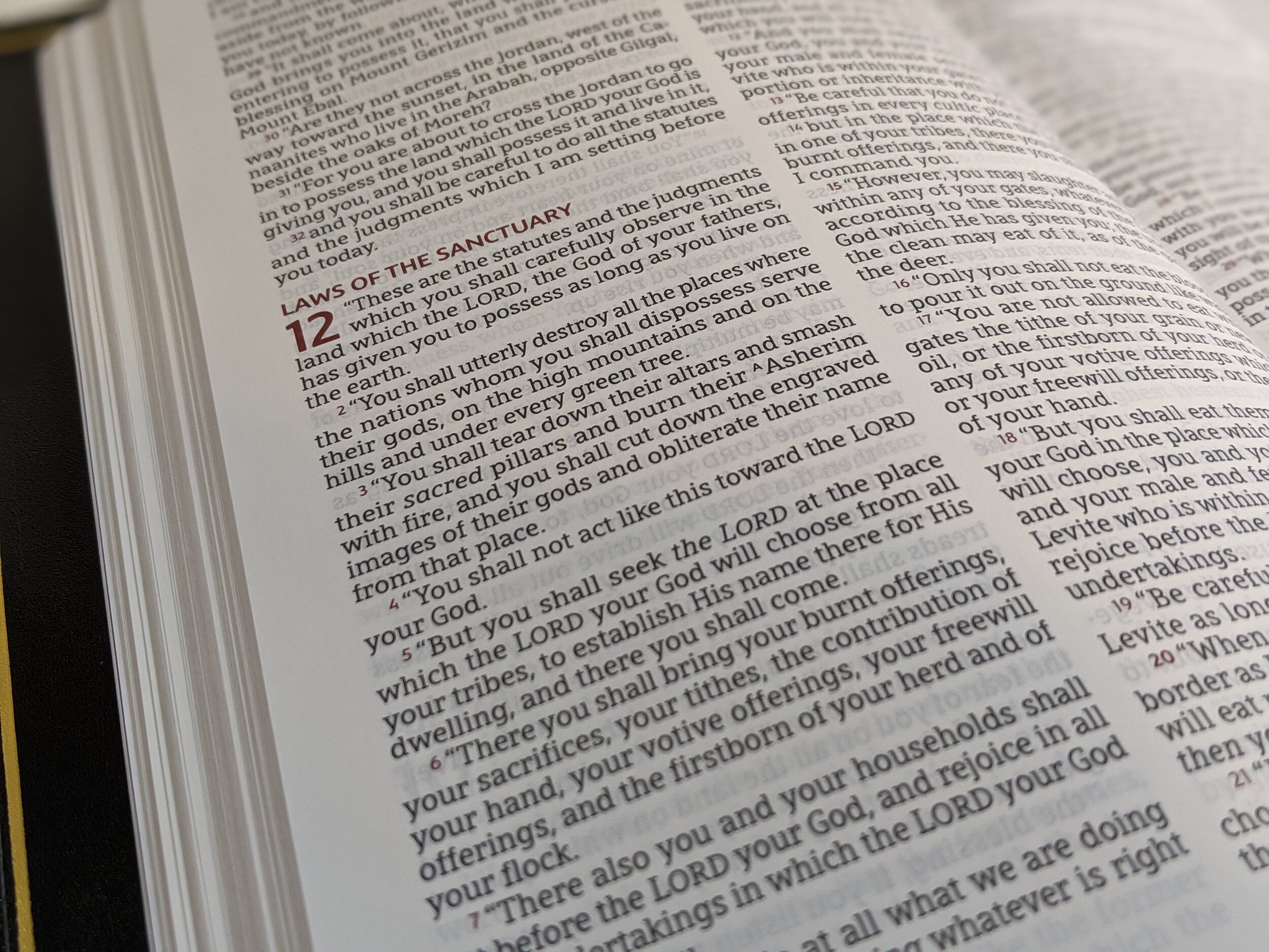
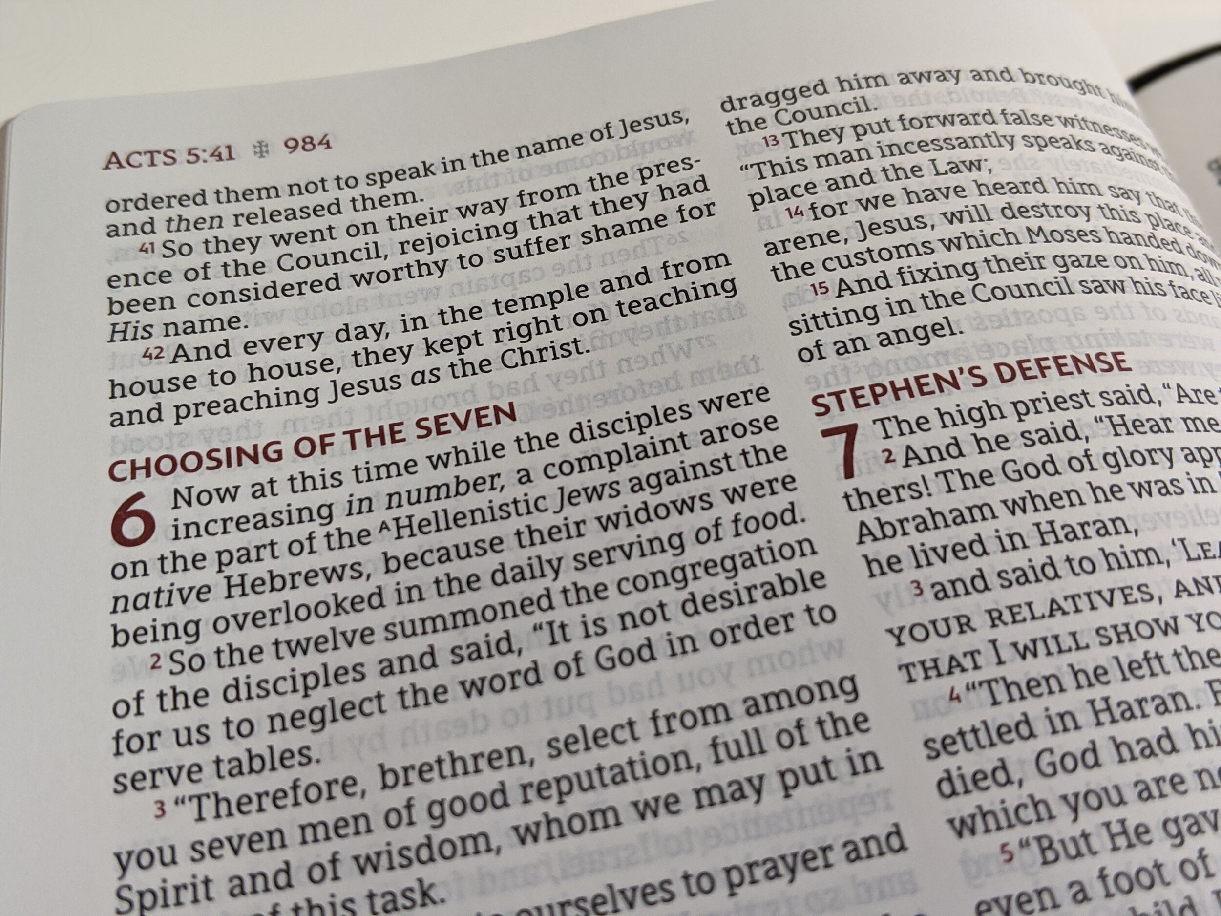
The page design is great. It is a double-column verse-by-verse layout. It is black-letter and line-matched. Page headings, sub headings, chapter numbers, and verse numbers are all in a red/maroon accent color. I love the choice to put verse numbers in a different color. This easily helps you locate the verse you’re looking for as it makes each verse number distinct and easier to see. I really wish the SCR had chosen to do this as well.
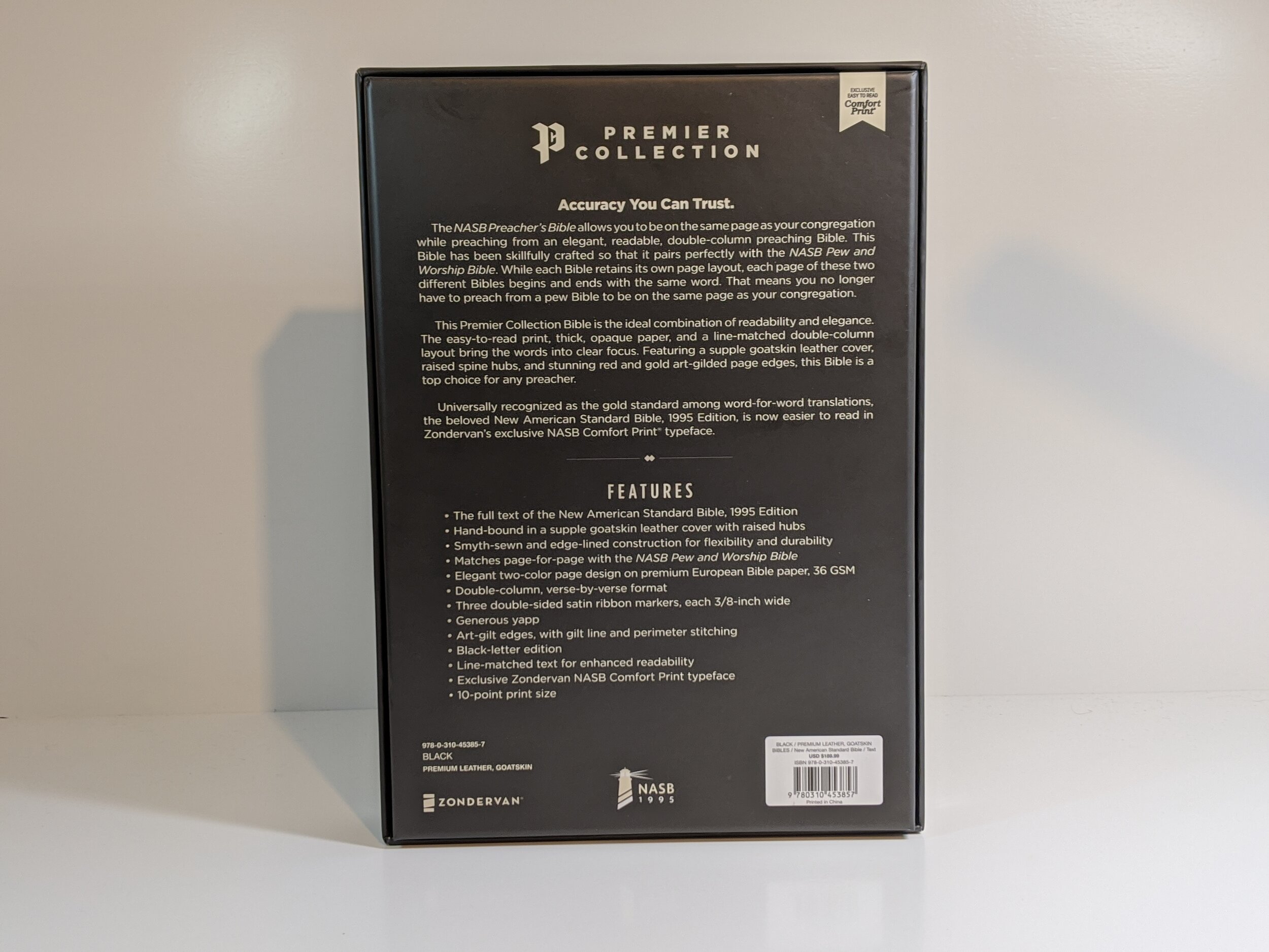
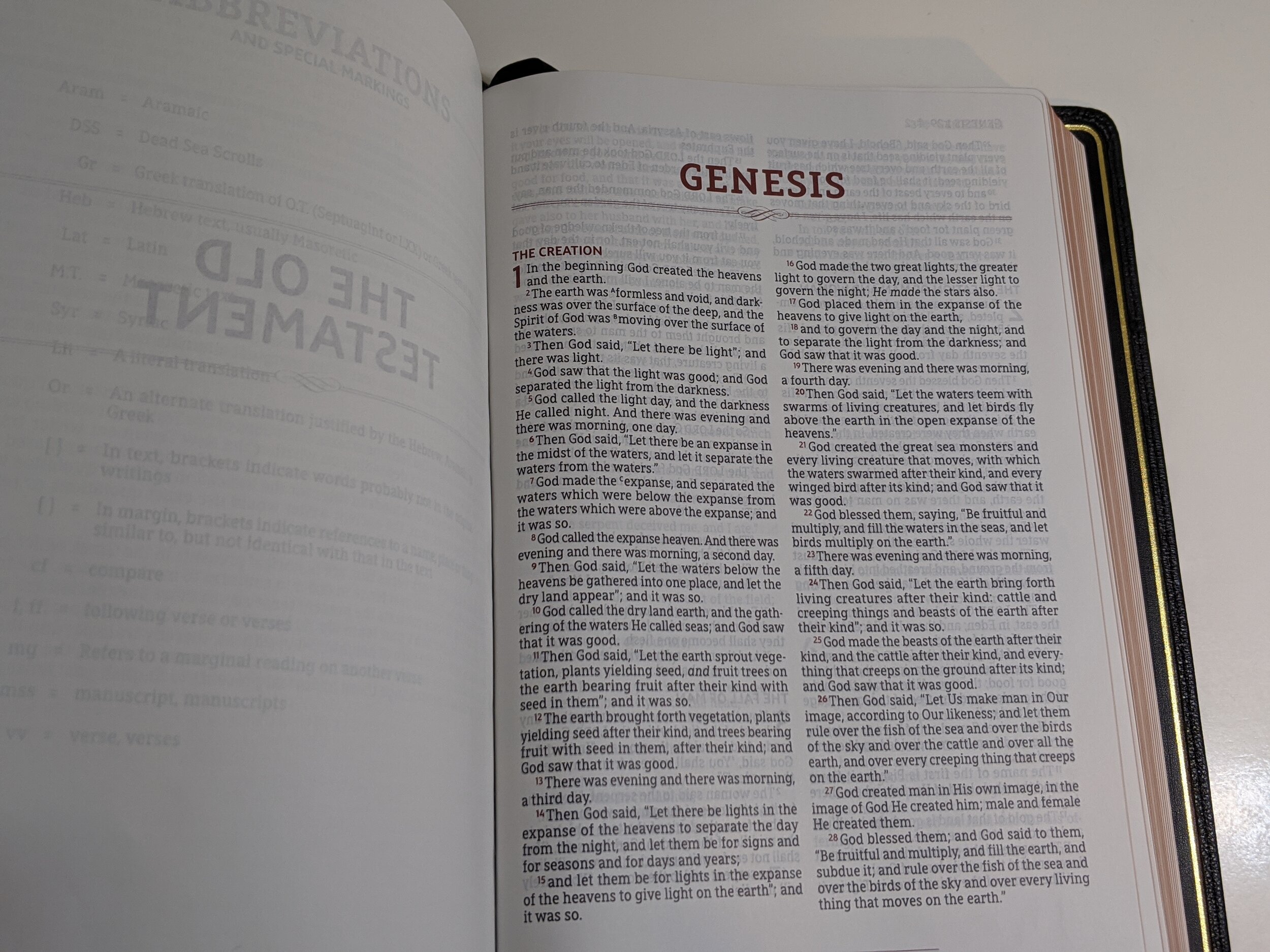
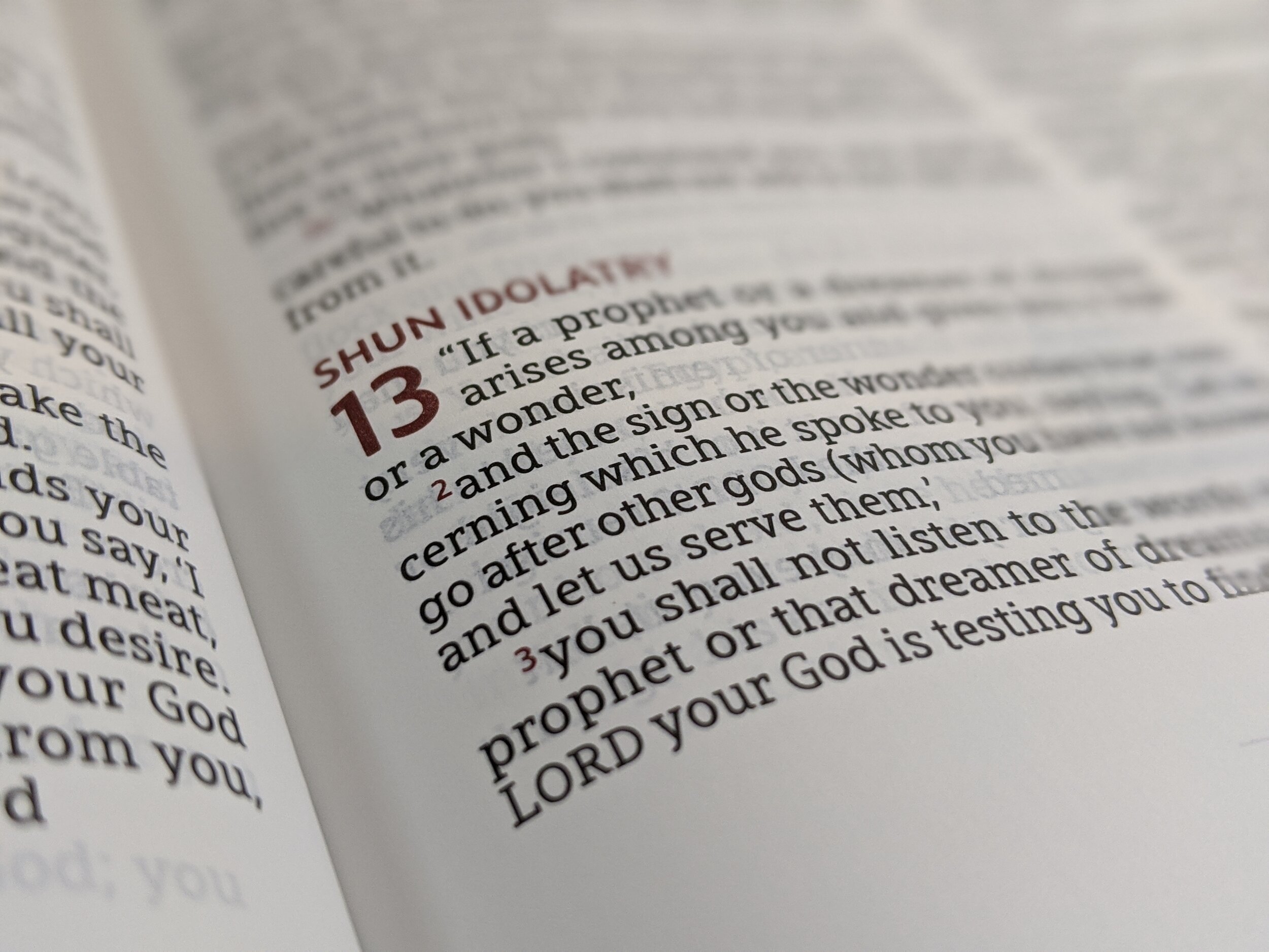
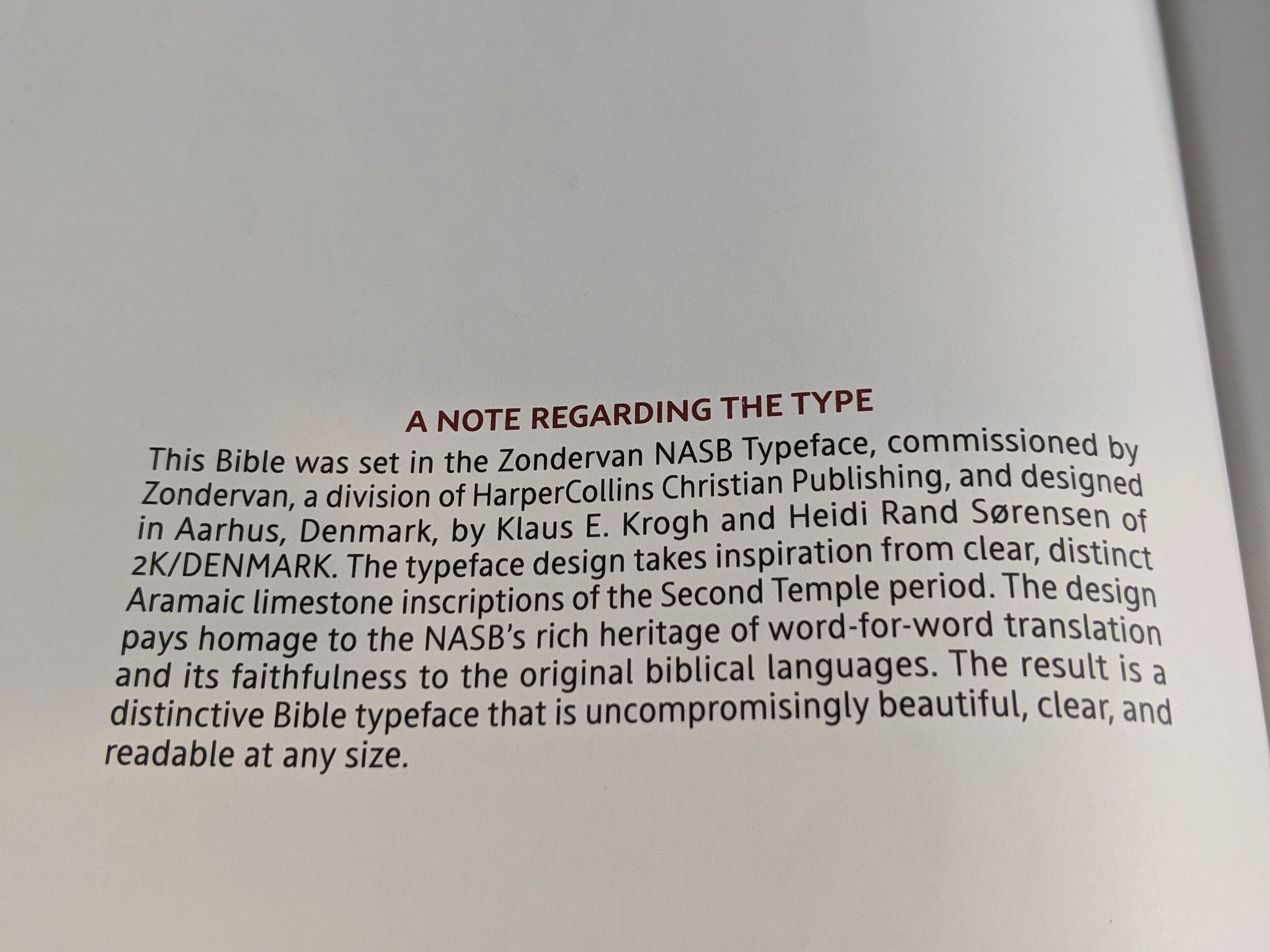

The font is a 10-point Comfort Print designed by 2k/Denmark specifically for the Zondervan NASB Bibles. I really love the font design and find it pleasing to read. However, I am not a fan of the size. I really wish it was bigger and to be a 10-point, it feels like it reads small. Cambridge has a font design in their Clarion that makes it read bigger than it actually is. To me, this one reads smaller than it actually is—and for a Preaching Bible—that’s not a great thing. I would’ve really been ok if this Bible was a little thicker, if it meant the font could be bigger. If you place it beside Cambridge’s new Topaz, the font of the Topaz looks noticeably bigger and really pops off the page when in fact, it’s also a 10-point.
What you won’t find in this Bible is any references. There are a few translation notes separated by a red line at the bottom of the page, but there aren’t many. The text is the focus here and I do like that choice for what this Bible is designed for. The paper is a 28 gsm Indopaque paper that is a true white color. There is minimal ghosting and line-matching seems to hand any distractions you would have. Another great feature for pastors who use this as their preaching Bible, is that Zondervan has created a Pew Bible that has the exact same page layout. This means you can tell your congregation what page to turn to and they will see it in the Pew Bible exactly as you see it in the Preacher’s Bible.
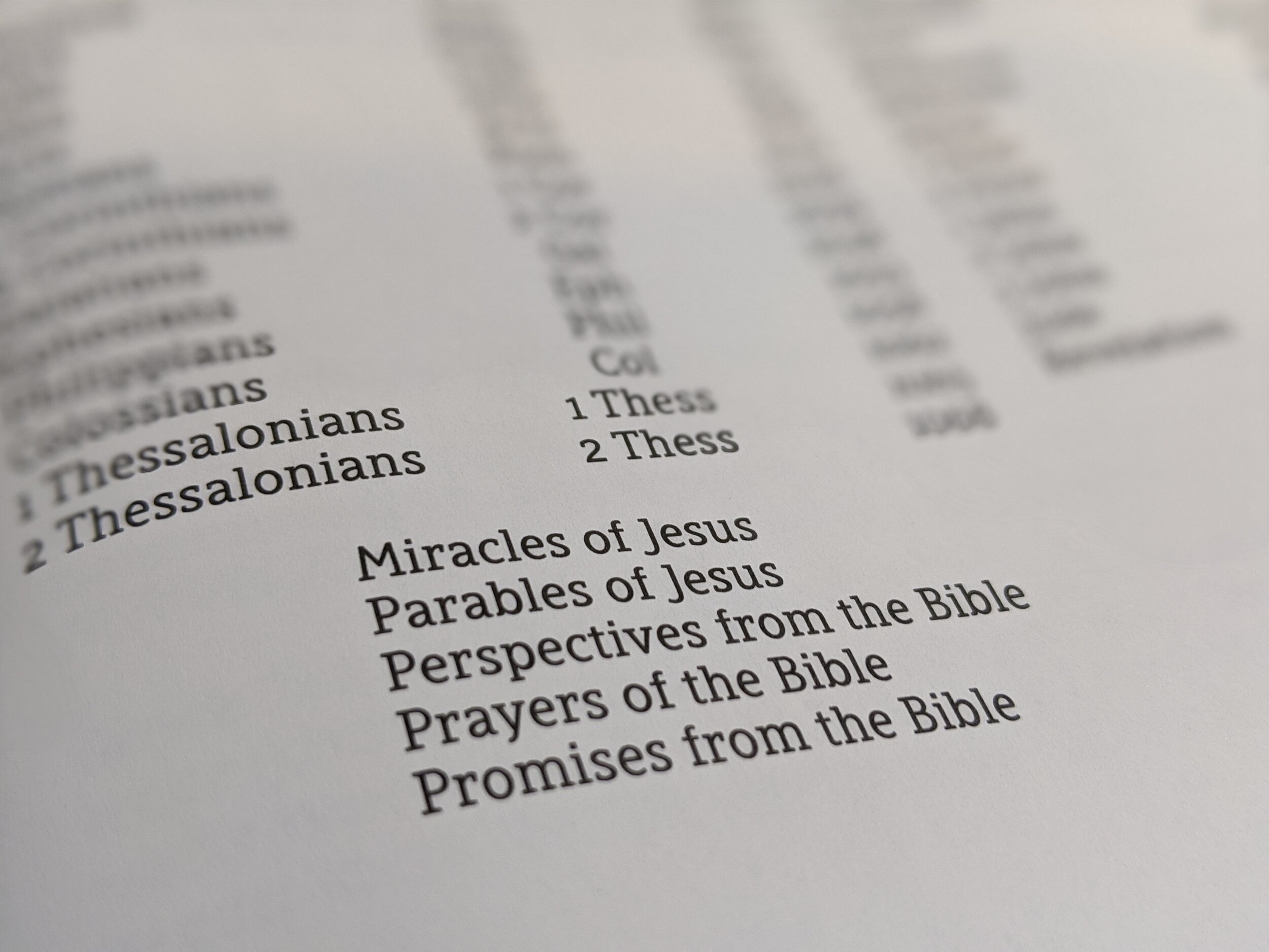
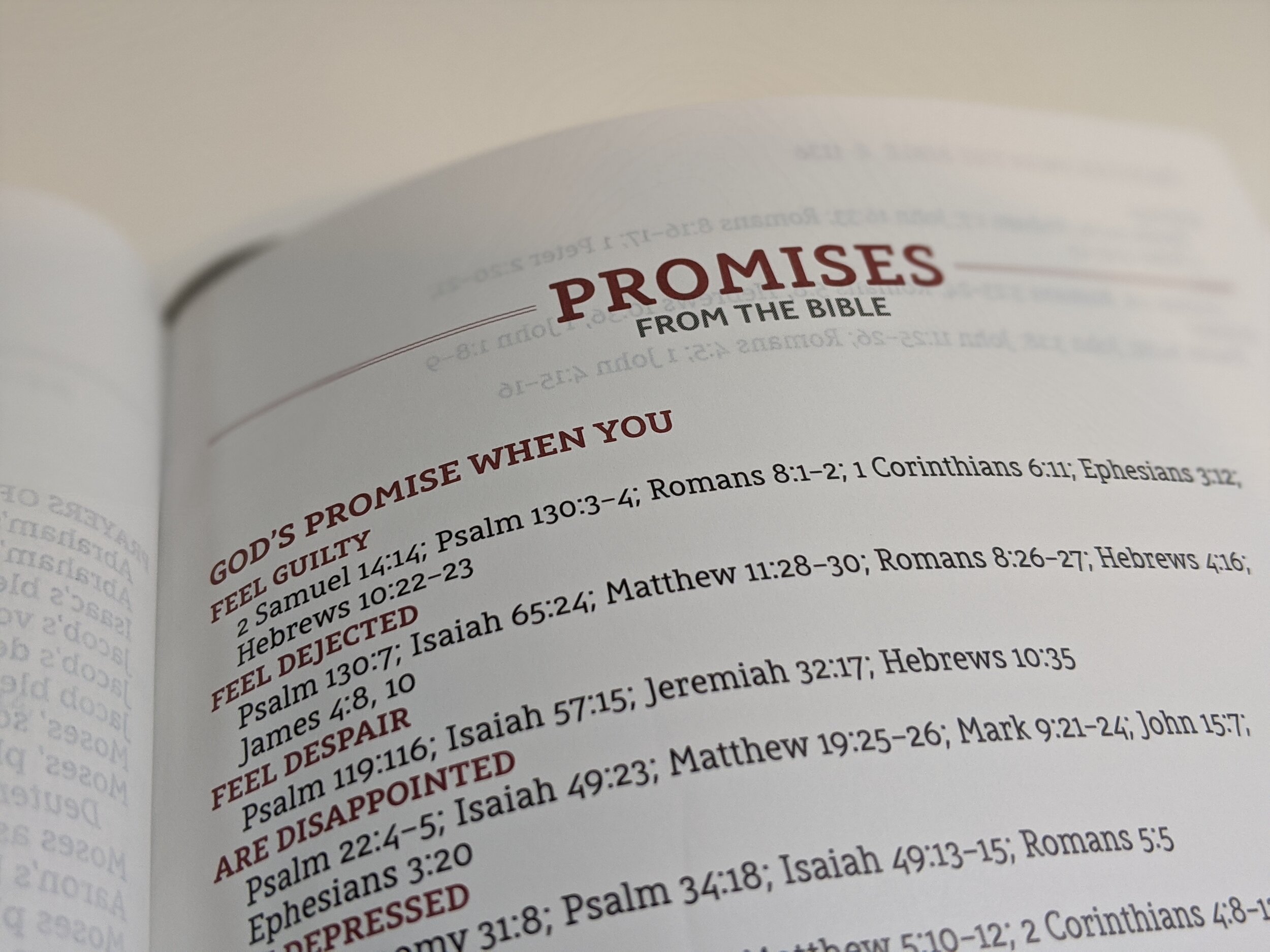
This Bible doesn’t have a concordance, but on the final pages you will find lists of the miracles of Jesus, parables of Jesus, perspectives from the Bible (which is Scripture to pray in different circumstances), prayers of the Bible, and promises from the Bible. At the very end is a paragraph explaining the font that was designed for the Bible. The other thing you won’t find in the back is maps! I have bemoaned the inclusion of maps in Bibles in several posts and not having them in this Bible honestly thrills my heart. I know some disagree with me, but I feel as though someone may have paid attention. That being said, this being geared specifically for preaching and teaching means maps are really unnecessary and I think Zondervan made a great choice.
Conclusion
To sum it up, I think this is a fantastic Bible. I think it pairs well with the SCR and if you’re a big NASB user, you’d do well to have both. If you could only get one, I would recommend the SCR because of the included references, concordance, and wide margin for notes. It, however, is much less portable and I think the verses are harder to quickly locate. Zondervan has knocked it out of the park with these additions to the NASB 95 line.
If you enjoyed my review, be sure to share it! Also, I’m trying to add more and extra book and Bible content on Instagram so be sure to follow @camlhyde. I just did my first IGTV last night with a short review of this Bible. I’m always sharing pictures of Bibles and other content so I’d love for you to follow me there.
You can pick up your copy of The Preacher’s Bible on Amazon. (affiliate)
Disclaimer: I received a complimentary copy of this Bible from Zondervan in exchange for a fair and honest review.

