

The Zondervan NASB Single Column Reference Bible (Premier Collection) Review

I’m not even sure where to start as I begin to write the review for this Bible. All I can really say is, “Wow!” I knew Zondervan and Thomas Nelson’s Premier Collections were progressively getting better, but the two new NASB’s that Zondervan has just released have blown me away. I would argue they are now directly competing with premium companies like Cambridge, Schuyler, and Allan. Not only are they competing, but they are offering their Bibles at a considerably lower cost. Let me say it again, “Wow!”
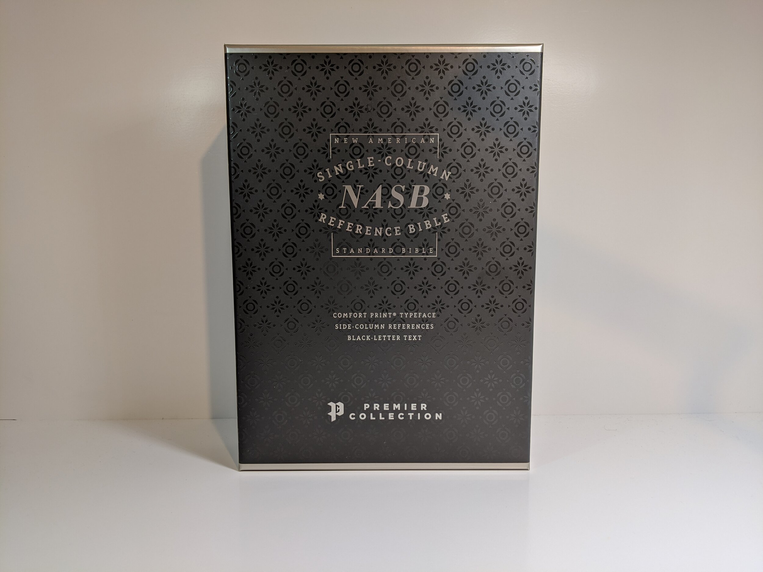
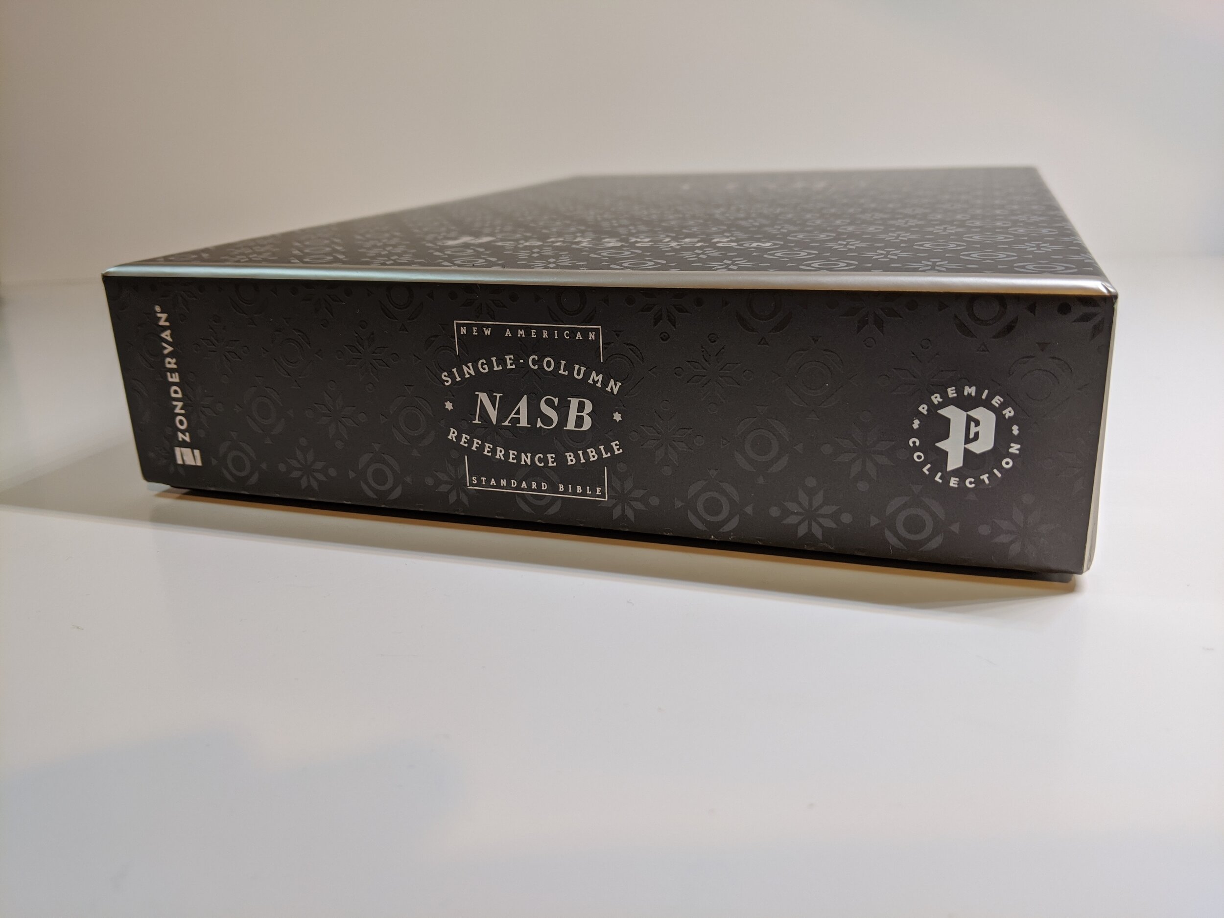
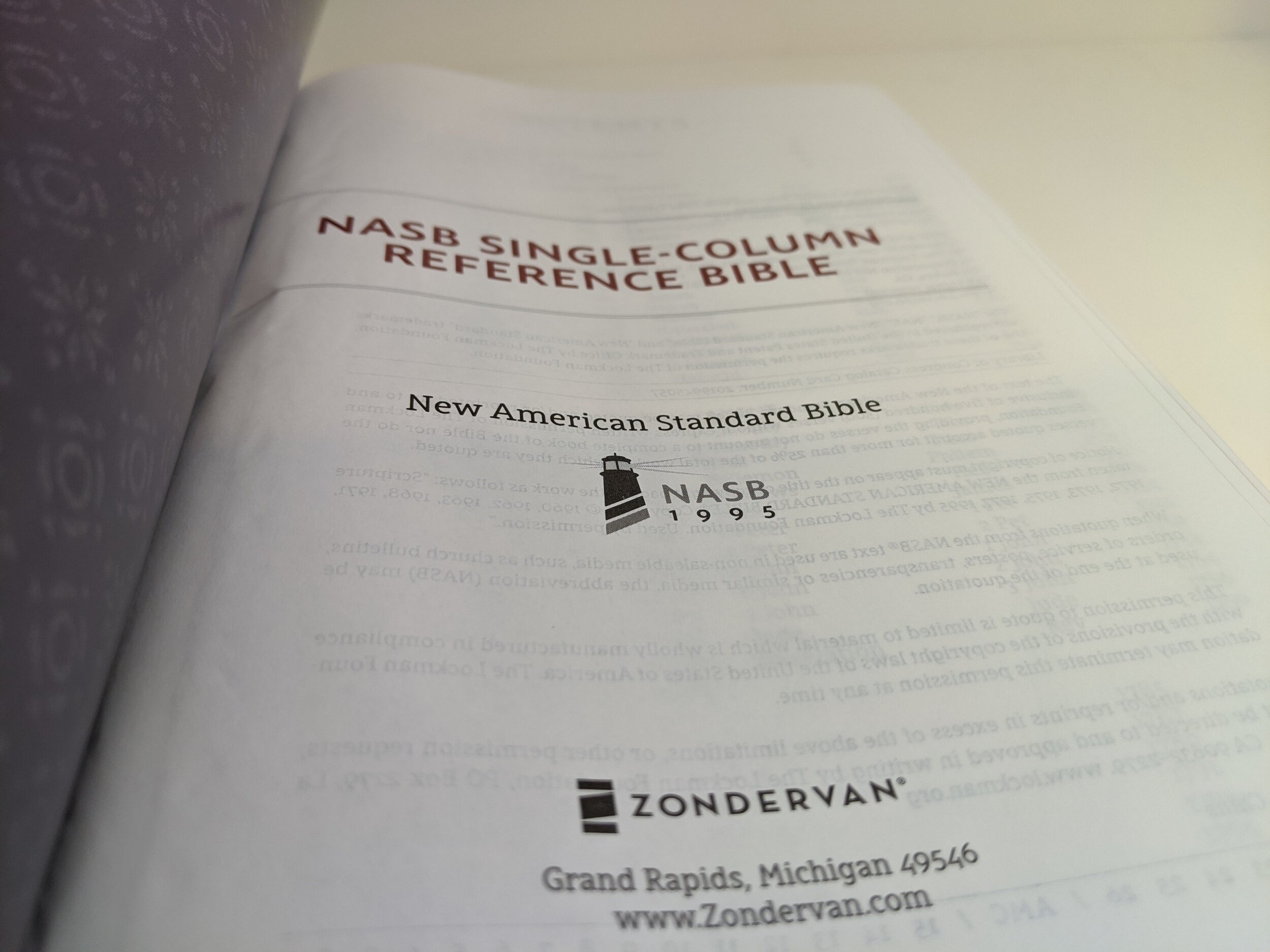
I’m reviewing the Zondervan NASB Single Column Column Reference Bible from Zondervan’s Premier Collection. This Bible is bound in black goatskin and it really is something to behold. Did I mention these Bibles are being printed in China? I can honestly say that you wouldn’t know it by examining it. Let’s jump into what makes this Bible so fantastic.
Outside
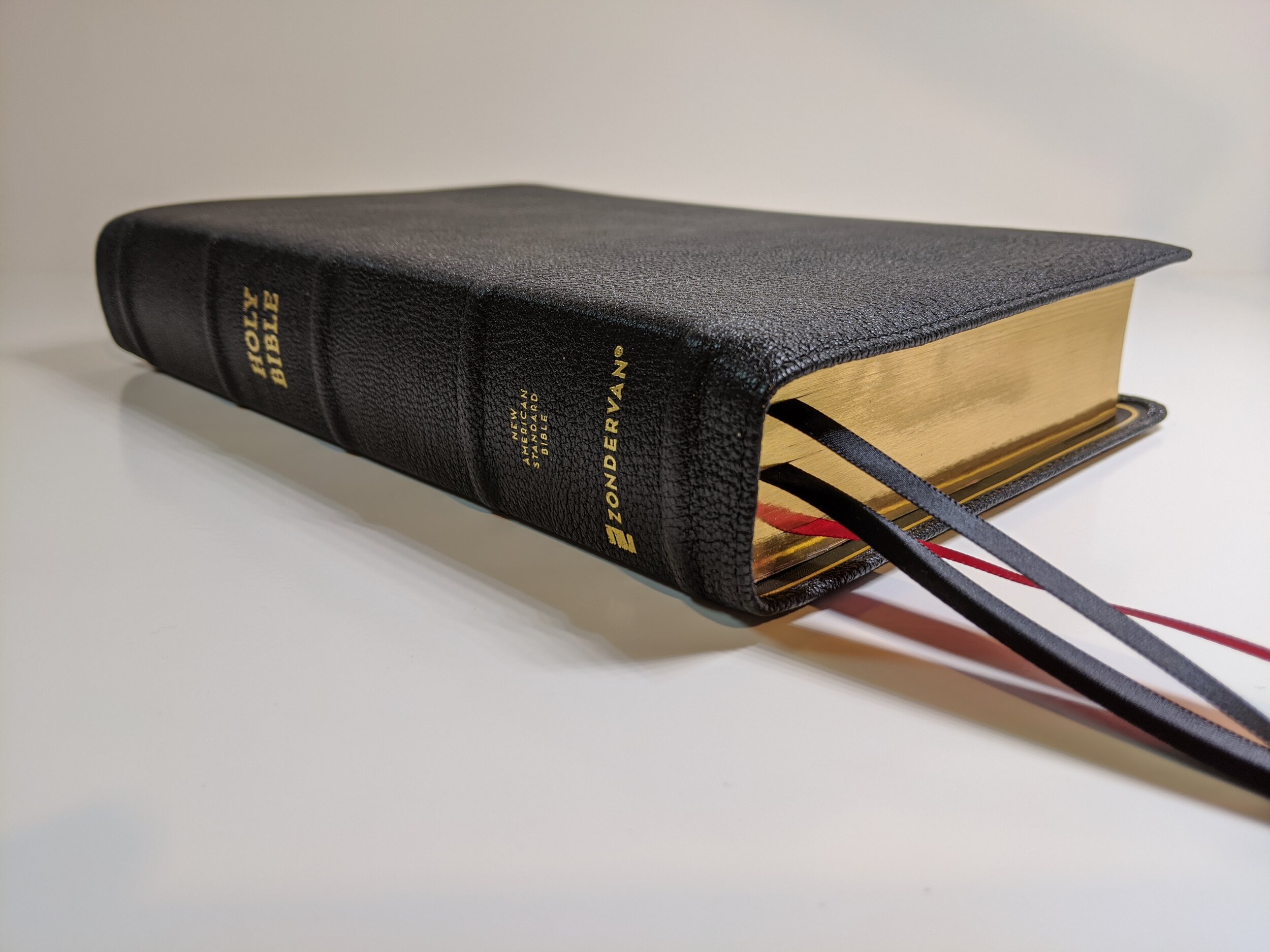
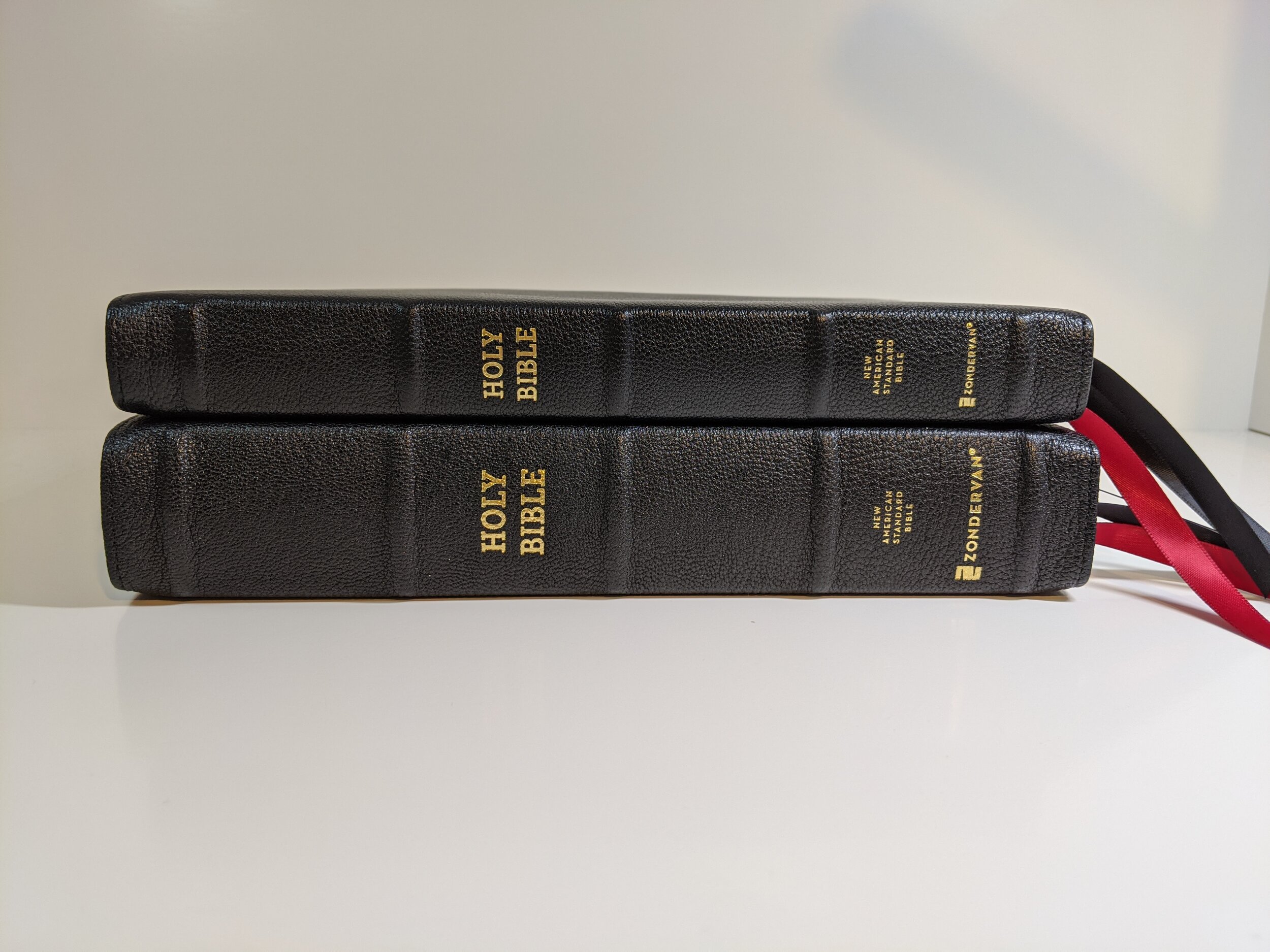
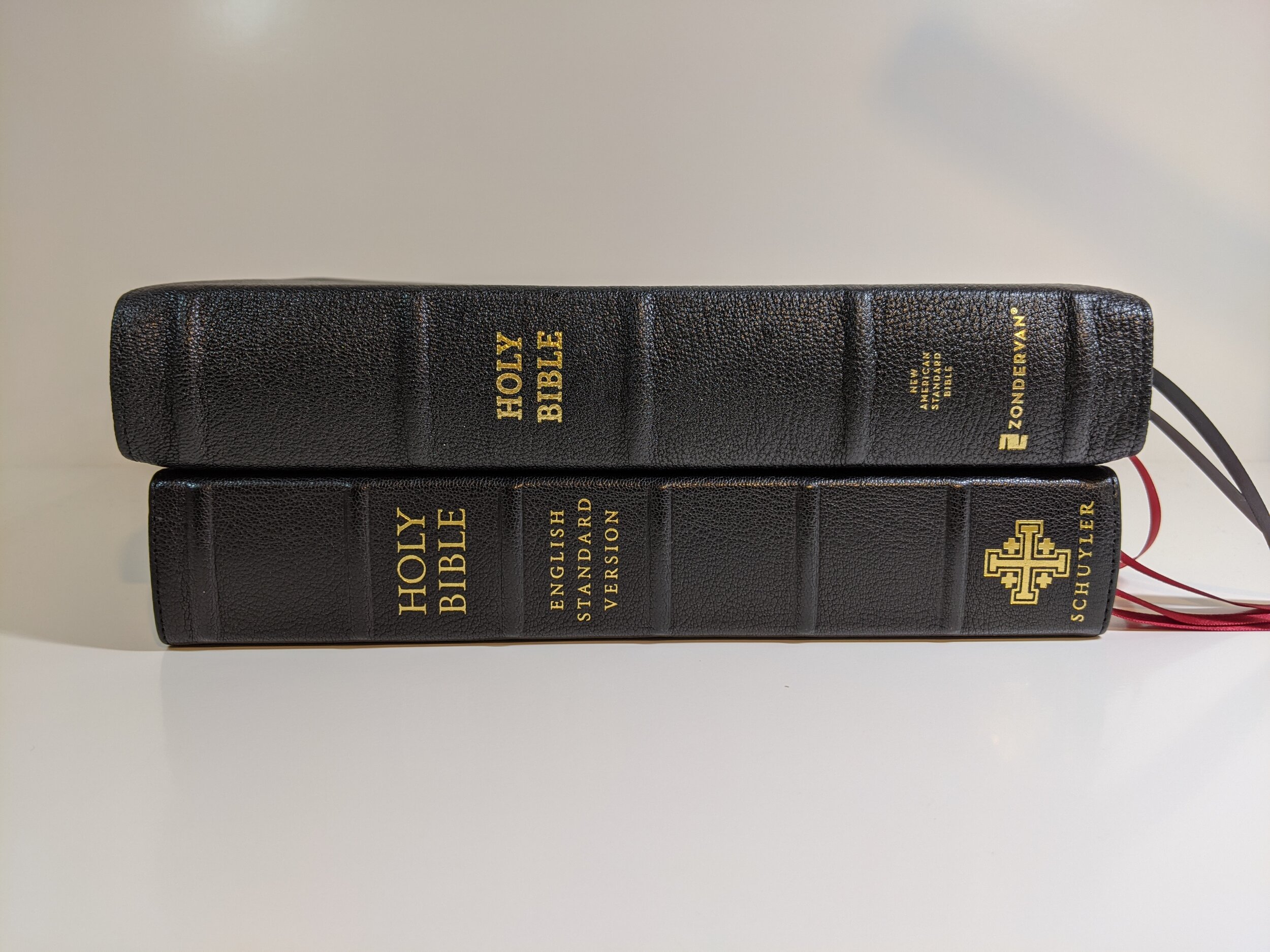
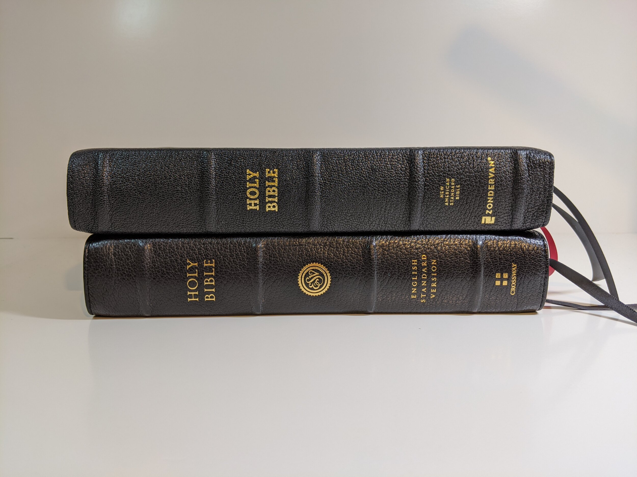
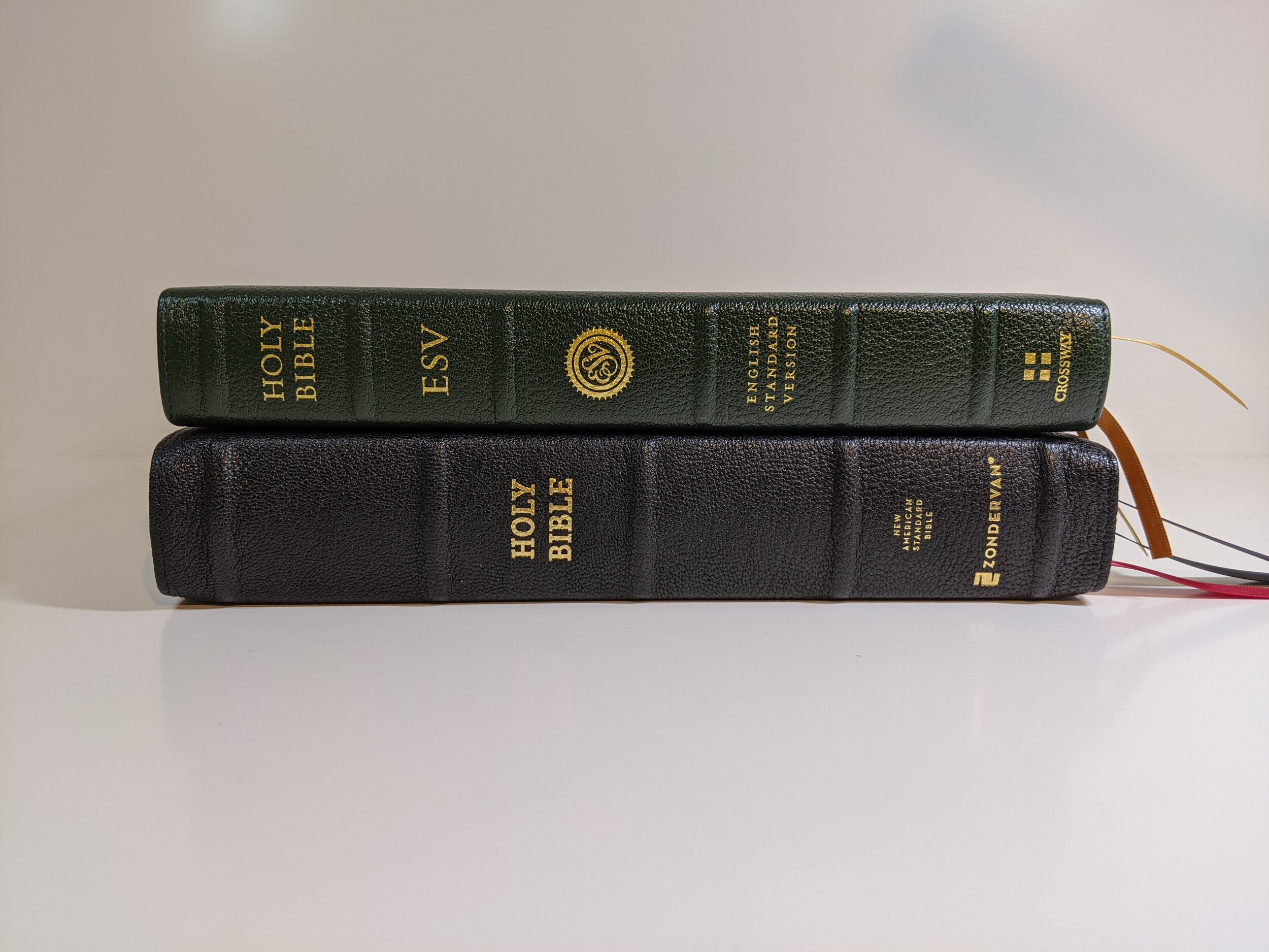
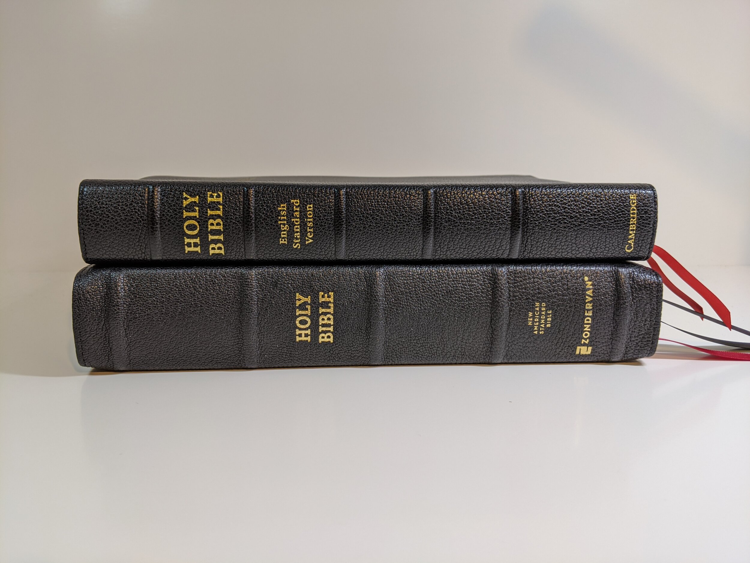
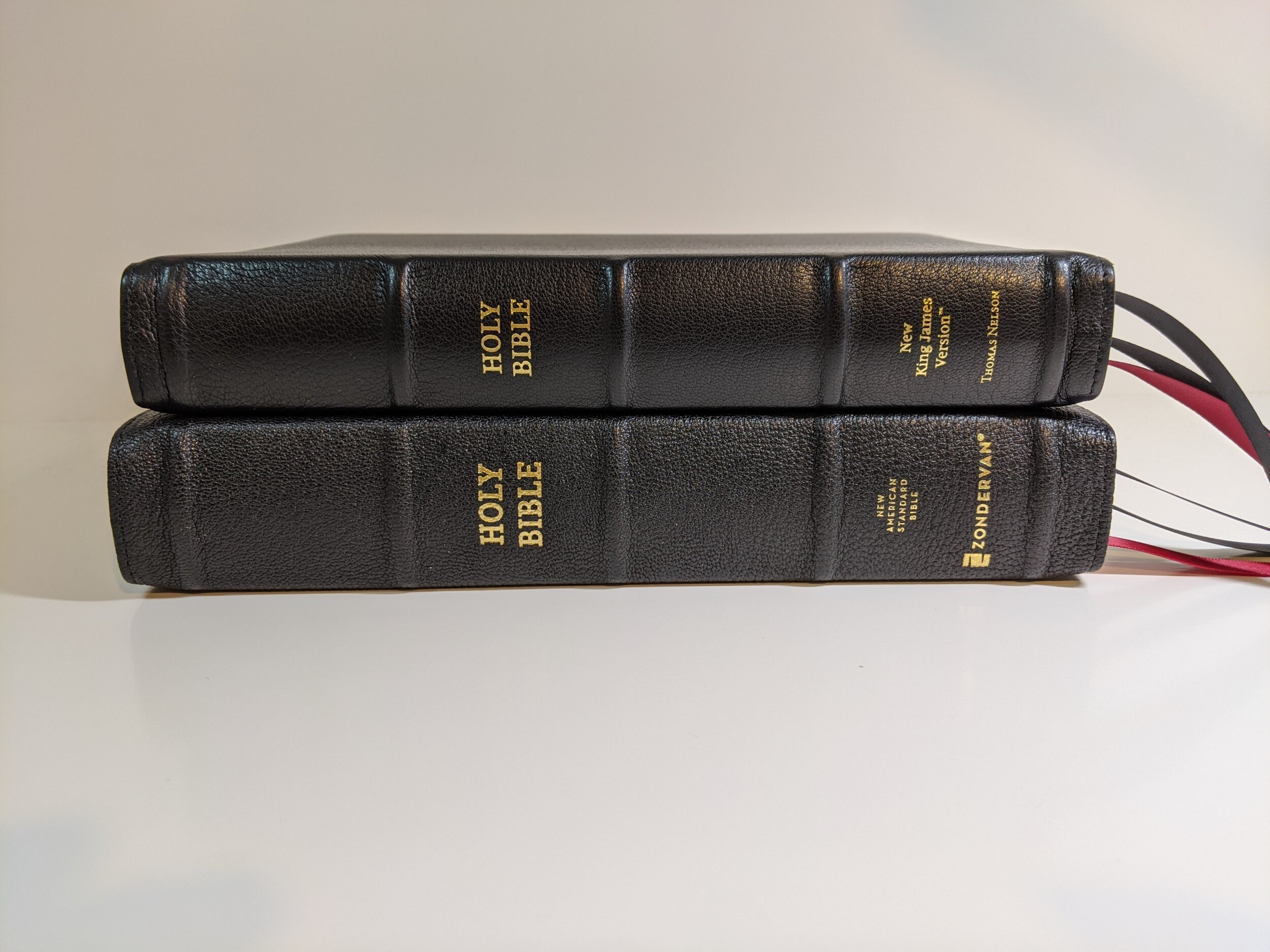
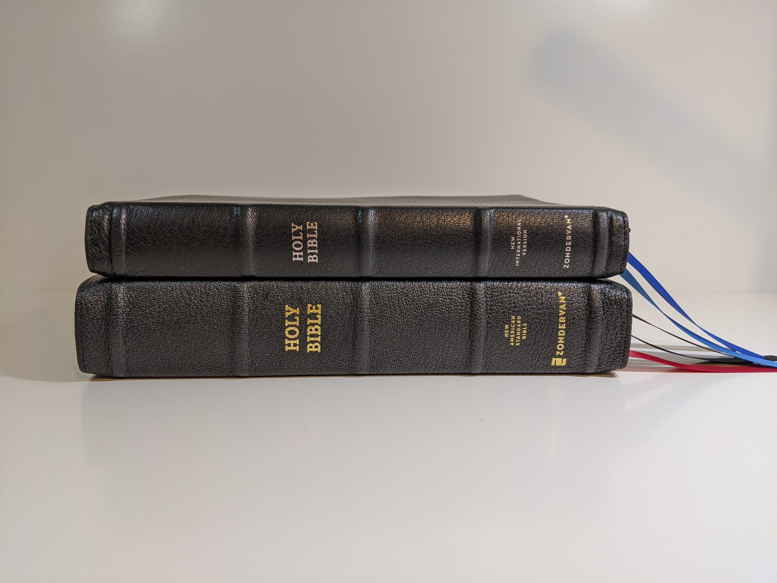
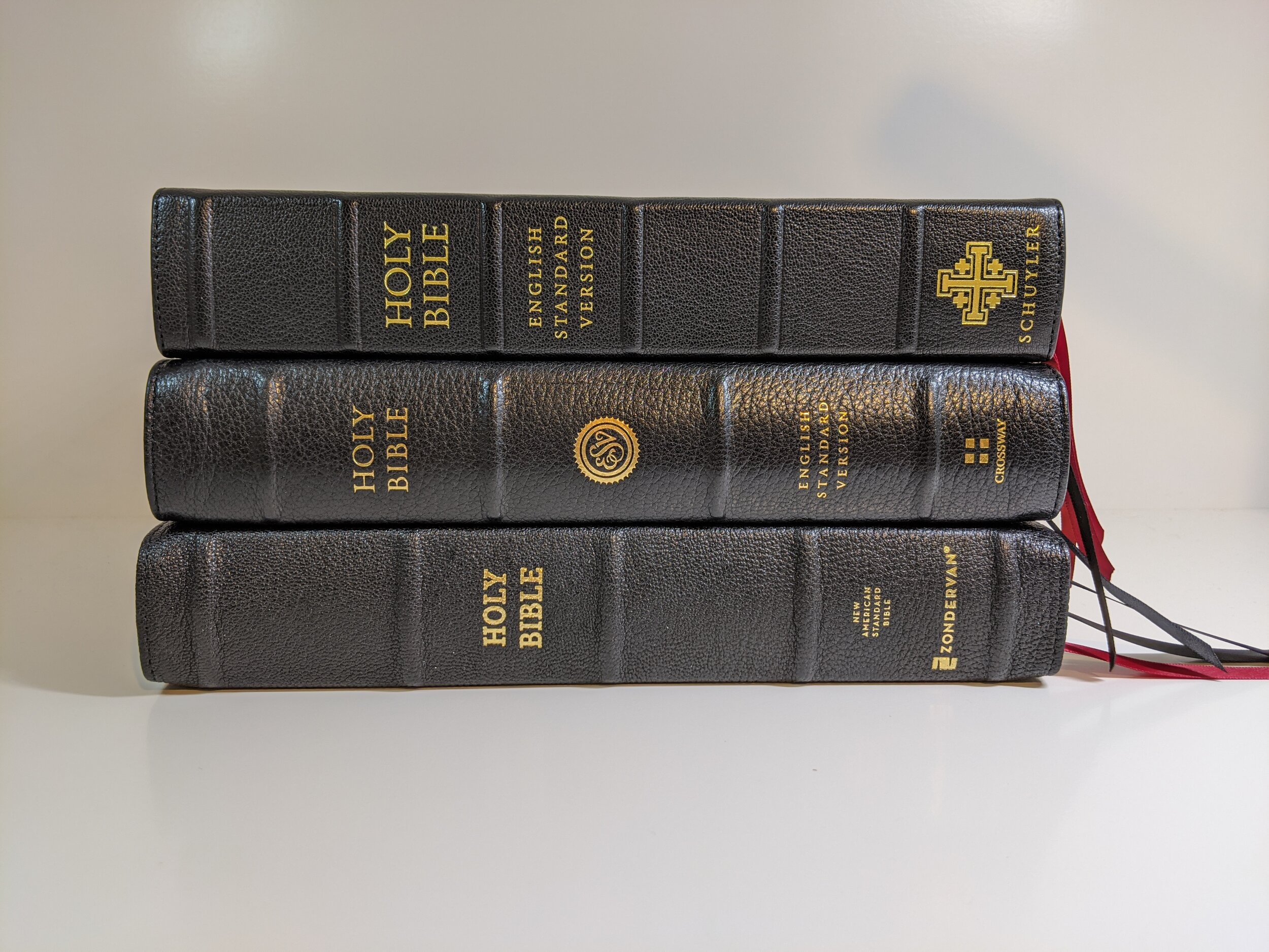
Let me start by saying this is a thick Bible. It has some heft. It is about the same size as a Schuyler Quentel or Crossway’s Preaching Bible. It will build muscle for you if you’re a repetitive Bible lifter. That’s the first thing you’ll notice when you take it out of the box.
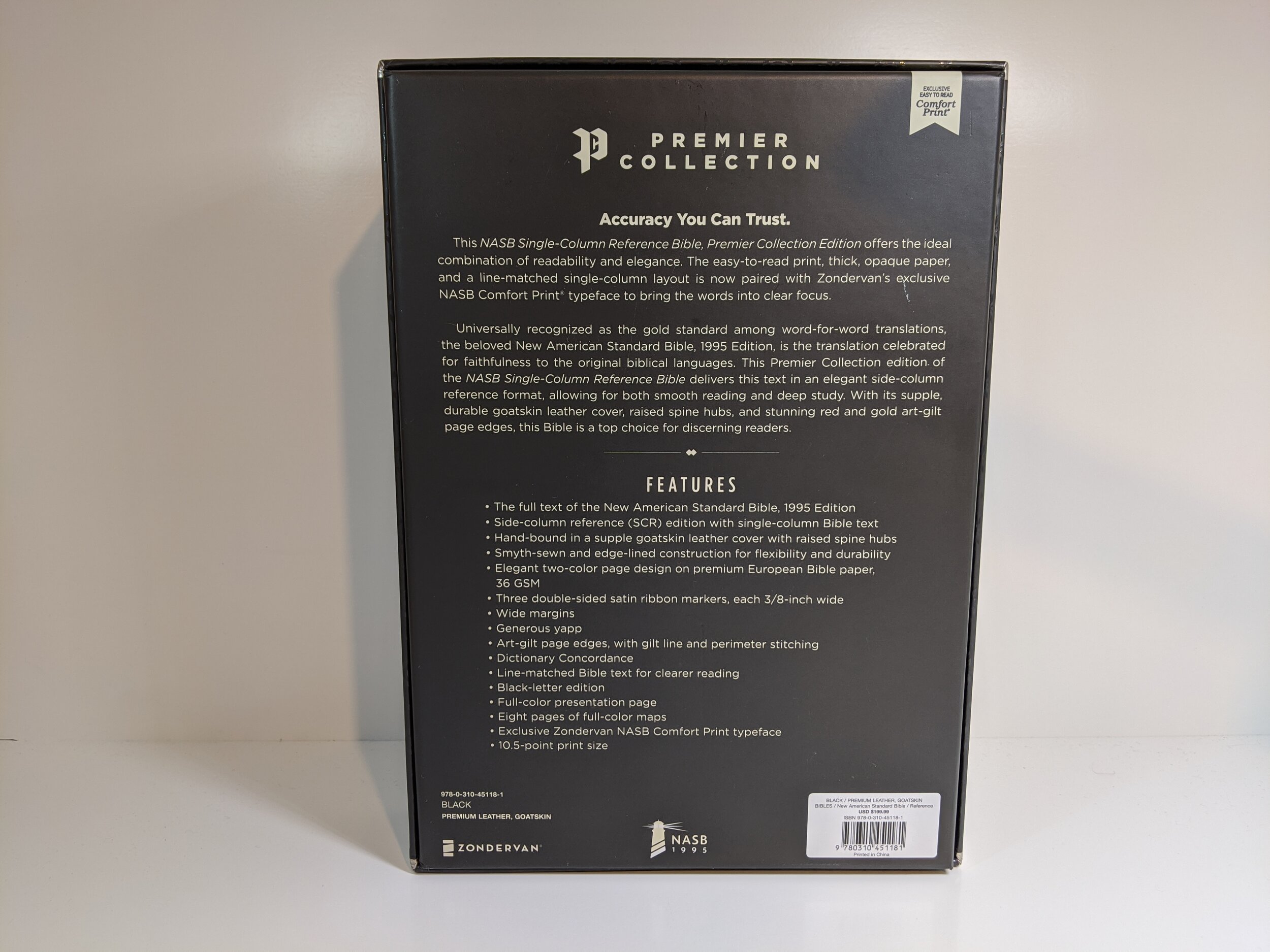
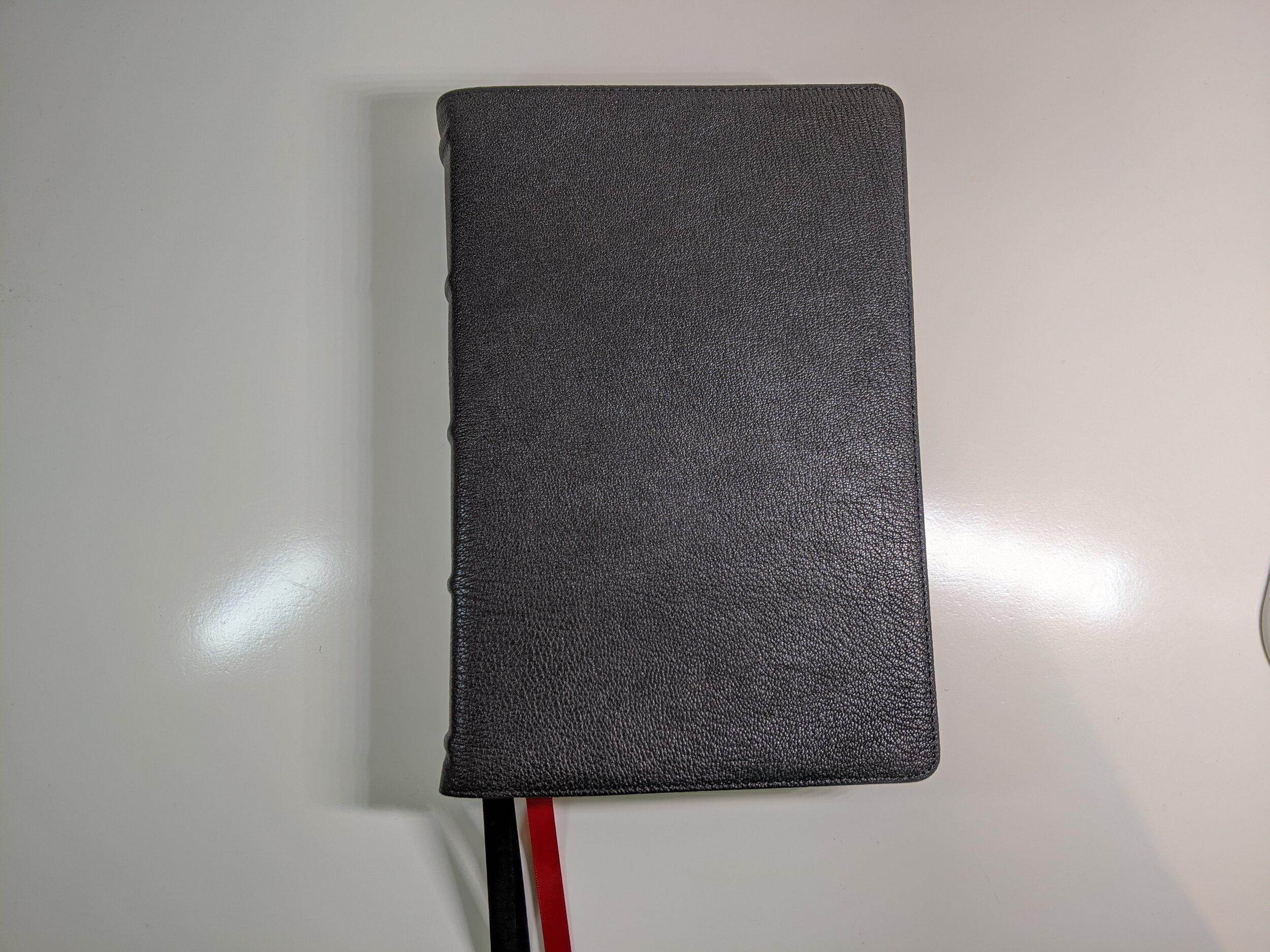
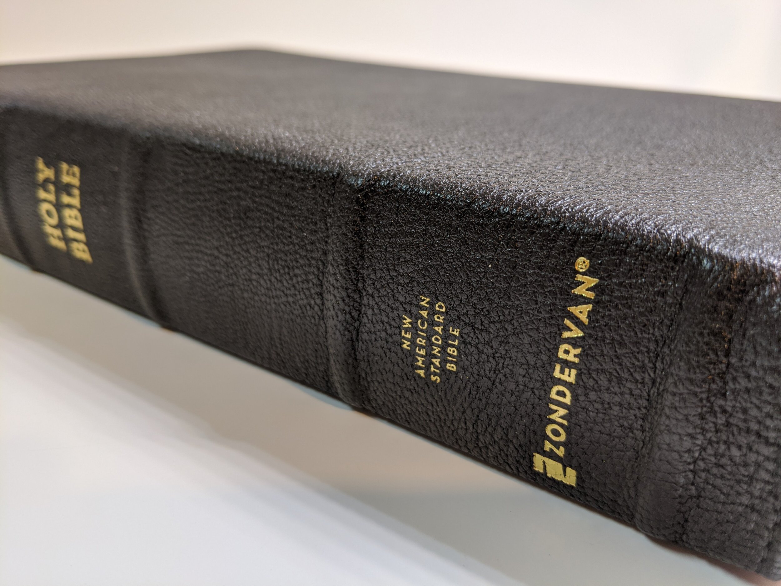
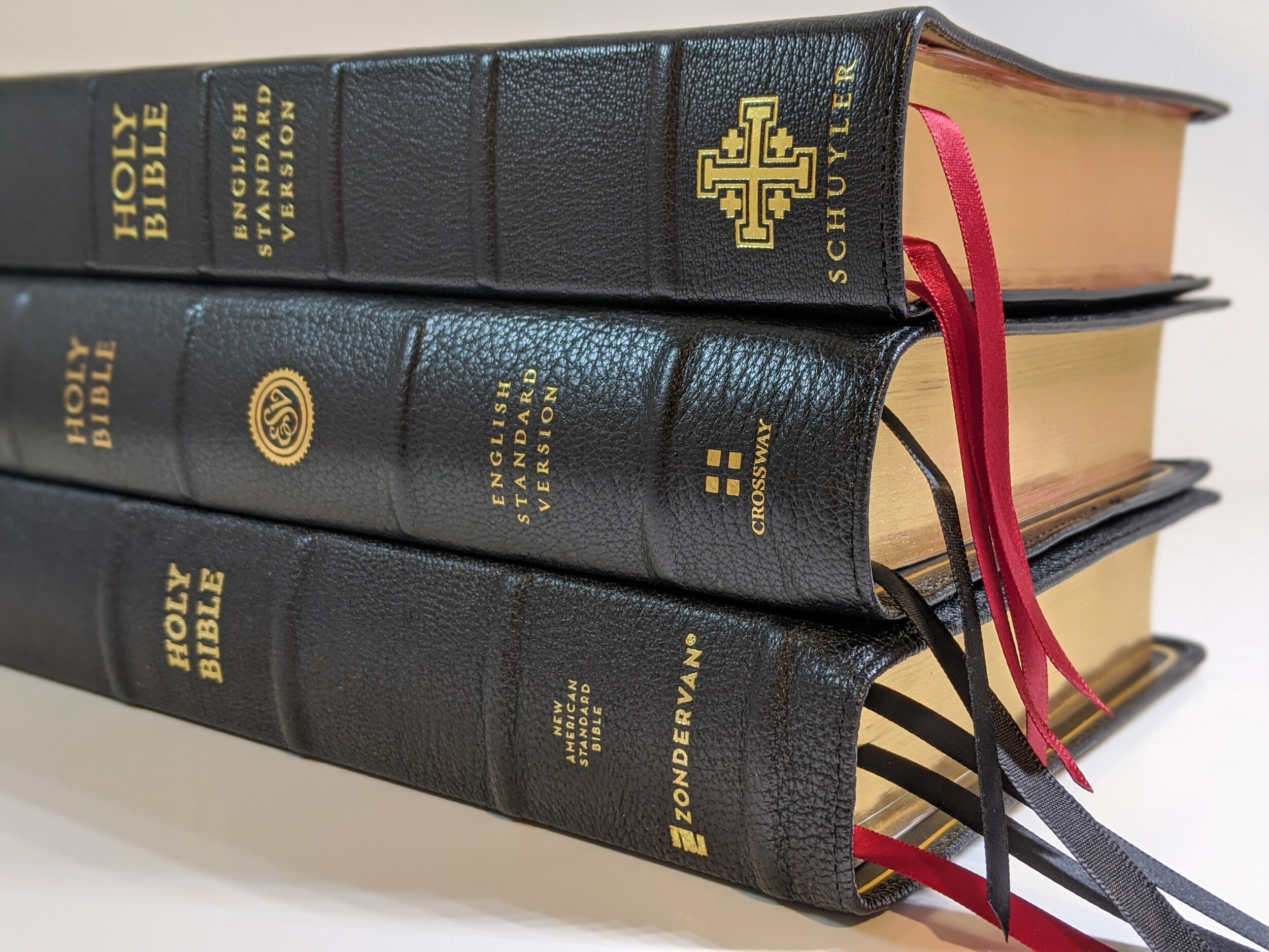
The second thing you’ll notice is the incredibly nice black goatskin. This goatskin has a good grain to it and it seems to be of a higher quality than the most recent NIV Premier Bible I reviewed from Zondervan. It really looks and feels like a step up in quality to me. The Bible is Smyth-sewn and perimeter stitched. The spine has five raised ribs and has the words, “HOLY BIBLE”, “New American Standard Bible”, and “Zondervan” in gold. The page edges have a red under gold art gilt and the Bible includes three double-sided satin ribbon bookmarks. Two are black and one is red.
I personally think Zondervan and Thomas Nelson have the nicest bookmarks of just about any Bible out there right now. They are 3/8-inch wide, which may be the perfect width and they are longer than most ribbon bookmarks included in Bibles these days, which I prefer. My only complaint here is that I would have loved for them to be three different colors instead of two being the same and one being different.
The Bible also has what Zondervan refers to as “generous yapp”. I’m not sure I would call the yapp on this Bible generous, but there is some. There may be just enough to train, but I’m not totally sure. I’d love to see them do a full yapp Bible though. I’m not sure I’ve seen that from a larger company.
Inside
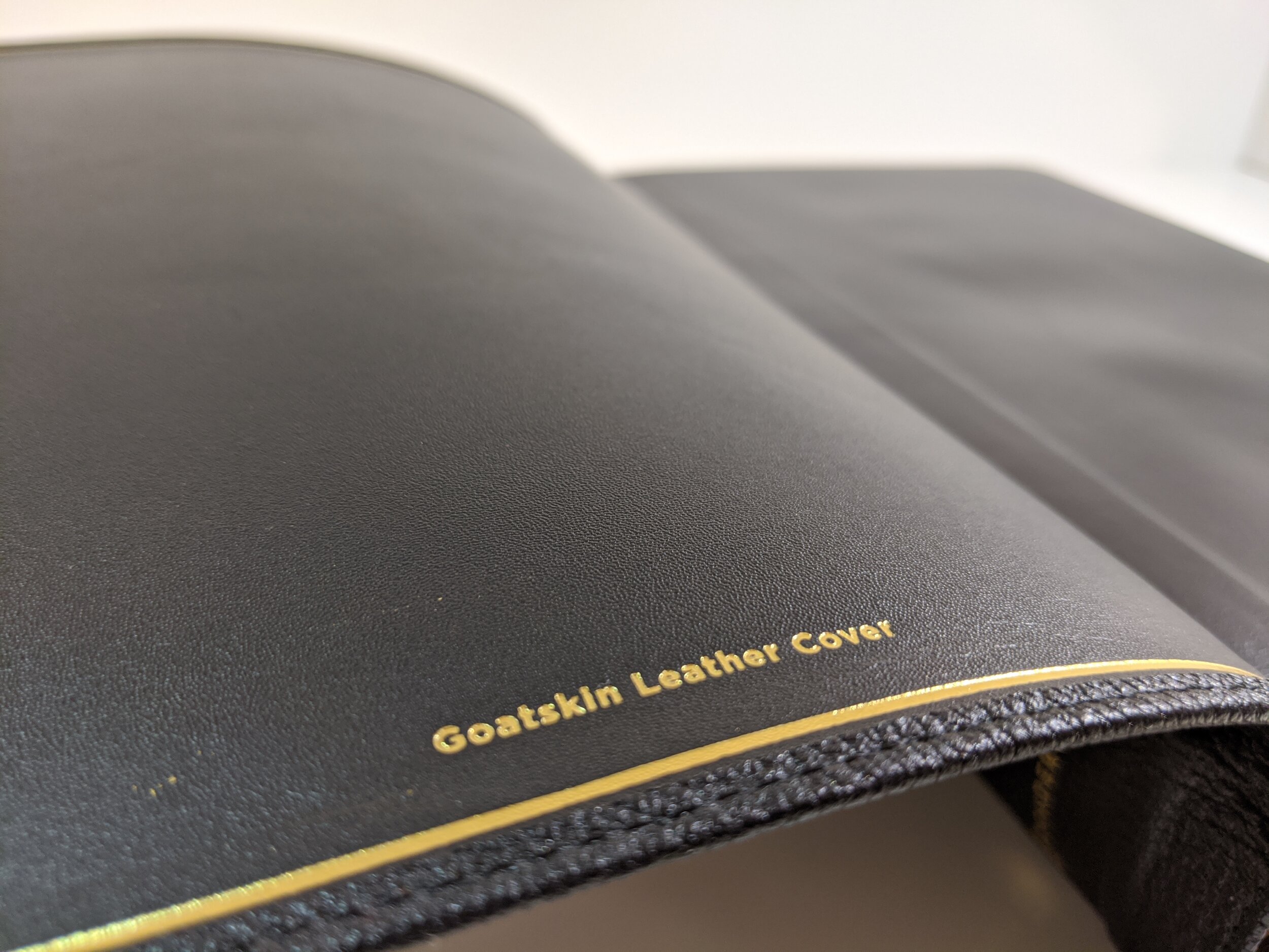
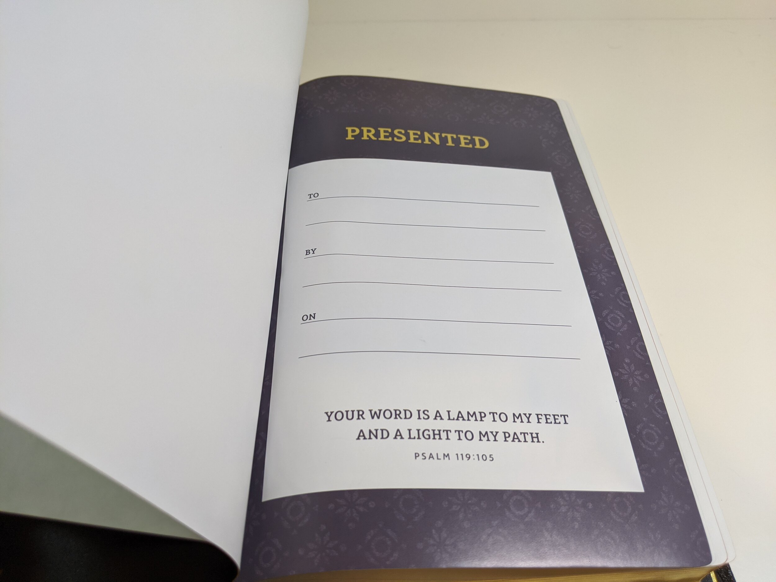
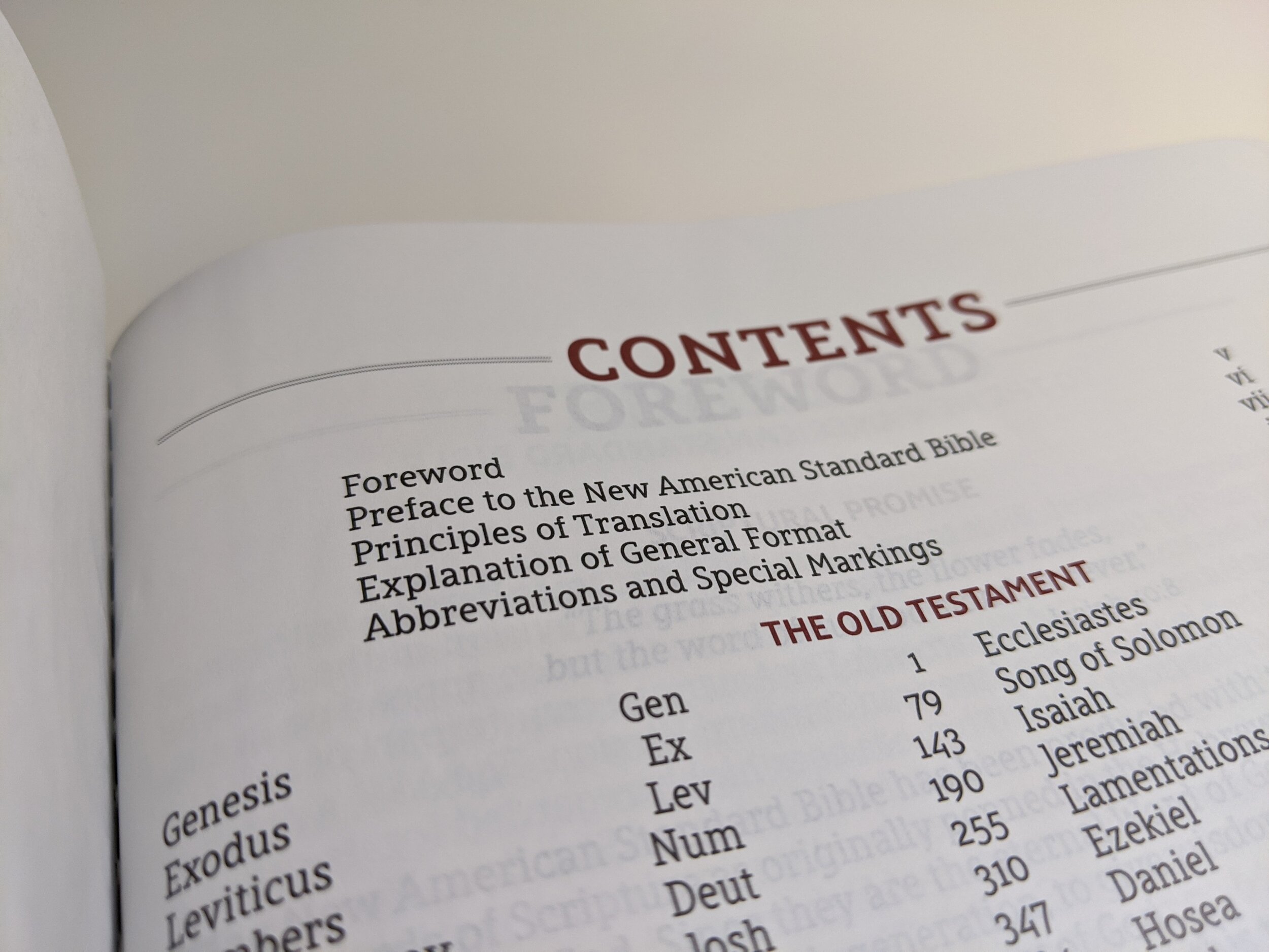
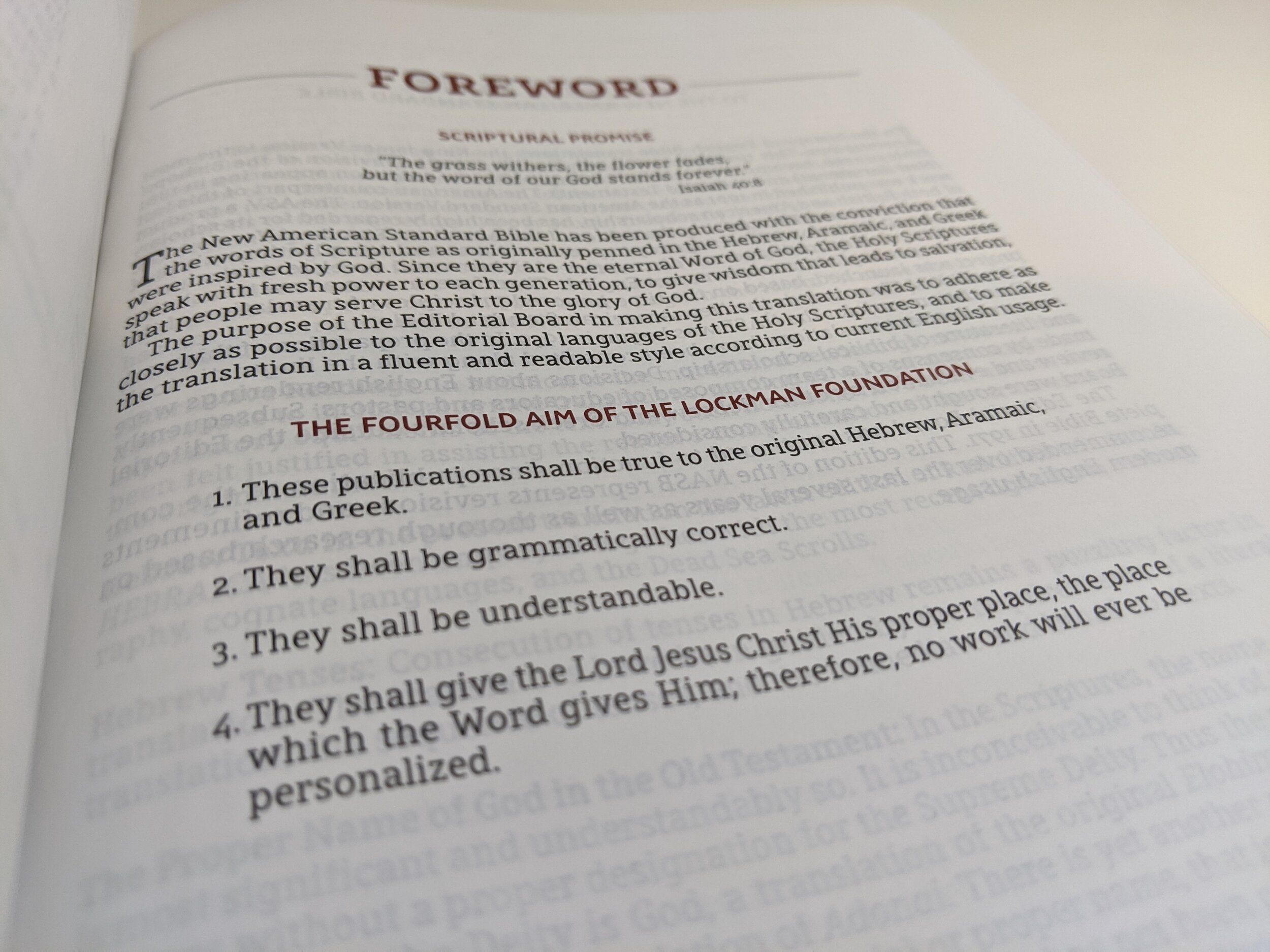
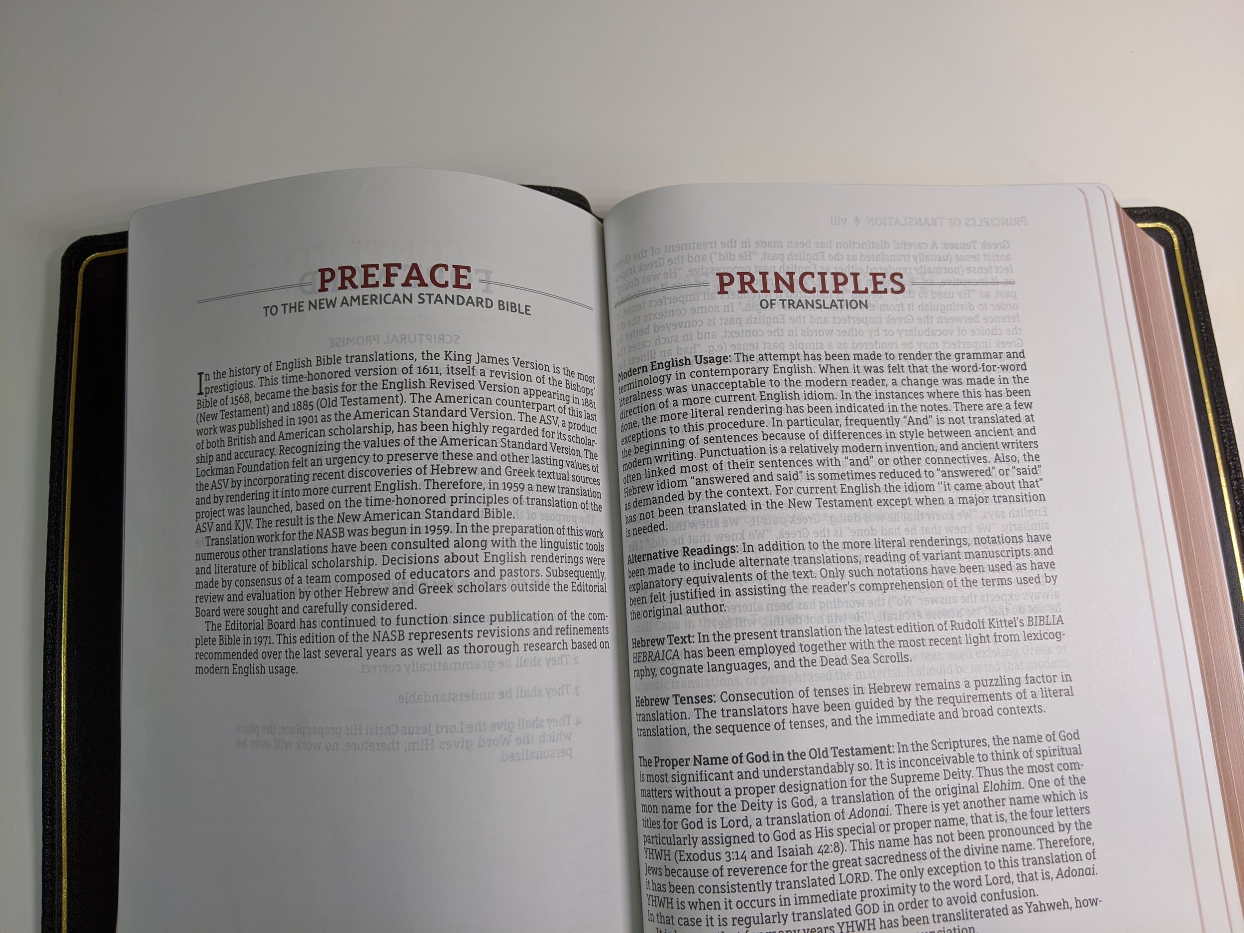
When you open the Bible, you’ll notice that it is edge-lined on the inside with a gold gilt line around the perimeter. The inside liner feels like calfskin, but I haven’t spoken with anyone to confirm this. As you begin to turn the pages, you’ll find a nice presentation page in full color. In the front you’ll find a foreword, preface, principles of translation, explanation of the general format of the Bible, and abbreviations and special markings.
I love the layout of this Bible. I love it paired alongside Zondervan’s new NASB Preacher’s Bible that I’ve found myself asking multiple times if I should switch to the NASB. That says a lot for the quality of these two new Bibles from Zondervan.
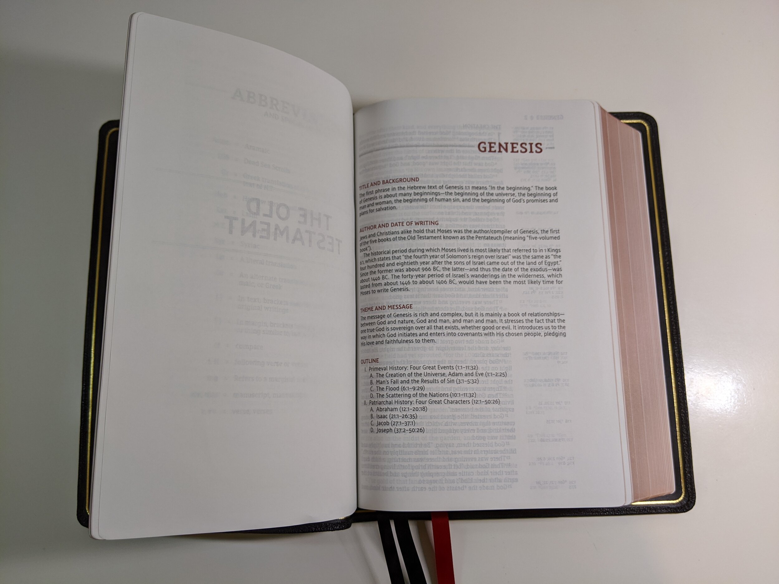
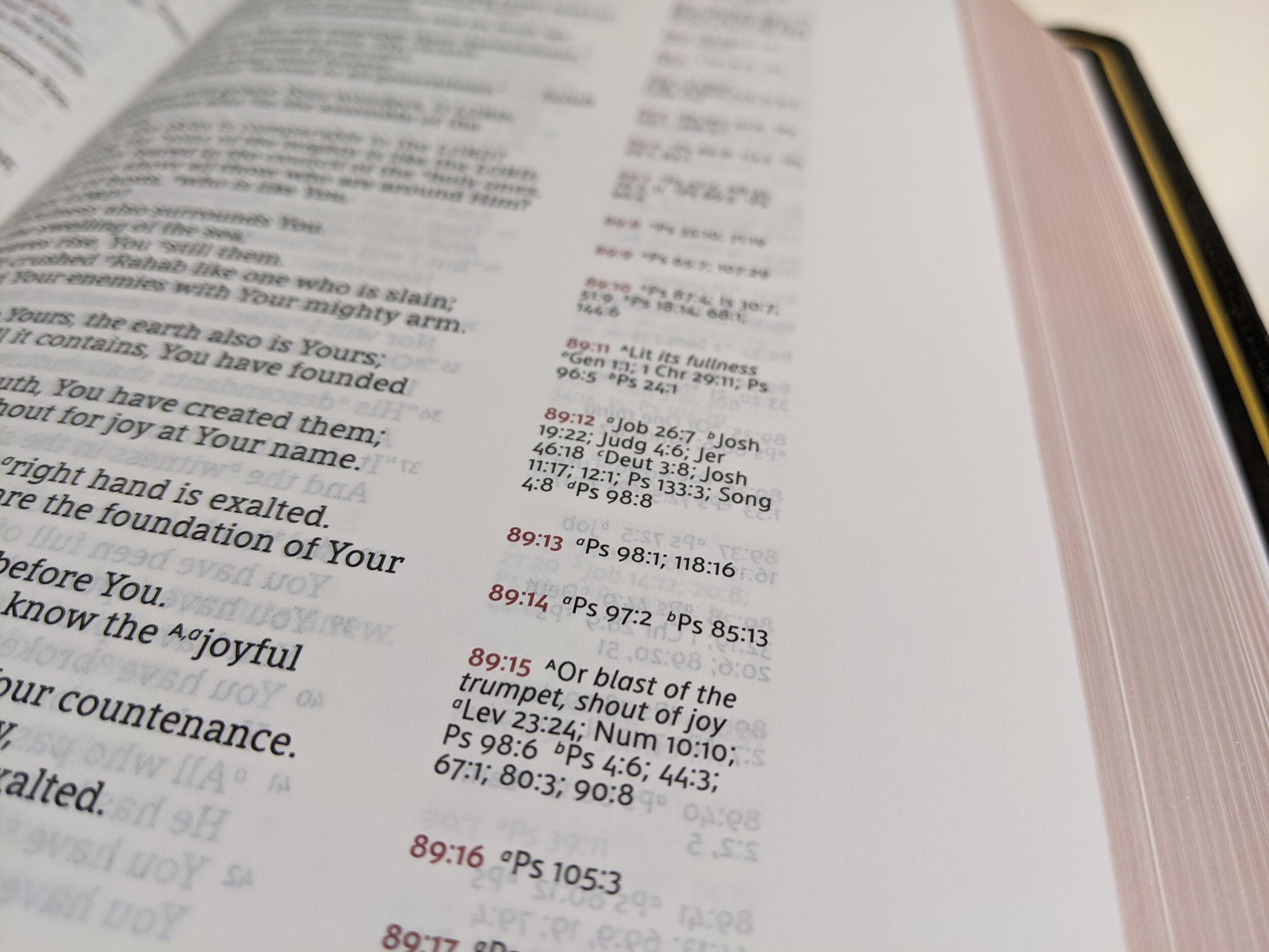
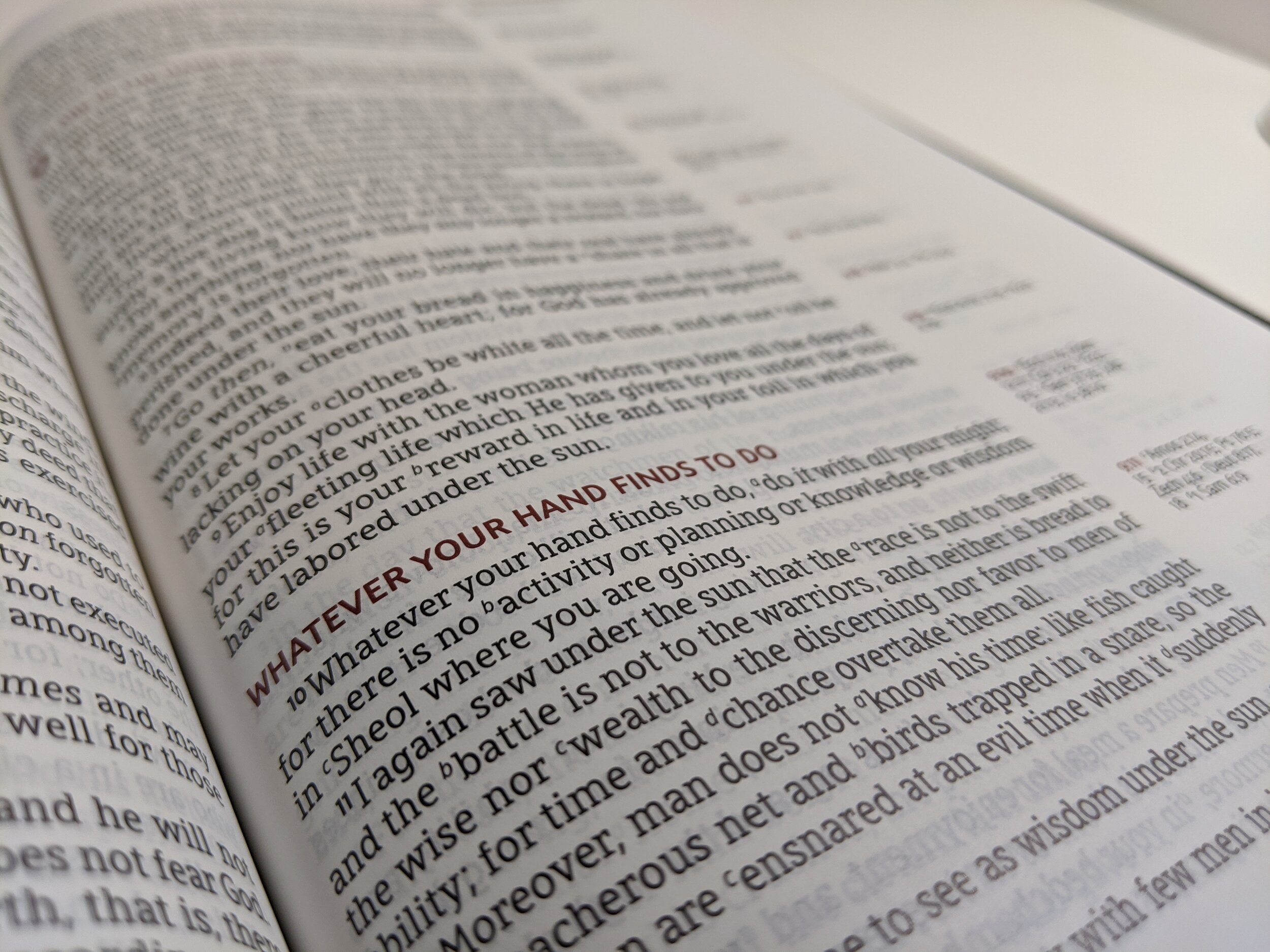
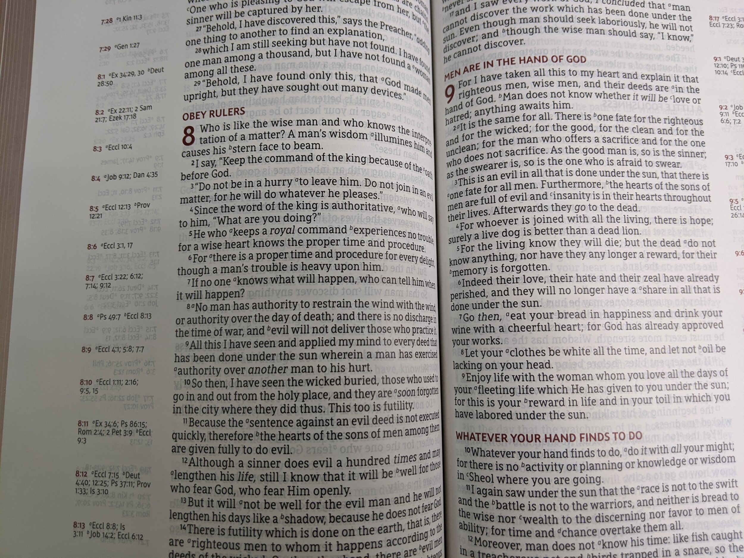
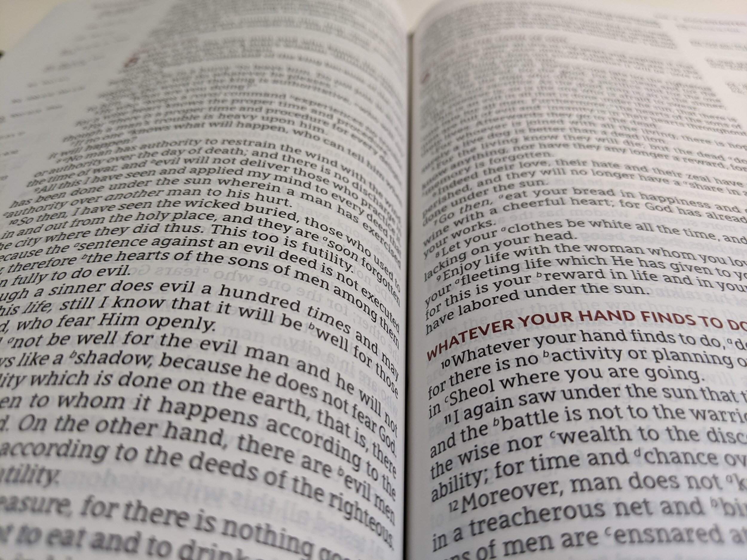
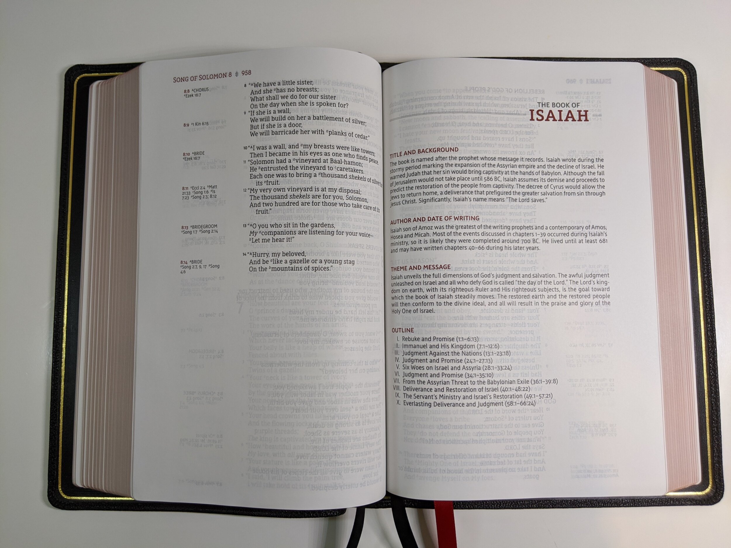
This is a reference Bible so each Book begins with an introduction that includes the title and background, author and date of writing, the theme and message, and an outline. The page layout is single-column, verse-by-verse, with references in the outer margin as well as space for notes on the far outside margin.
The paper is a 36 gsm premium European Bible paper. It is white and really helps the text to pop. The font size is a generous 10.5 point. The font is called Zondervan NASB Typeface designed by 2K/DENMARK. I really like the font that has been designed for these Bibles. According to the page just before the maps in this Bible, “The typeface design takes inspiration from clear, distinct Aramaic limestone inscriptions of the Second Temple period. The design pays homage to the NASB’s rich heritage of word-for-word translation and its faithfulness to the original biblical languages.”
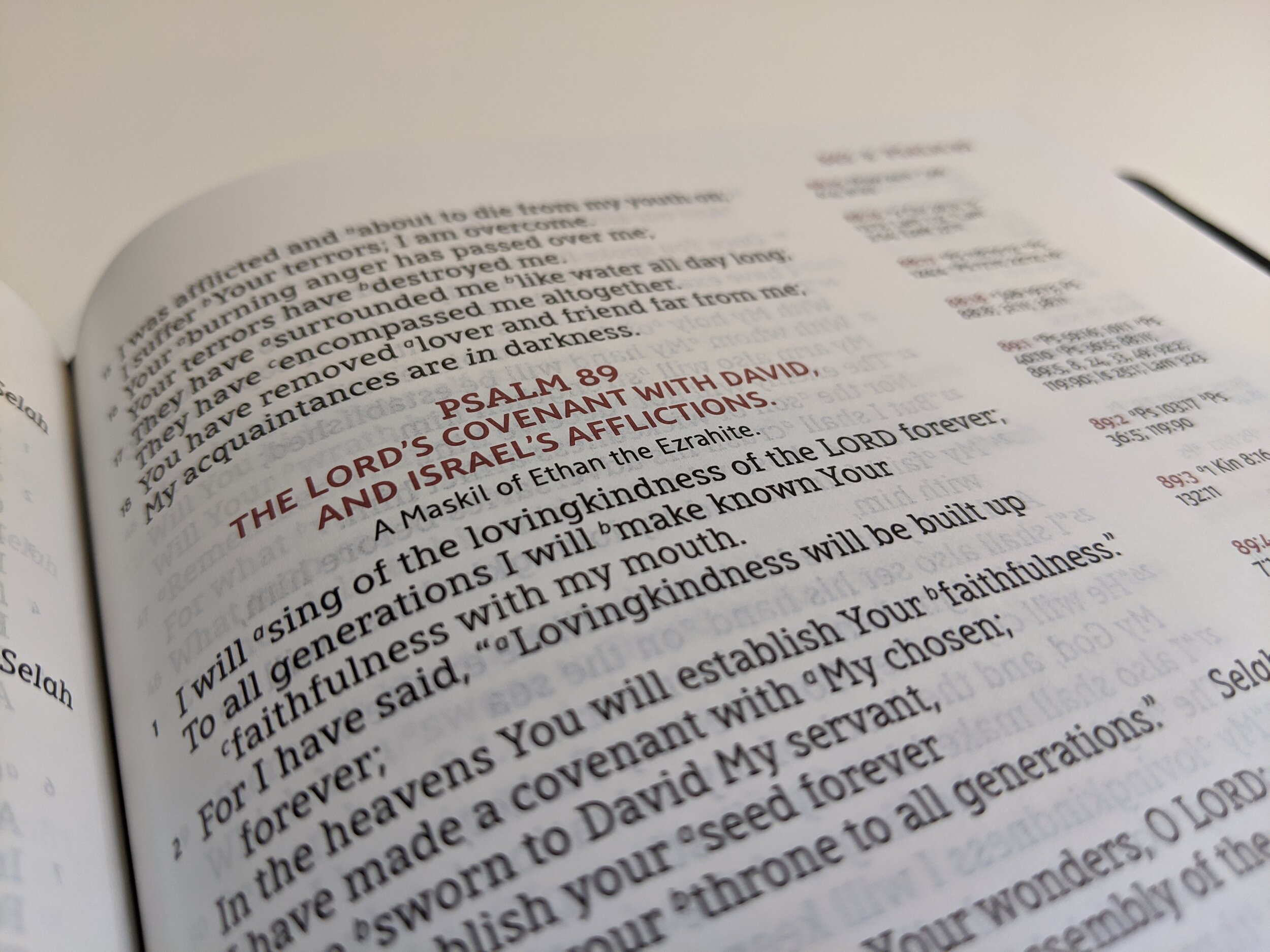
I find it to be a really attractive font design. The text is line-matched to help minimize ghosting, and while there is some, it isn’t terribly bad. Zondervan uses two colors of text on the pages. The text is black and the page headings, chapter numbers, subheadings, as well as verse references are in a dark red/maroon. Zondervan has created a really attractive page layout. I really wish the verse numbers were bigger and bolder in this layout to make locating them a bit easier. I think easy location is one of the attractions of a verse-by-verse Bible.
One of my biggest critiques of this Bible is that text does dip into the gutter making you have to move your head a little to read it. It doesn’t make the text unreadable, but it is an inconvenience. It may get better with some break-in. I think it would have been better for Zondervan to put the references close to the gutter and move the text more toward the page edges. Being a Bible, we obviously want to focus on the Scripture.
I’ve always loved the way the NASB handles some of the text formatting. The translation capitalizes personal pronouns when pertaining to deity and I’ve always liked this. It uses italics to indicate words which aren’t found in the original languages, but are implied by them. It also uses small caps in the New Testament to indicate Old Testament quotations or obvious references to the Old Testament. I appreciate these features as they’re useful when studying and reading. There are a few more features built in that are explained at the beginning of the Bible in the section called Explanation of General Format.
Extras
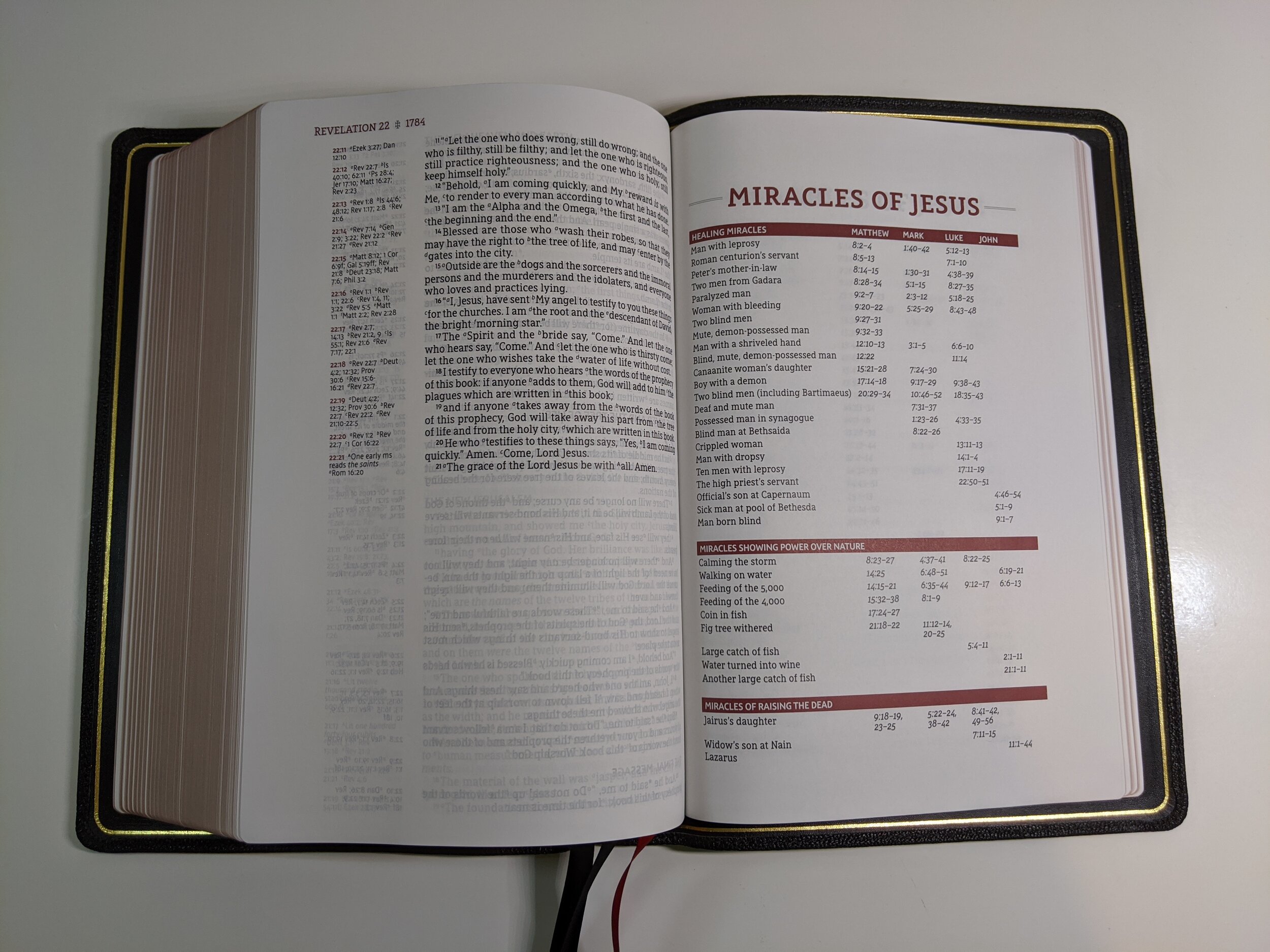
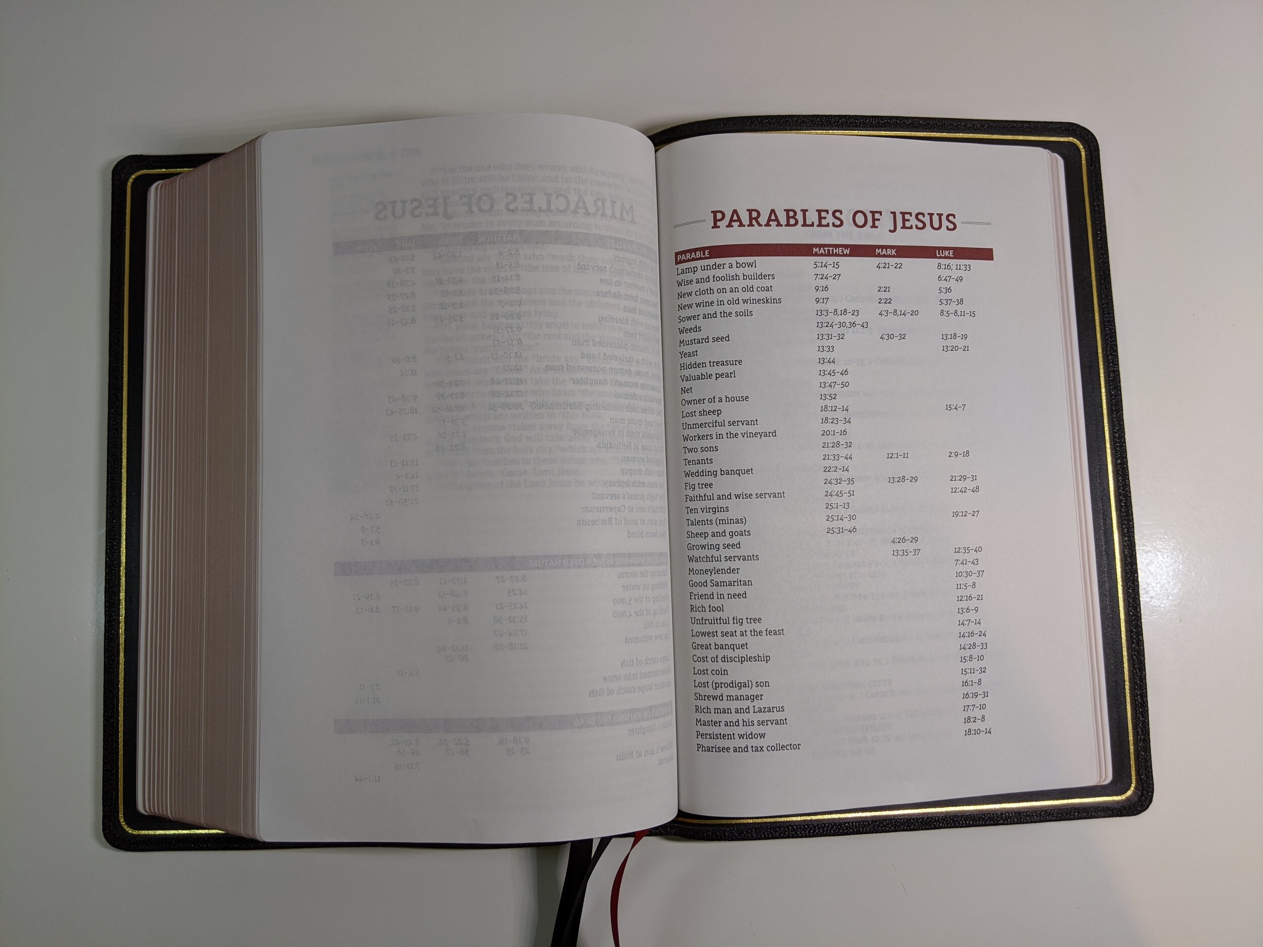
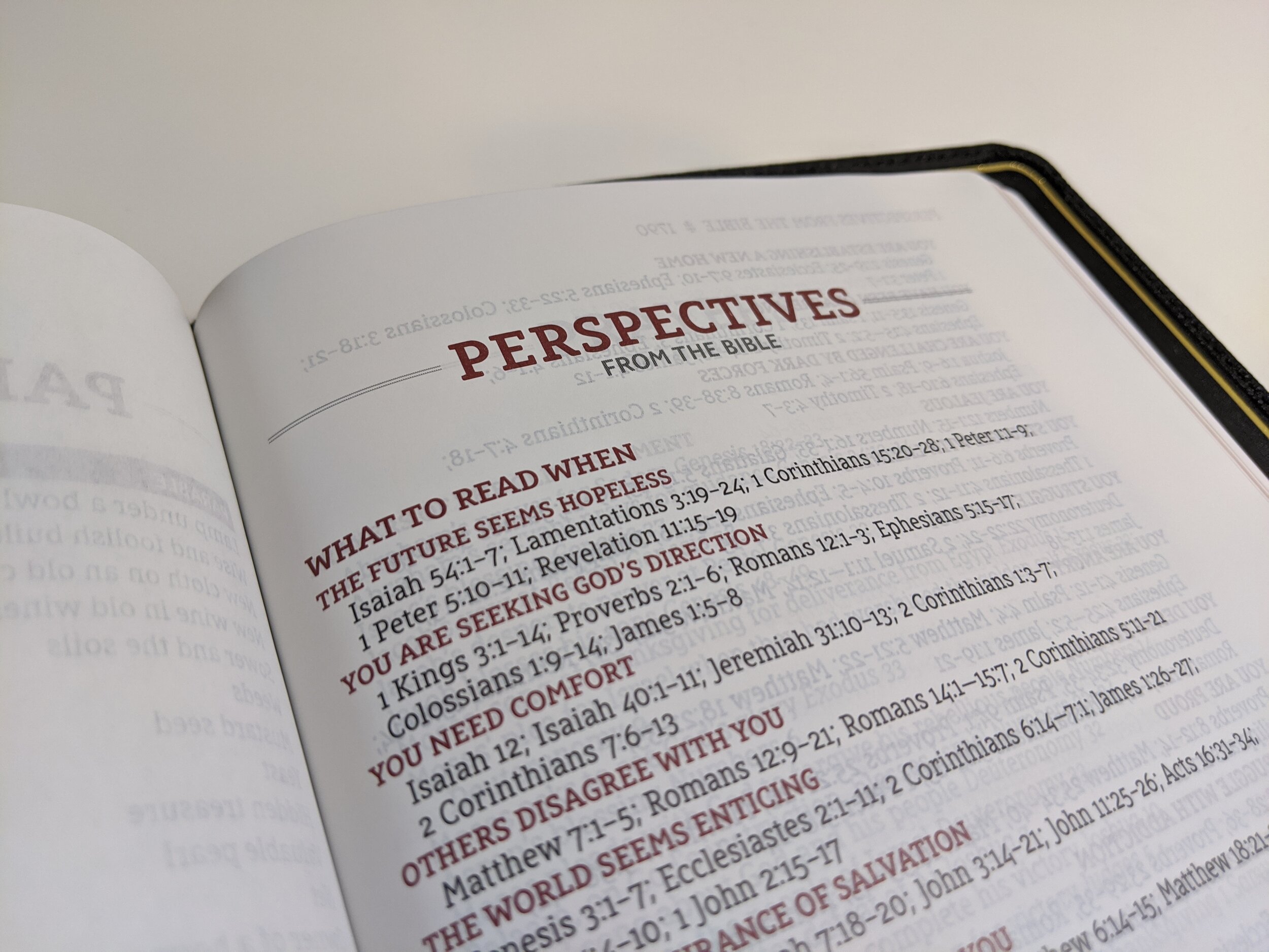
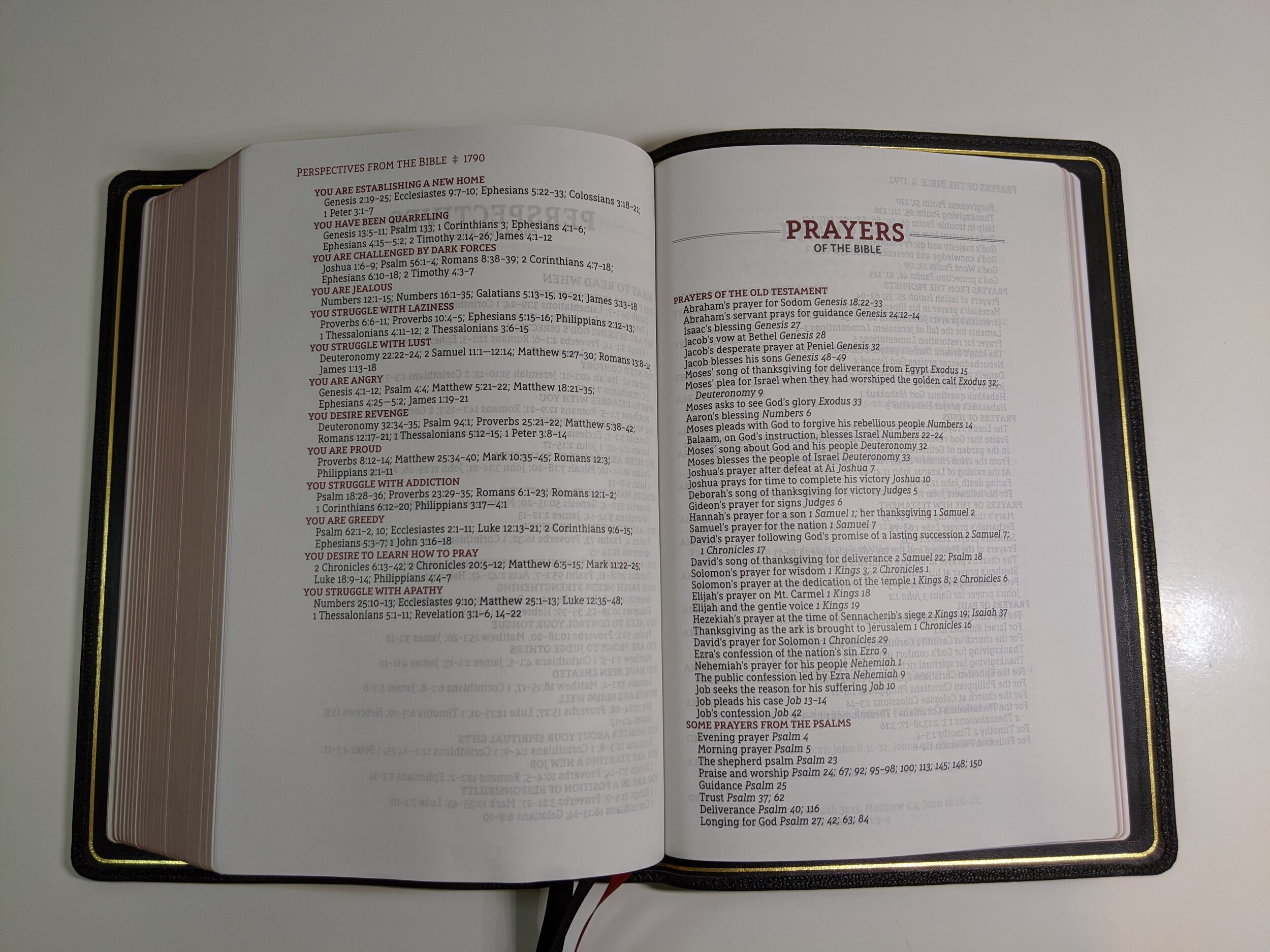
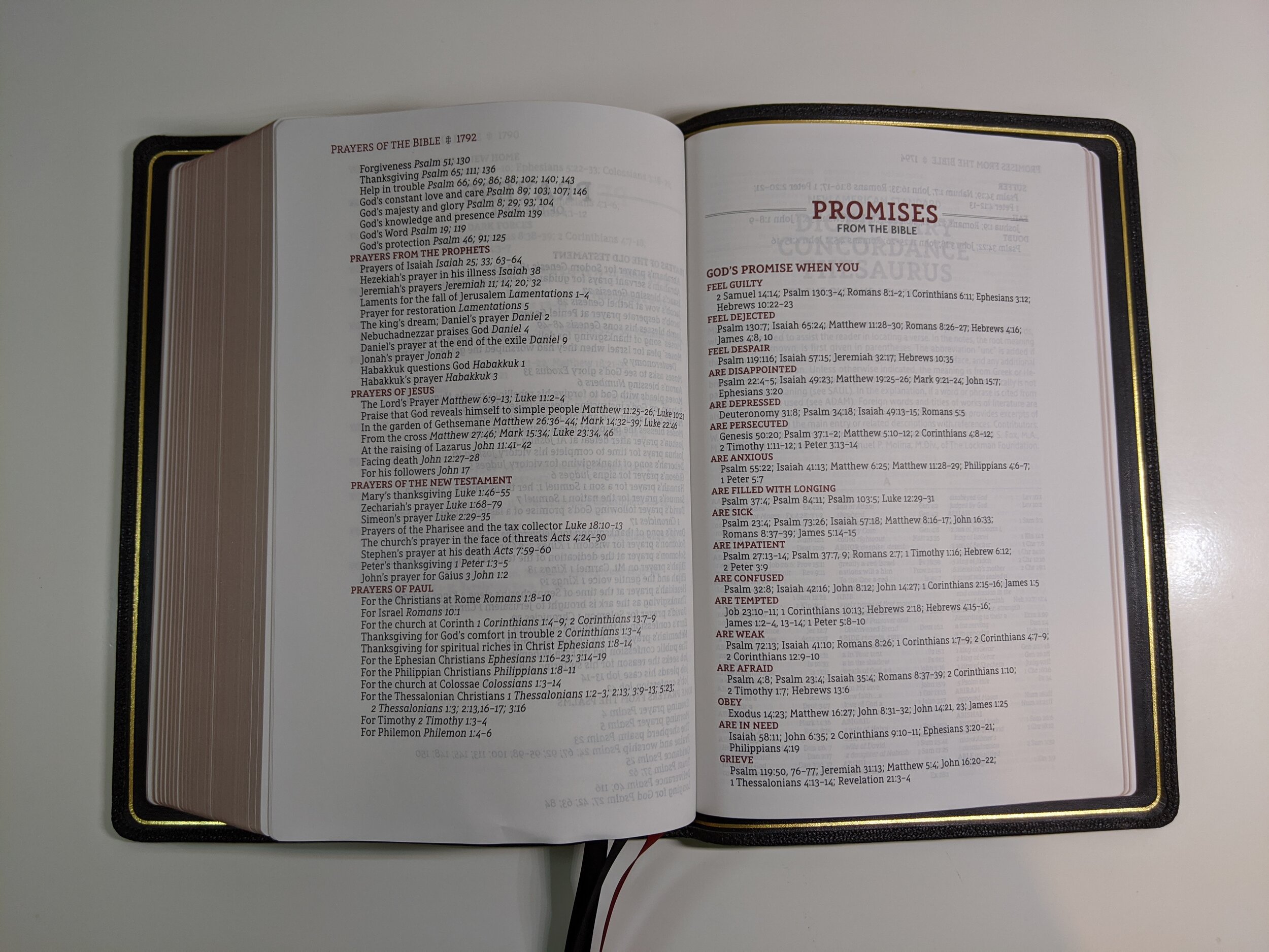
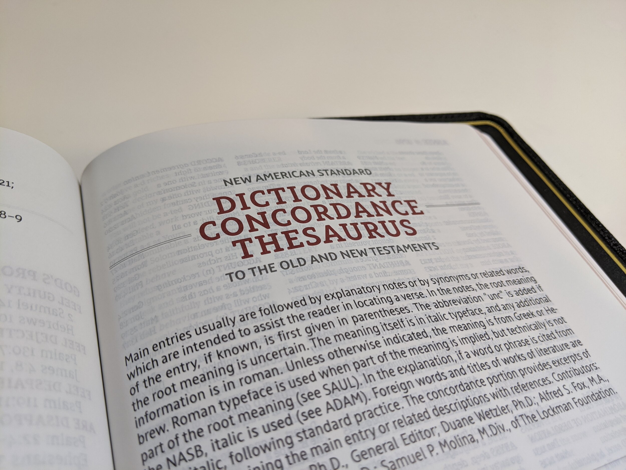
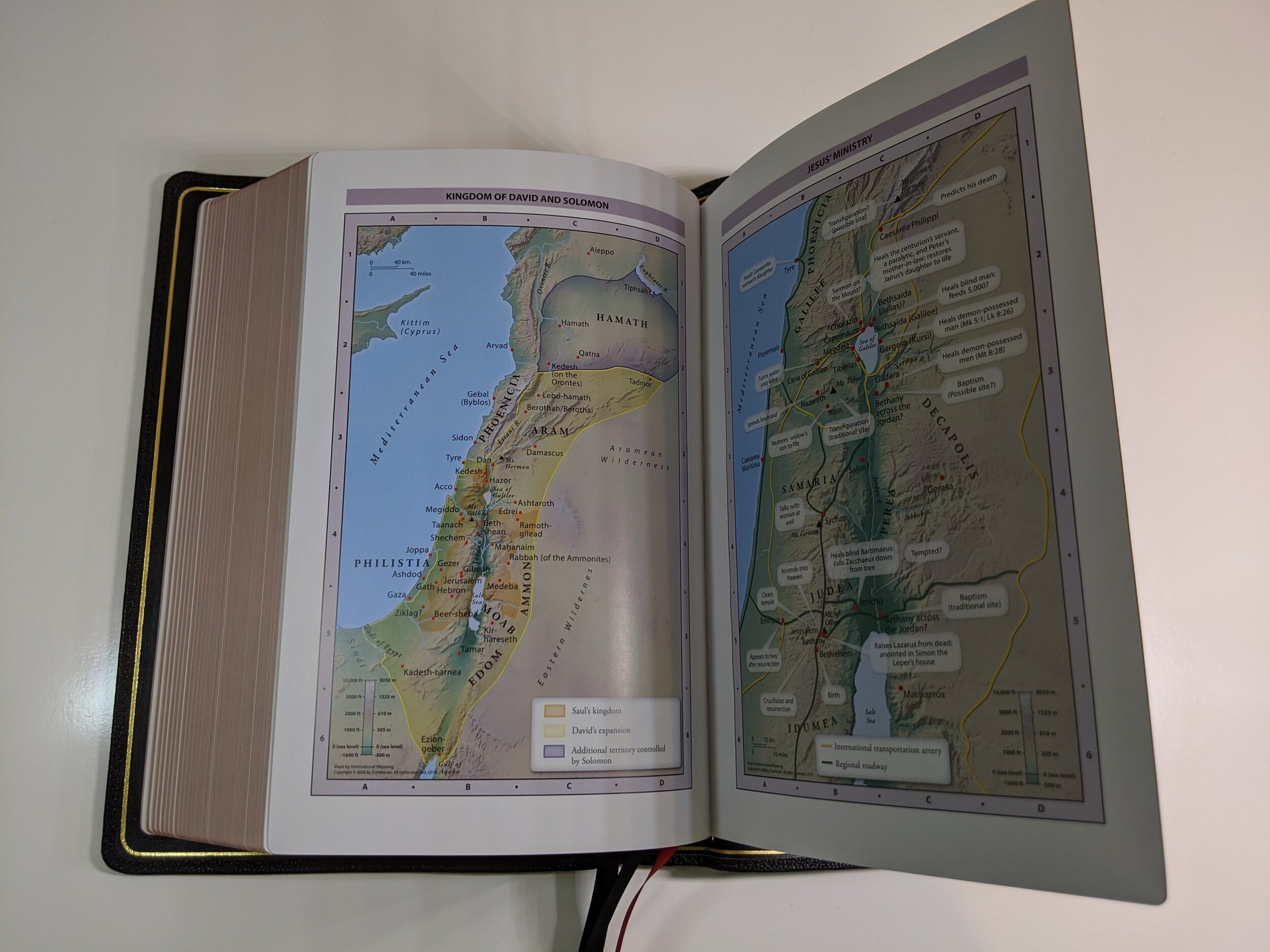
This Bible also has some extra features that I really like that are found in the back. There is a list of the miracles of Jesus with Scripture references in each Gospel laid out beside them. There’s a list of the parables of Jesus. They also included what they call “Perspectives from the Bible”, which gives youa topical list of passages to read when you are facing certain things in life. I love the list of prayers of the Bible. I think praying Scripture is powerful and this is a really great list to have. Finally, there is a list of promises from the Bible, which gives you a list of things God promises you when you are facing various trials. After these lists, we find a generous concordance and eight pages of full-color maps.
Conclusion
As I said at the beginning, this is an excellent Bible. If you’re a single column fan then I think you’ll love it. If you’re a NASB fan then I think you’ll love it. It really is hard to believe that Zondervan is putting out Bibles of this calibre. I’ve been using it in my personal quiet time and I’ve not been disappointed. Even if you’re not primarily a NASB user, I think you’ll enjoy having this Bible in your collection.
You can pick up the NASB Single Column Reference Bible from the Premier Collection on Amazon. (affiliate)
I received a complimentary copy of this Bible from Zondervan in exchange for a fair and honest review.

