

The Zondervan NASB 95 Large Print Thinline in Blue Buffalo

Zondervan has been releasing some awesome Bibles lately. I was excited to find out they were releasing a Bible in blue buffalo leather and knew I had to try and review it. What I didn't expect, however, was the overwhelming response I received when I posted a snapshot of it in a Bible Facebook group in which I participate. This Bible has a lot of interesting features and I"m excited to get share them with you.
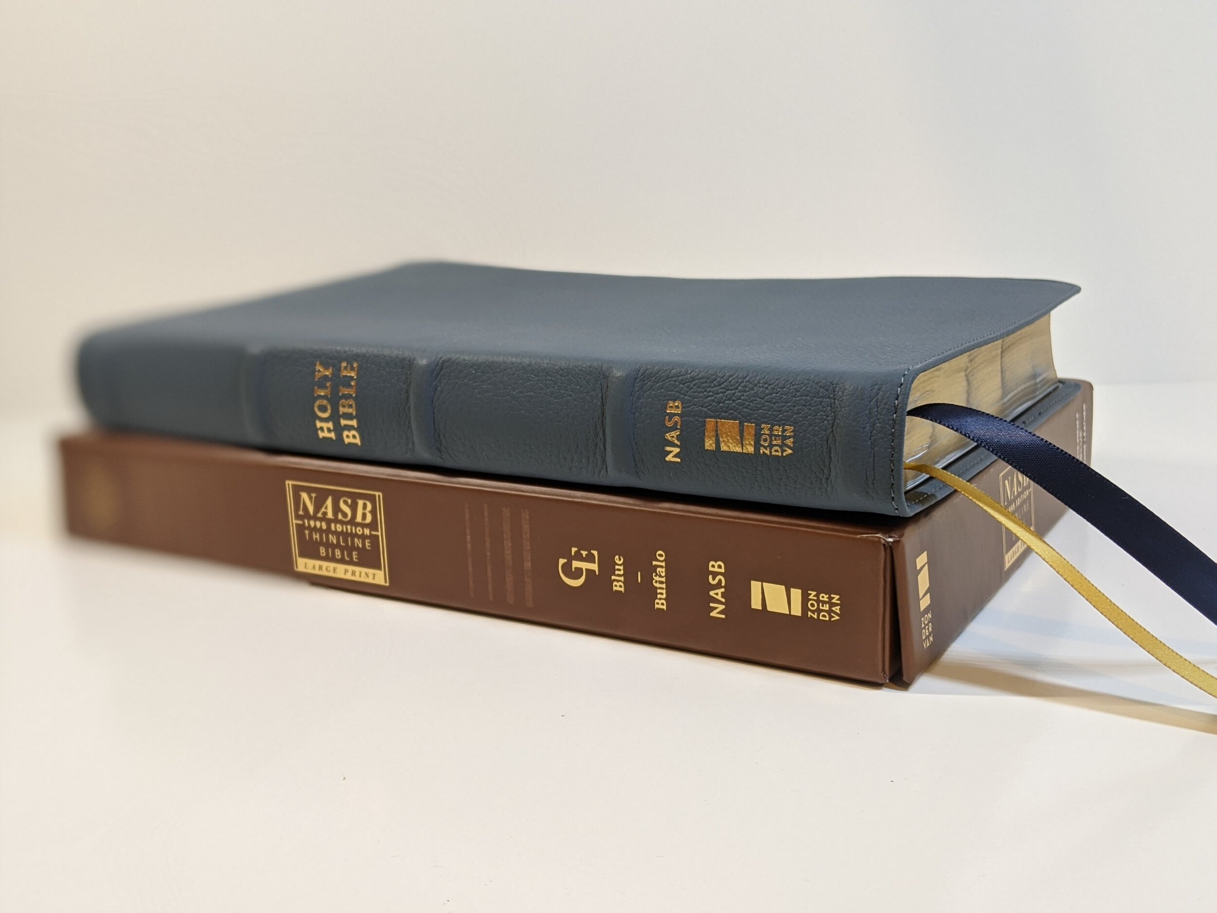
The Bible comes in a brown clam shell box with gold writing on the front. The Bible itself is a thinline NASB in the 95 text. It seems to be about the same size as the Zondervan NASB Preacher's Bible.

Outer Materials
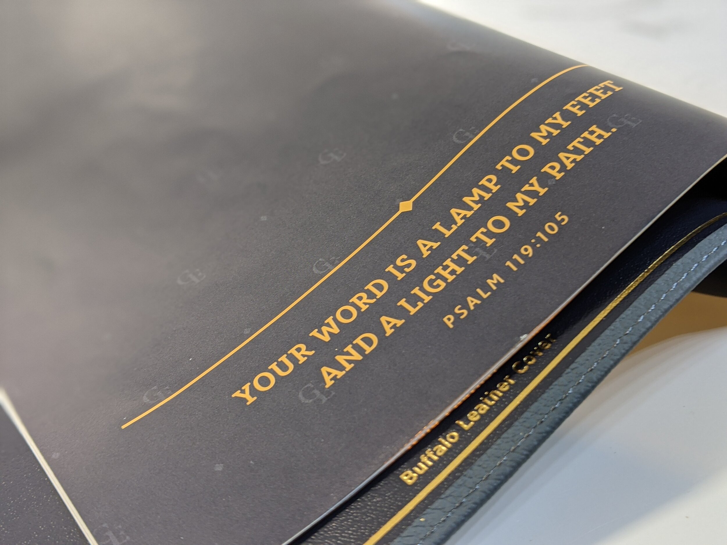
The leather on this Bible is striking. It's a beautiful blue buffalo that many are likening to the petrol color Allan uses on some Bibles. Upon comparing it with pictures of the Allan, I'd say this Bible is a bit lighter of a blue. In the right light it can look grey. It is flat and doesn't have a shine to it. The leather itself is soft and feels slightly spongy. It has perimeter stitching. The Bible is also Smyth-sewn


The spine has five raised hubs. In gold are the words "Holy Bible", "NASB", and the Zondervan logo. I actually really like the simplicity of the spine and it feels simple instead of overcrowded with words. I like Zondervan's choice here. The Bible has navy head and tail bands. The page edges have a blue under gold art gilt. There are two double-sided satin ribbons and one is navy while the other is gold. They are long and wide just like the premium ribbons Zondervan has been using in their Premier Collection. I honestly never thought I'd feel so opinionated about Bible ribbons, but I love the ribbons Zondervan uses and I love how long they are.

Inner Materials and Design
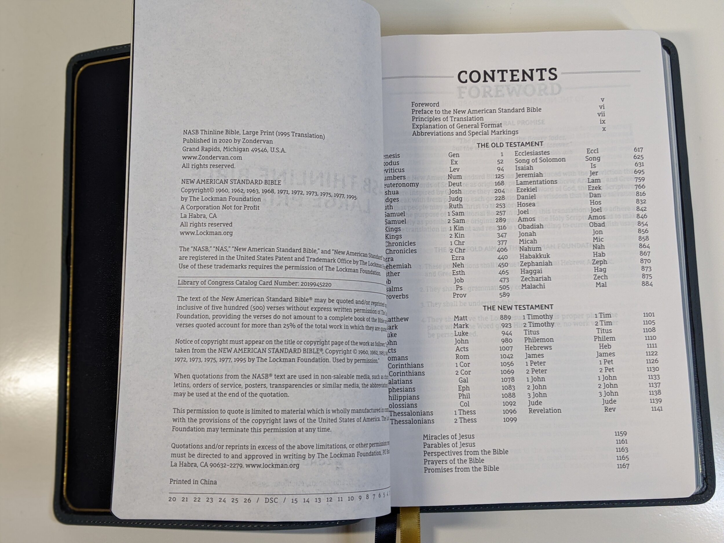
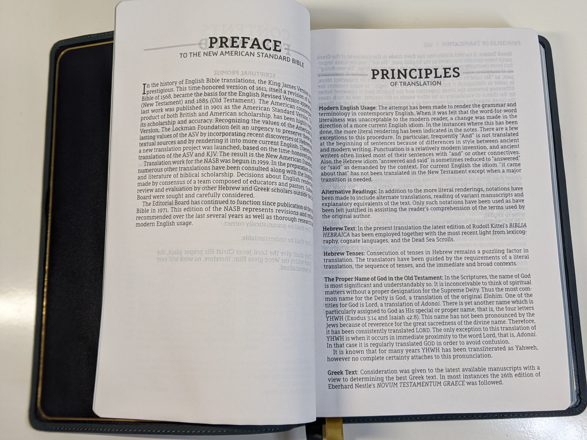
This Bible is edge-lined. This means there's no paste-down paper liner and there is some increased durability and flexibility. The inner liner is a synthetic, navy material. There's also a gold perimeter gilt line on the inside cover. There are three blank, white sides of pages in the front, which is a perfect place if you like to take extra notes. After this is a single presentation page. The Bible also has the standard pages in the front that Zondervan has included in their NASB Bibles including Contents, a Foreward, the Preface to the New American Standard Bible, Principles of Translation, an Explanation of the General Format, and a key explaining abbreviations and special markings.


Paper and Text
I was unable to find any information regarding the paper in this edition. I will note that it is a bright white and there is very little ghosting. I think only the pickiest of people would complain about this paper. I'll also note that the Bible is printed in China. As best I can tell, the text is line matched. If it isn't, it's very close.


The page layout is a double-column, verse-by-verse type setting. There isn't an accent font color in this edition, but words of Christ are in what I’d describe as a brighter red. Verse numbers are in bold to indicate the beginning of a new paragraph. This Bible does not include the full set of NASB 95 footnotes and there are no references. However, these sacrifices are how they make this large print edition a true thinline.
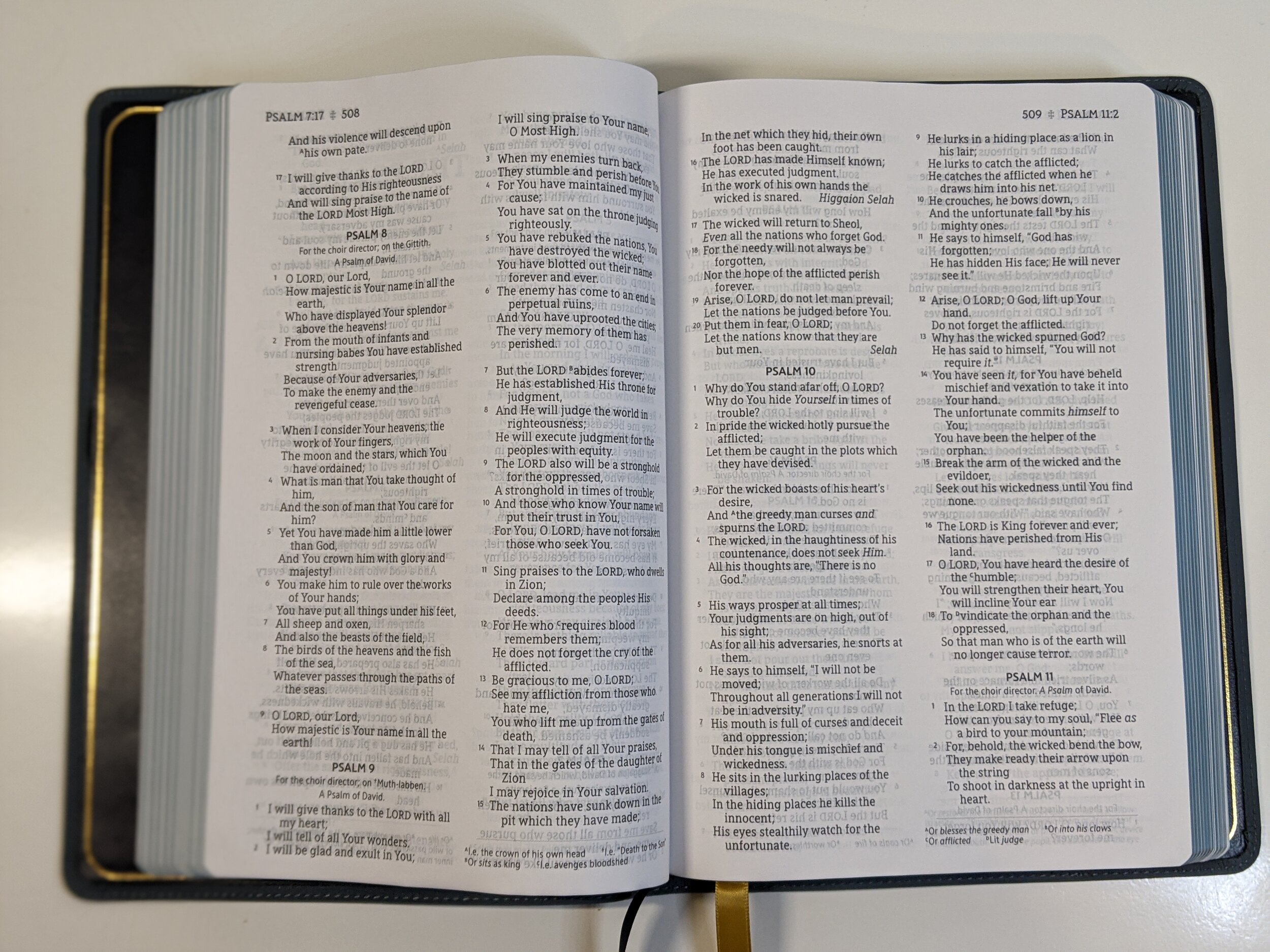


The font itself is a 10.5 set in the Zondervan NASB Typeface and designed by 2K/DENMARK. I love a good, large font and this one is easy to read while keeping that slim form factor of the Bible.

Extras
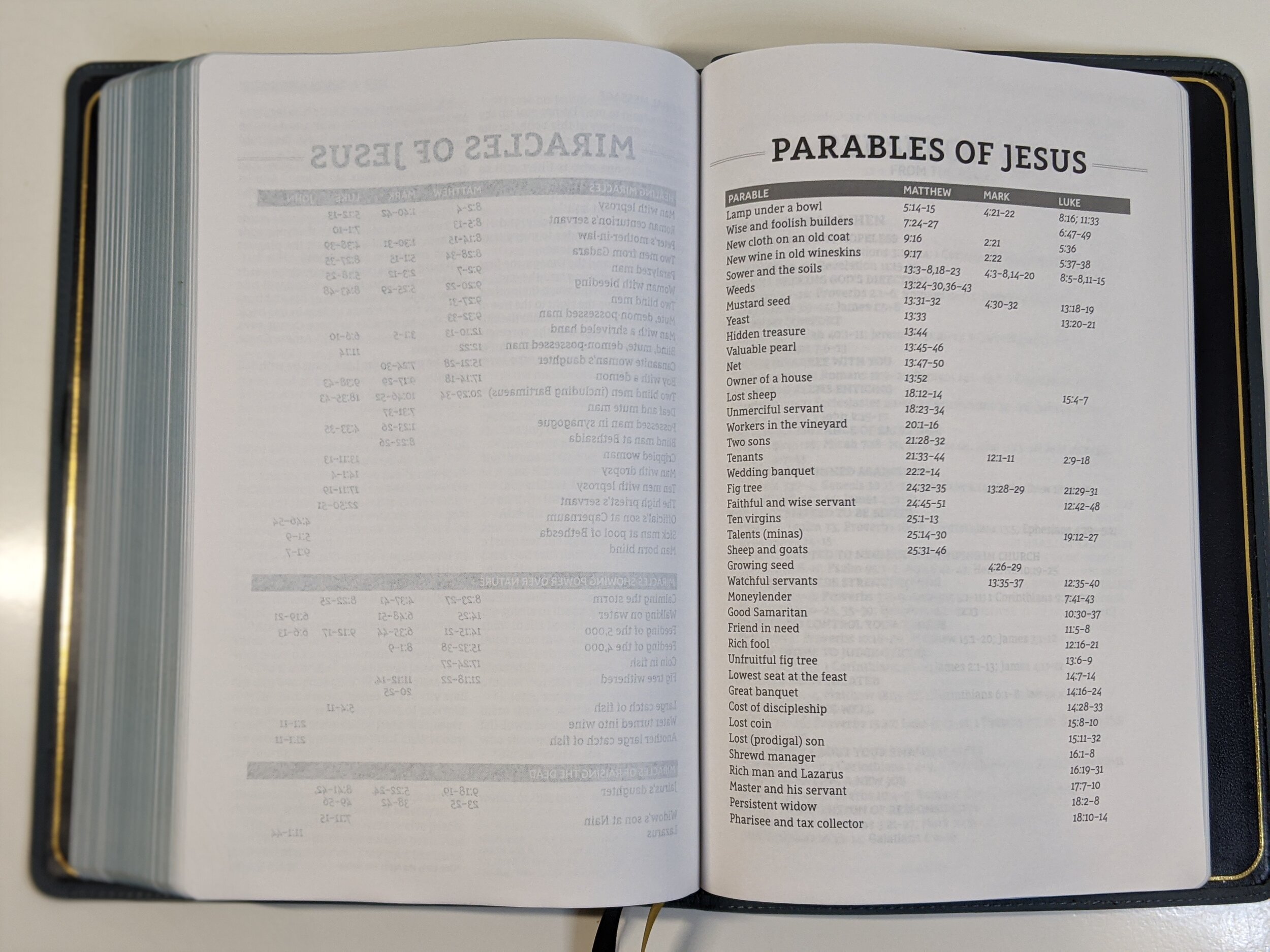
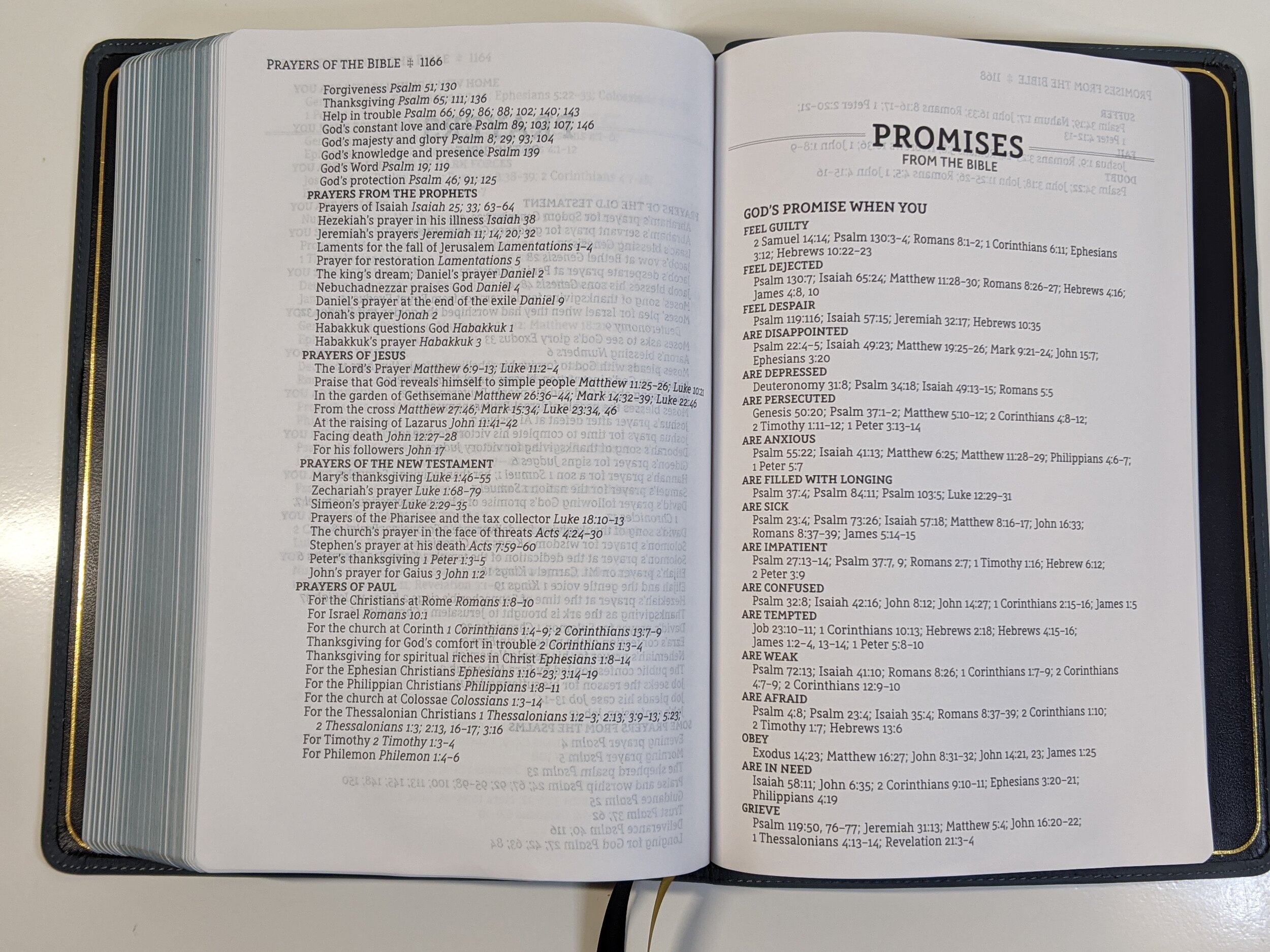
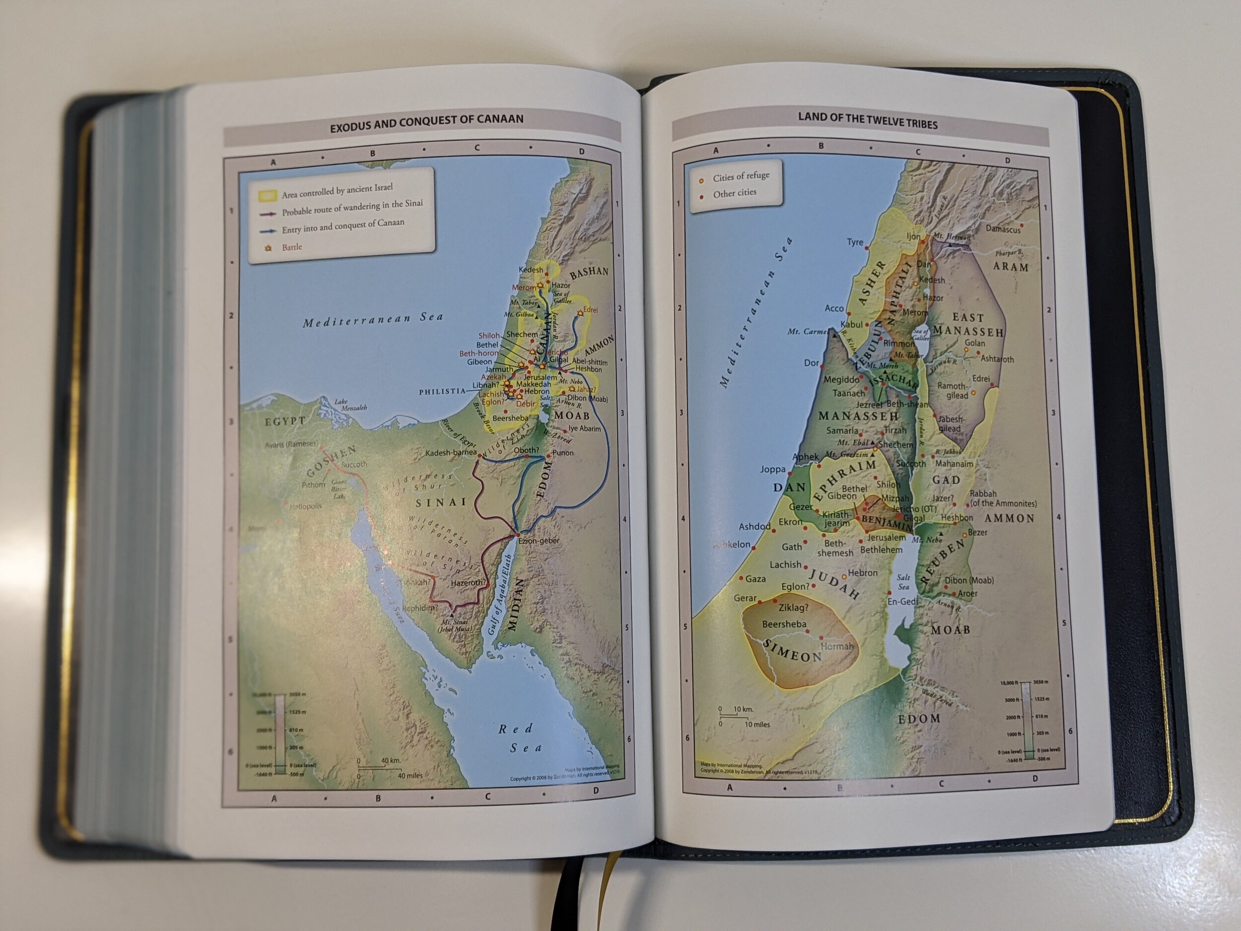
The back does not have a concordance, but it does have the extra charts that Zondervan has been including in their NASB editions including Miracles of Jesus, Parables of Jesus, Perspectives from the Bible, Prayers of the Bible, and Promises from the Bible. There is a blank sheet, eight maps, and a couple of blank pages in the back.

Conclusion
This is a great edition from Zondervan! It has a slim form factor that makes it easy to carry, the color is striking and unique, the ribbons are awesome, and it has a great size font in a verse-by-verse format. If I could change one thing about this Bible, it would be to get rid of the red words of Christ and the font be all black. I can get past it though. I think any NASB lover will want to add this one to their collection. This Bible is slated to release on October 6th, but you can preorder it now.
(At the time of this writing the best price can be found at Christianbook.com for $84.99)
You can also support what I do by picking it up through Amazon. (affiliate)
Disclaimer: I was provided a complimentary copy of this Bible from Zondervan in exchange for a fair and honest review.

