
The Cambridge NKJV Topaz Review

I’ve been a long-time fan of the Cambridge Topaz. Originally, it was released in the ESV, and I was pretty quick to herald it as the best ESV Bible in print. Even now, I may still give it that title. The folks at Cambridge Bibles realized that it just wouldn’t be fair to keep all the goodness packed in the Topaz exclusive to the ESV lovers out there so they have now released it in the New King James Version. The NKJV Topaz brings with it a green goatskin option and a couple of options in calf-split leather. Today, I have the pleasure of reviewing the NKJV Topaz in black goatskin. Let’s see if the Topaz lives up to the hype in the New King James Version.
The box design of the Topaz is striking. It has a matte finish and brings the same design as the ESV Topaz box, but with the jewel design being purple instead of green. It’s a clamshell design and when it’s opened, you’re immediately greeted by the Bible.

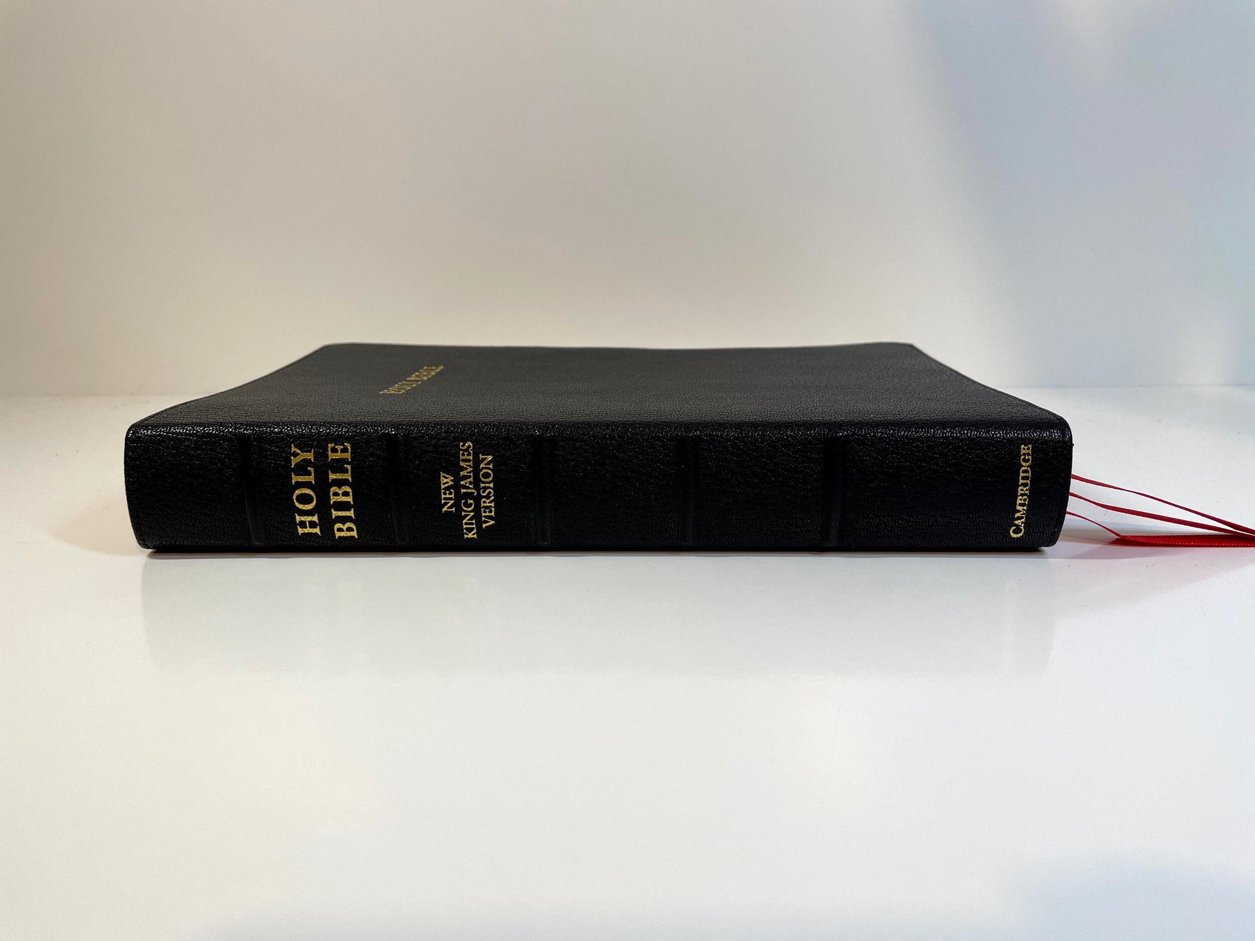
I love the goatskin Cambridge uses. It’s such a nice grain and has a great feeling texture to it. Even in black, I think the grain makes the Bible pop. Another stand out feature is the gold stamped "HOLY BIBLE" on the front of the Bible. With many publishers opting to leave this off, Cambridge has chosen to to continue with this design. This design has grown on me over the time of using the ESV Topaz, but I do still wish Cambridge gave an option of a Topaz without "HOLY BIBLE" on the front. Honestly, the Topaz is beautiful and is truly a design worthy of its name.


The spine has five raised hubs. Stamped in gold are the words, "HOLY BIBLE", "NEW KING JAMES VERSION", and "CAMBRIDGE". The Bible is Smyth-sewn. The page edges are a red under gold art gilt. There are red and gold head and tail bands. A distinct feature of the NKJV Topaz is the addition of a third bookmark. The ESV Topaz only includes two bookmarks and Cambridge made the decision to include a third with the release of the NKJV. I do hope they’ll update the ESV to include this in the next printing. The third bookmark is a nice touch. These bookmarks double-sided satin and are nice and wide. In the black goatskin Bible, they are all the same color red and they pull to the corner easily. I did notice the blue and green goatskin editions have three different colors for their bookmarks. I would’ve liked to have seen this feature in the black as well as I believe it is a helpful feature for preaching.

The Bible is edge-lined with a black calfskin liner. The Bible has a presentation page and several family record pages on matte card stock. These pages seems a little stiff, but would break in I imagine. The Bible does not lay flat at Genesis, but once again, I imagine this is due to the stiff family records pages and I think it could be resolved.


Two things that I think make the Topaz really shine are the text block and the paper. The ESV Topaz paper really set it off for me and the paper in the NKJV Topaz is no different. It is a 28 gsm Indopaque from France. For 28 gsm, it’s very opaque and it feels so smooth to the touch. I often just find myself rubbing my hands across the paper in the Topaz because it feels so nice.


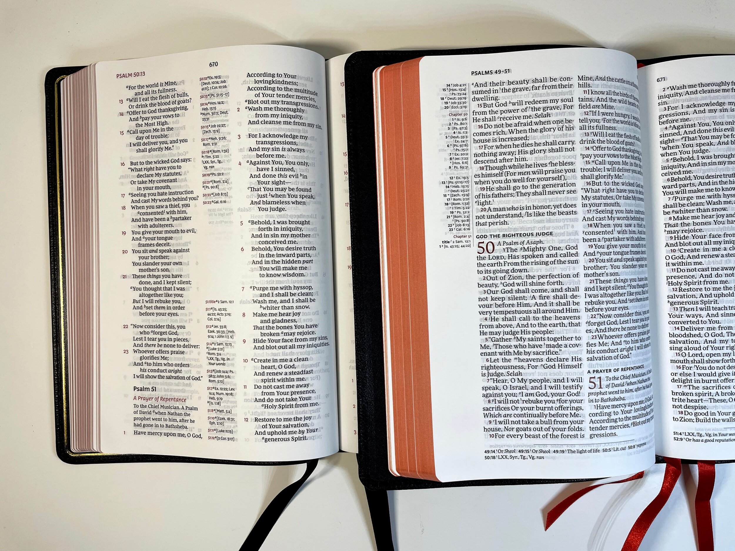
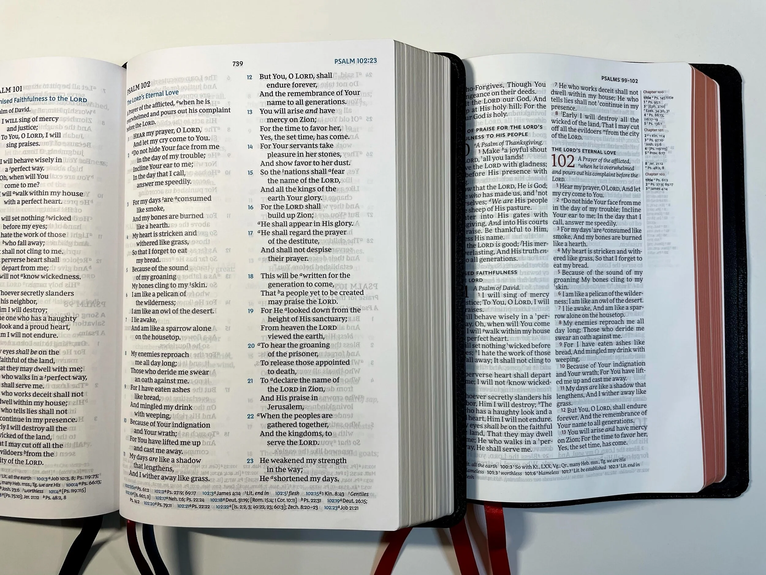
The layout of the Topaz is a double-column verse-by-verse setting with references in the outer margin and footnotes at the bottom. The font size is a 10-point type called More Pro Book. Each verse starts on a new line and is indented. The text is line-matched, which helps eliminate any ghosting from the other side of the paper. Verse numbers are accented in a maroon color, which is incredibly helpful to quickly locate the verse number while preaching. Chapter numbers are also featured in the accent color. Subheadings giving section descriptions are written in a bolded black in all caps. Words of Christ are in red. In my review copy, the red appears to be very dark and uniform. Lighter red sections were a common complaint in the ESV Topaz, but it seems very well done in my NKJV Topaz.
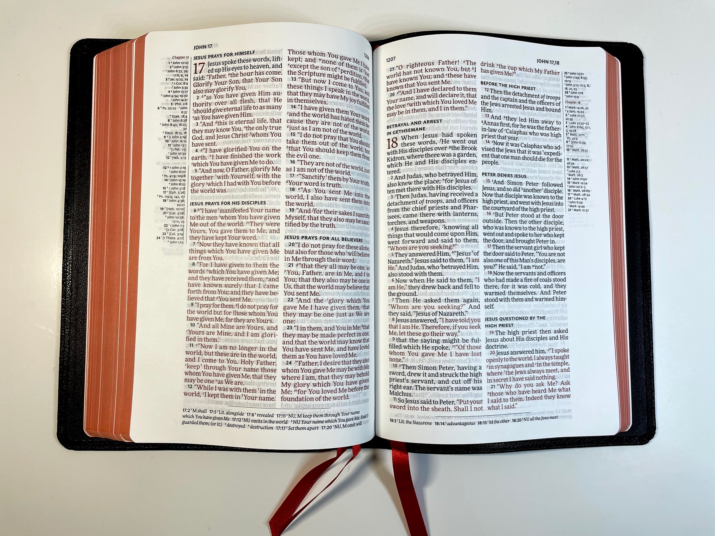
As stated earlier, references are in the outer margin in a smaller font. They are very easy to locate within the text and keeping the references in the outer margin serves to keep the biblical text together, which is especially helpful in a preaching Bible. On most pages there is also ample room in the margin for notes or writing in your own references. Textual notes appear at the bottom.

One feature I wish the Topaz included is a way of indicating new paragraphs. This can be helpful if you were to desire to use this Bible as a reader and not just a preaching Bible. I’d love to see them include a pilcrow symbol for indication of a new paragraph or make the verse number of new paragraphs a different color.
I find the Topaz to be an extremely versatile Bible. It shines as a preaching and teaching Bible, but being double column, I think it also easily lends itself to being a reader if one desired. I’ve found single-column verse-by-verse layouts to be harder for doing daily reading, but the shorter word count per line of the double-column doesn’t interrupt the flow of reading as much as one might think.
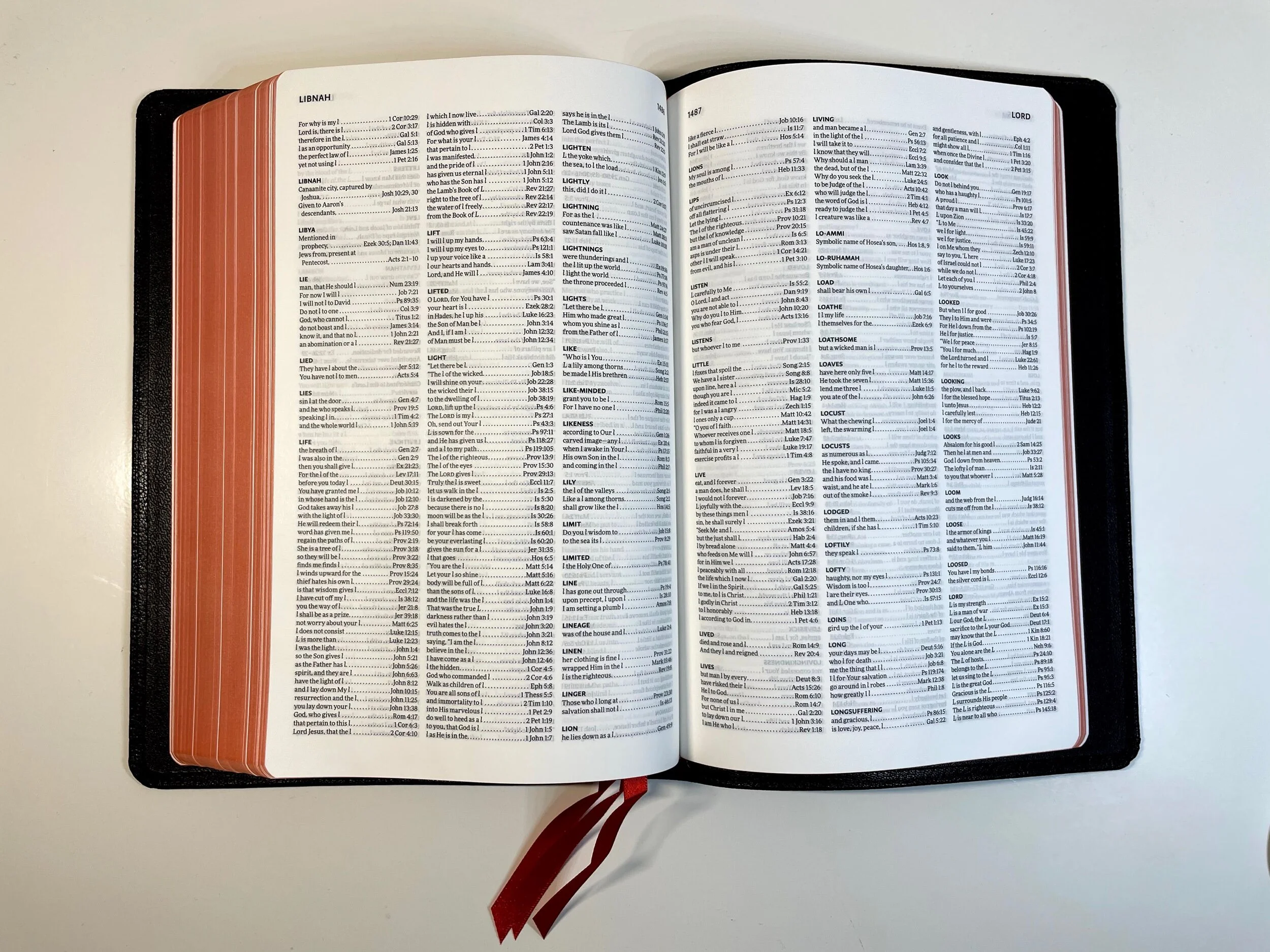
In the back is a thick, triple-column concordance. There are several blank pages that are suitable for notes or writing quick helps and references. Finally, there is a map index along with 15 detailed maps. Most readers will know that I don’t care for maps in Bibles, but I will say that Cambridge’s are some of the nicest I’ve seen.


The NKJV Topaz lives up to the hype of its predecessor and even adds another bookmark! The only thing I find concerning about the Topaz is the high retail price. It does seem priced a good deal higher than other Bibles it may compete with and I’m unsure why. The materials are beautiful and the layout is wonderful. I hope the price will come down just as it did with the ESV Topaz. It is hard to beat the beauty and function of the Topaz. It’s very versatile and if you’re a fan of the NKJV and verse-by-verse formatting, you won’t find a nicer Bible than the Cambridge Topaz. Be sure to keep scrolling for a few comparisons.
You can pick up a copy of the Cambridge NKJV Topaz on Amazon (affiliate), Evangelical Bible, or Cambridge.
Disclaimer: I received a complimentary copy of this Bible from Cambridge in exchange for a fair and honest review.
The ESV Topaz and the NKJV Topaz


Left: ESV
Right: NKJV
The NKJV Topaz and The Thomas Nelson NJKV Preaching Bible
The Preaching Bible is calfskin and may have a slightly larger font and the traditional NKJV poetic setting. The Cambridge uses much nicer materials. Both are verse-by-verse.

The NJKV Topaz and The Thomas Nelson Premier Collection Verse-By-Verse Reference Bible
The Premier Collection has center column references while the Topaz places the references on the outer edge. The Premier Collection seems to have a smaller font and the Topaz uses nicer materials and is priced accordingly.