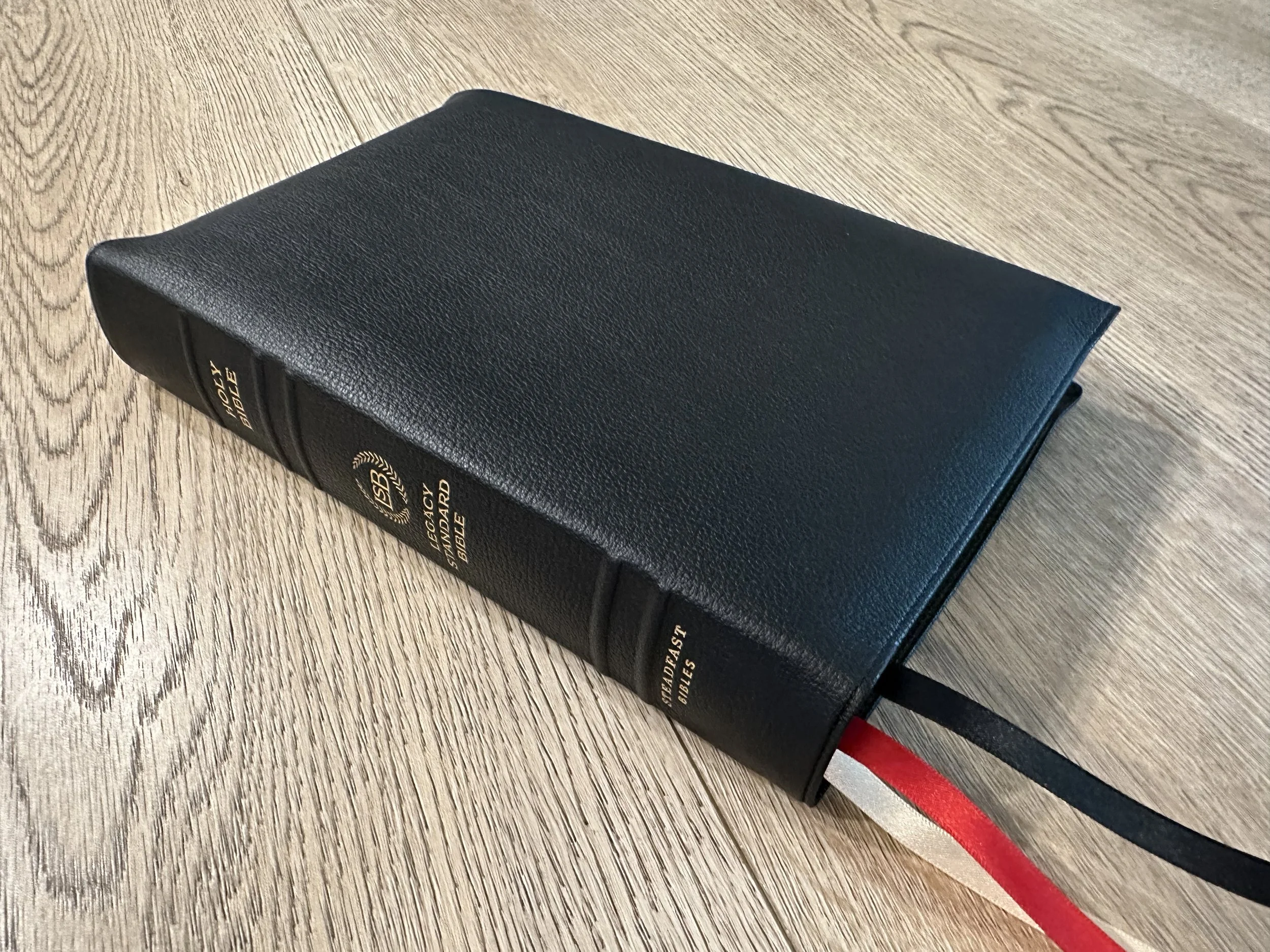
The Legacy Standard Bible Giant Print Reference in Black Goatskin
I’m a big fan of the Legacy Standard Bible translation. Even more so, I think Steadfast is knocking it out of the park with Bibles they’re producing. Their blocks and materials are second to none. The new LSB Giant Print Reference is no exception. The goatskin version of this Bible has all the bells and whistles. Let’s check it out.
I just love the way Steadfast designs Bibles. When I take this Bible out of the box, I see near perfection. I know Bible design is largely preferential, but Steadfast seems to make Bibles for me. The goatskin is nice, and soft. They do a nice semi yapp that looks and feels fantastic. The spine hubs are asymmetrical, which I just think is cool. The ribbons are wide, long, and different colors. They even do a cool pattern for the inside perimeter instead of a plain line. Their Bibles look and feel fantastic.
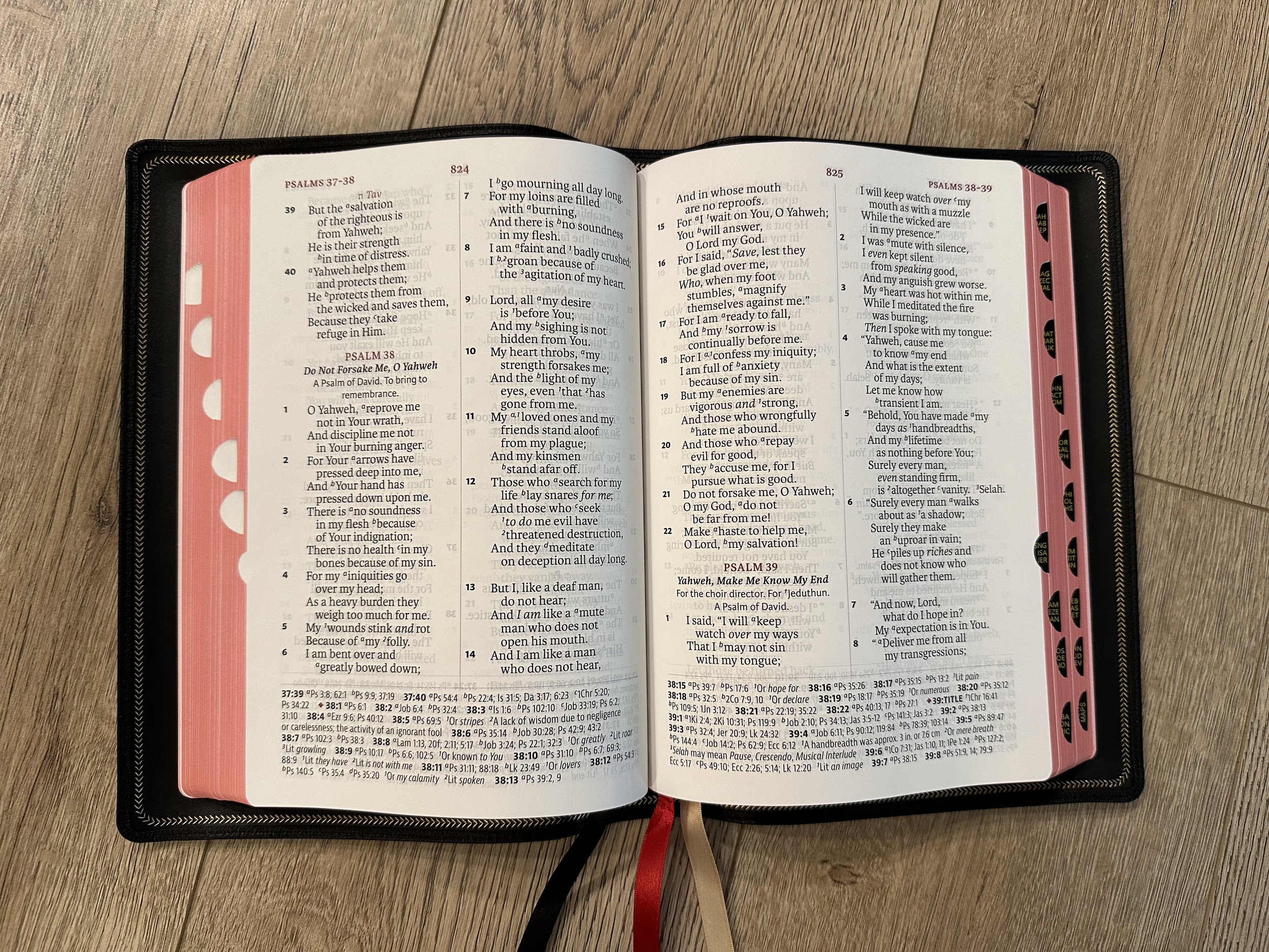
If that wasn’t enough, the red under gold page edges look fantastic and the Bible I’m reviewing has thumb tabs for the index, which is a nice feature that I don’t often choose, but I do like. This Bible is also Smyth-sewn and edge-lined for durability.
Steadfast just uses excellent materials. I’ve said in the past that their hardcovers are the nicest I’ve ever held and I saw someone recently say that after getting a hardcover, they didn’t feel any need to go more premium because the hardcover felt so premium. This is because inside is where you’ll really be blown away by the Bibles Steadfast is producing. The materials are high quality from the hardcover to the goatskin. This one in particular is printed and bound in Korea and I’ve also been a big fan of Bibles coming from there.
The paper in this Bible is fantastic. It’s nice and opaque. It’s hard to beat 32 GSM and if you’re used to 28 then you will notice the difference. The layout is also incredible. This Bible features a double column paragraph layout. There’s a red accent for page headings, chapter numbers, and the lines that divide the page. This truly is a giant print as the text size is a 13 point. References are laid out in a single column at the bottom of each page. The text is line matched.
A couple of things I love about this layout is that the verse numbers are so bold! I’d have no problem preaching from this layout because it’s so easy to locate verse numbers. The other feature I love is the reference text size.
One feature I don’t love is the dividing lines. There’s a line separating the columns in the center of the page and a line separating the references running horizontal on the lower part of the page. I always think this just creates a busier look and I’ve never been a fan of it.
This Bible also features a table of weights and measures, a Concordance, several full color maps, and some blank pages for extra notes in the back.
All in all, I consider this Bible a home run. It’s so readable and so well designed. I’ve been loving every format of the LSB released and this is no exception. If you’re a double column fan then this Bible should be at the top of your list. If you just love well made Bibles then this one is for you as well!
You can pick up your copy of the LSB Giant Print Reference from 316’s website.
Disclaimer: I received a copy of this Bible in exchange for a fair and honest review.


