

The Zondervan NASB Single Column Reference Bible in Brown Leathersoft
When I seriously began reading the Bible for myself, I started with the New American Standard Bible Translation. I loved it, but then came the English Standard Version. The ESV was marketed so well that I made the switch and never looked back. Zondervan's acquisition of rights to print the NASB has brought a resurgence! I have jumped back in to the translation that started it all for me and I've really been enjoying it.
I reviewed their Single-Column Reference Bible in Goatskin and I fell in love with the layout. It is so good that I knew I wanted to see how the cheaper Leathersoft edition compared. They were gracious enough to send me a copy so I could check it out and I am glad to be reviewing it for you today.
I'm just going to say it up front and be pretty blunt with you. Get this Bible. It is an absolute steal! There, I said it. I put the cart before the horse, but I really think that this Bible is so good that you deserved to know here in the beginning. You can stop and click this link and go ahead and order this Bible and then you can e-mail me and thank me once it comes in. I'm serious right now.
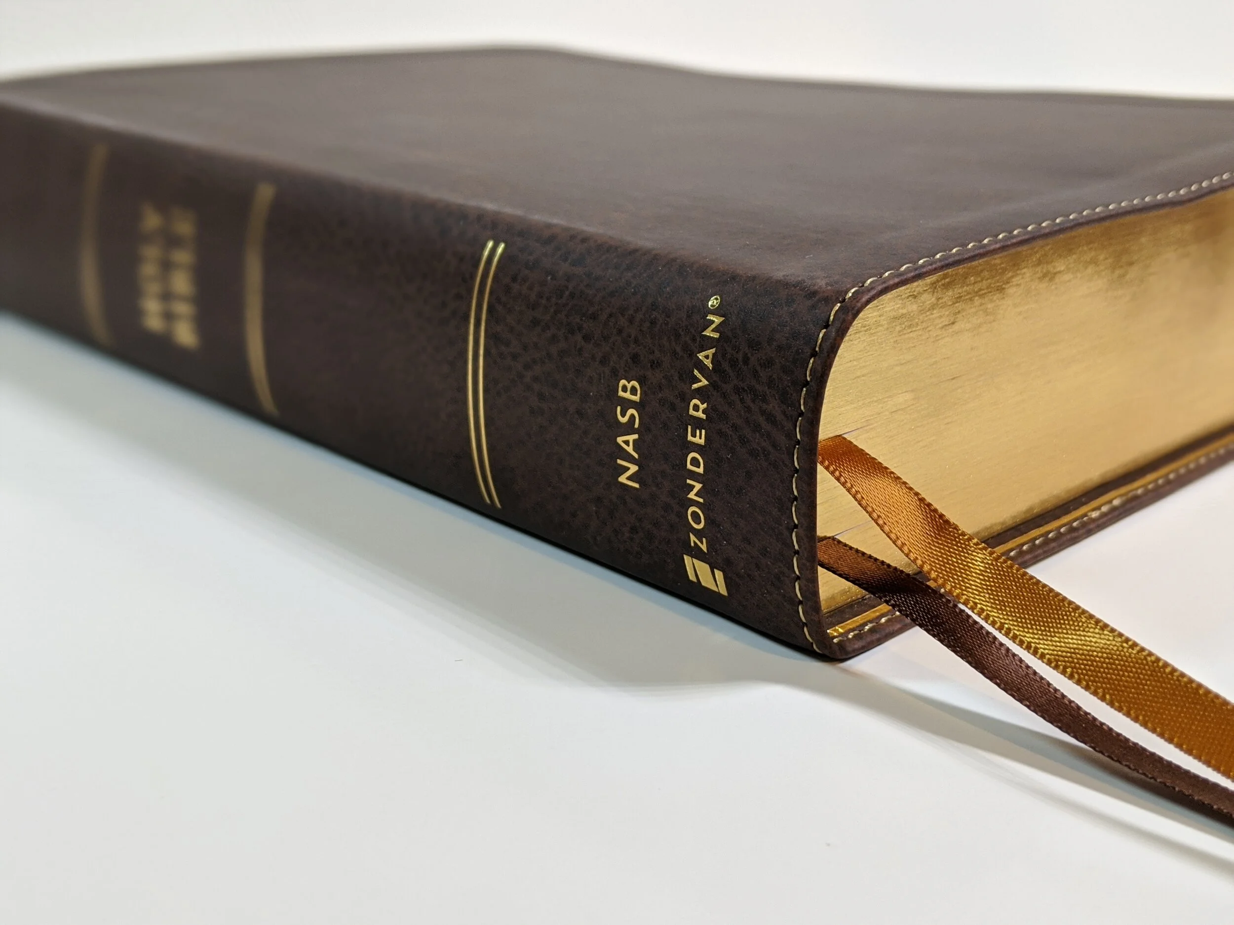
Now let me answer the why. This Bible is almost identical to it’s goatskin counterpart that costs twice as much, and in fact, I do recommend the goatskin if you want an amazing Bible that will last your lifetime and you want a really nice cover and bookmarks as well. The goatskin edition is incredibly nice. However, if you want to get this text block rebound then go for the Leathersoft. The Leathersoft is Smyth-sewn, it has the same art gilt as the goatskin, and the same paper and text block. I can’t believe the value here!


What’s better about the goatskin? The outside and inside (which is a big deal if you’re not planning for a rebind) and the bookmarks. The cover of the goatskin is edge-lined, which you’ll definitely like and appreciate if that’s the cover you stick with. The bookmarks are also much nicer in the goatskin edition. They are wider and you get three.


I will tell you that I like this text block so much that I’d just go ahead and say get both! Treat the goatskin as your heirloom to pass down and the Leathersoft as you’re go everywhere Bible. Or pick up the Leathersoft for an awesome rebind.
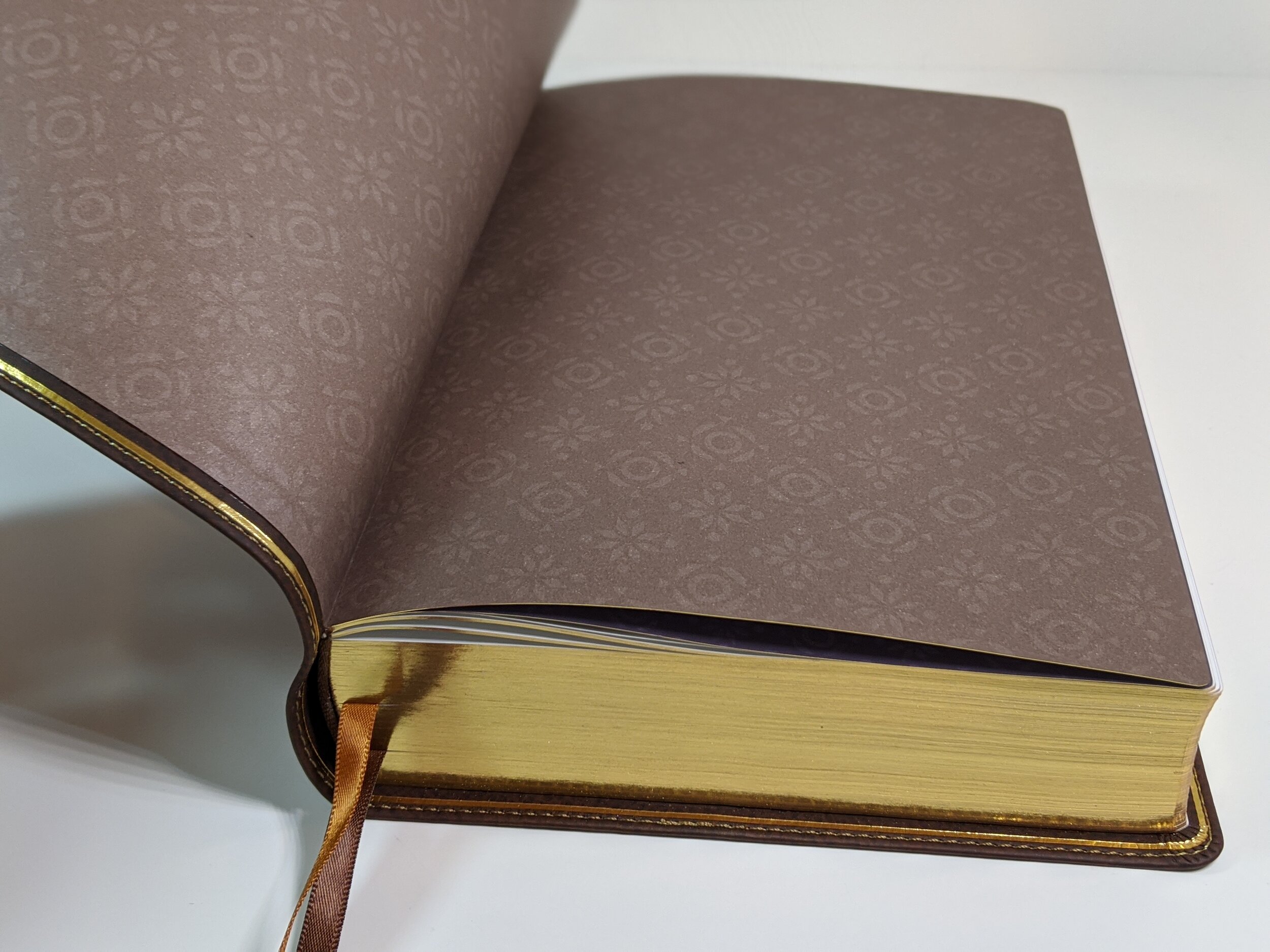
All that being said, the cover on this Bible is nice. It’s a brown Leathersoft that feels great. The spine is flat with gold gilt. It has two ribbon bookmarks. One is gold and the other is brown. It has a brown, patterned paste-down liner, which actually looks really nice.


As you begin to turn the pages, you’ll find a nice presentation page in full color. In the front you’ll find a foreword, preface, principles of translation, explanation of the general format of the Bible, and abbreviations and special markings.


This is a reference Bible so each Book begins with an introduction that includes the title and background, author and date of writing, the theme and message, and an outline. The page layout is single-column, verse-by-verse, with references in the outer margin as well as space for notes on the far outside margin.
The paper is a 36 gsm premium European Bible paper. It is white and really helps the text to pop. The font size is a generous 10.5 point. The font is called Zondervan NASB Typeface designed by 2K/DENMARK. I really like the font that has been designed for these Bibles. According to the page just before the maps in this Bible, “The typeface design takes inspiration from clear, distinct Aramaic limestone inscriptions of the Second Temple period. The design pays homage to the NASB’s rich heritage of word-for-word translation and its faithfulness to the original biblical languages.”
I find it to be a really attractive font design. The text is line-matched to help minimize ghosting, and while there is some, it isn’t terribly bad. Zondervan uses two colors of text on the pages. The text is black and the page headings, chapter numbers, subheadings, as well as verse references are in a dark red/maroon. Zondervan has created a really attractive page layout. I really wish the verse numbers were bigger and bolder in this layout to make locating them a bit easier. I think easy location is one of the attractions of a verse-by-verse Bible.


One of my biggest critiques of this Bible is that text does dip into the gutter making you have to move your head a little to read it. It doesn’t make the text unreadable, but it is an inconvenience. It may get better with some break-in. I think it would have been better for Zondervan to put the references close to the gutter and move the text more toward the page edges. Being a Bible, we obviously want to focus on the Scripture.
I’ve always loved the way the NASB handles some of the text formatting. The translation capitalizes personal pronouns when pertaining to deity and I’ve always liked this. It uses italics to indicate words which aren’t found in the original languages, but are implied by them. It also uses small caps in the New Testament to indicate Old Testament quotations or obvious references to the Old Testament. I appreciate these features as they’re useful when studying and reading. There are a few more features built in that are explained at the beginning of the Bible in the section called Explanation of General Format.
Extras
This Bible also has some extra features that I really like that are found in the back. There is a list of the miracles of Jesus with Scripture references in each Gospel laid out beside them. There’s a list of the parables of Jesus. They also included what they call “Perspectives from the Bible”, which gives you a topical list of passages to read when you are facing certain things in life. I love the list of prayers of the Bible. I think praying Scripture is powerful and this is a really great list to have. Finally, there is a list of promises from the Bible, which gives you a list of things God promises you when you are facing various trials. After these lists, we find a generous concordance and eight pages of full-color maps.


Conclusion
I’ll say it one more time for those of you who still need to hear it. Get this Bible! This is a great edition from Zondervan that is an incredible value. I still can’t believe it. I like it so much that maybe I’ll get another! Who knows, but I highly recommend that you pick one up today.
You can pick up your copy of the NASB SCR in Leathersoft on Amazon. (affiliate)
Disclaimer: I was provided a complimentary copy of this Bible from Zondervan in exchange for a fair and honest review.

