
The Cambridge ESV Diadem with and without Apocrypha
I think Cambridge Bibles are some of the finest quality Bibles out there. They also make some unique editions and have a really loyal following. I’m excited to review the Cambridge ESV Diadem today in hardcover. I’ll be reviewing editions both with and without the Apocrypha. The Diadem is highly anticipated as many people have been pleading for a Bible with the same layout as the Pitt Minion and Wide Margin, but at a size in between the two. Cambridge has listened and answered with the Diadem.
You can pick up a hardcover copy of the Diadem right now, but if you’re hoping for a leather edition, you’ll have to wait until 2022. Let’s jump in and take a look at the hardcovers.

Both hardcover editions feature dust jackets with art. The standard ESV has a dark blue dust jacket with a crown of thorns design. The ESV with Apocrypha has Jesus wearing the crown of thorns in the art. I like that Cambridge decided to make the covers unique on these editions as it would have been easy for them to just make them look the same. The distinctions are a nice tough. The back of the dust jackets feature descriptions of the content within the Bibles.

After removing the dust jackets, both Bibles have navy hardcovers. The words “HOLY BIBLE” are stamped in gold on the front. Underneath is a crown of thorns debossed into the cover.

The spines feature gold stamping with the words, “HOLY BIBLE”, the ESV logo, “ENGLISH STANDARD VERSION”, “DIADEM REFERENCE”, and “CAMBRIDGE”. The version with the Apocrypha also says, “WITH APOCRYPHA”. There are also 3 bars debossed into the spine as well.


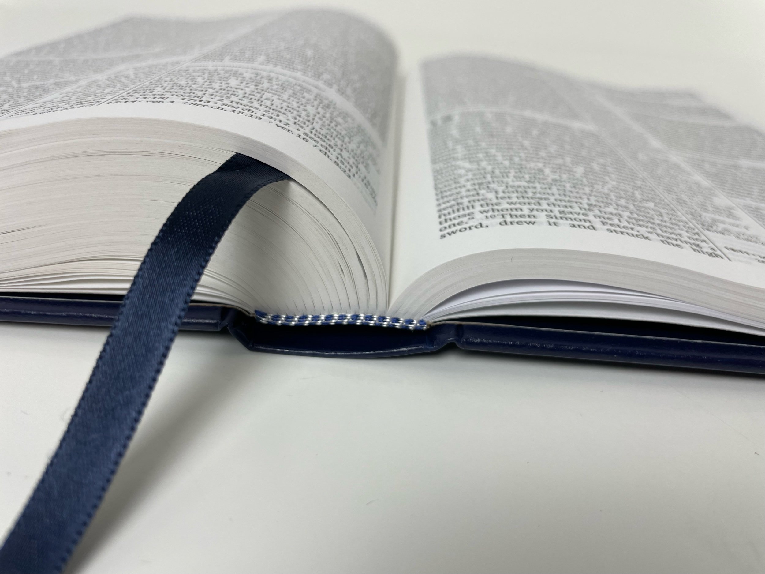
These Bibles have a single, navy, double-sided satin bookmark. What I really love is the head and tail bands Cambridge uses. The standard ESV has an alternating white and navy pattern on the head and tail bands, while the ESV with Apocrypha has a red and gold alternating pattern. I feel like using these shows attention to detail instead of sticking a standard single color on there. These make a hardcover look classier! Well done Cambridge!

Inside is a navy vinyl liner with vinyl end sheets. Included in the front are some pretty cool study materials. You’ll find a “Chronology of rulers during biblical times” and a “Table of weights and measures and monetary units.” Both of these can help as you dive deep into God’s Word. The Apocrphya version also includes a “Preface to the English Standard Version Apocrypha,” which is quite helpful in understanding the Apocrypha and the ESV’s approach to it.

The paper in these editions is a white 36 gsm. It’s line matched and there is almost no show through. It’s impressively thick paper and helps these editions be highly readable. The most show through is in the poetic settings, but it really isn’t a distraction.

The page layout is a double column setting with references in the middle marked out by two vertical lines. Book and chapter headings are at the outer top corner of each page and page numbers are found in the inner top corner. Page numbers start over at one in the Apocrypha. They also begin at one again in the New Testament.

If I’m honest, this is not my favorite layout as I always felt the lines made the page look too busy, but many people really love this layout. This is the same layout and pagination that you’ll find in the Cambridge Pitt Minion and the Cambridge Wide Margin meaning you could have three Bibles with different purposes that you’re extremely familiar with. This is a really nice option to have! Textual notes are found in the bottom right corner of each page and extra references may be found there as well.


Daidem on the left. Pitt Minion on the right
The type is an 8.1 Lexicon. It’s small, but not too small. I would have loved for Cambridge to up this to at least a 9, but I’m always an advocate of bigger fonts. The lines of text are close together. Underlining would be difficult in these editions. The words of Christ are in black and I’m a big fan of this choice. It’s nothing but preference really.

The back features a robust, three column Concordance. There is also a lot of room at the top and bottom, which could be useful for note taking if one desired to do so. There are also fifteen full color maps in the back on really nice paper. I’m not usually a fan of maps, but these are beautiful and are on great paper!


A lot of people are going to love the Diadem. I could never tote a Pitt Minion with me because the font was too small, but I could easily see myself carrying a Diadem. The hardcover is built in a way where it lays flat anywhere you open it. This is a great reference Bible to have. Even better is if you also love the Pitt Minion and Wide Margin. Cambridge has created another edition that many will love. Making it in a hardcover also makes it more affordable assuring many more can be blessed with access to it!
You can pick up your copy of the Cambridge ESV Diadem from Cambridge or Amazon. (affiliate)
Disclaimer: I received complimentary copies of these Bibles from Cambridge in exchange for a fair and honest review.