The Premier Collection NIV Grace & Truth Study Bible
I have been really excited about this Bible for a long time. If I’m honest with you, the New International Version isn’t even in my top five translation wise, but this is a study Bible and the value in study Bibles are the notes. This is also a premium Bible and I can’t believe what Zondervan has done with this thing! You’ve got a blue Bible with a red liner and a semi-yapp. I saw it online and was like, “Man, I’ve got to see this thing for myself!” Not only that, Dr. Albert Mohler, the president of The Southern Baptist Theological Seminary—my alma mater—is the general editor. To say I’m excited about getting to review this Bible is an understatement! I thought it looked great online, but it has blown me away in person.
This Bible comes in a two piece box that has the standard Premier Collection look. It’s grey with silver writing. You also get this Grace & Truth logo on the box that looks incredible. The Premier Collection boxes look sharp and this one is no exception. Opening it up, the Bible is wrapped in black card stock with the Premier Collection seal/sticker.
When you pull this Bible out you’ll be blown away! It’s beautiful. I can’t believe Zondervan made a Bible like this and I’m 110% for it! The colors are bold, the Bible is big, and it’s a thing of beauty. Most of Zondervan’s Premier Collection Bibles come in your standard black or brown, but this is blue. They call it navy, but it’s brighter than that. It could be like a cobalt or something. The Bible is big and flexible. It’s a blue goatskin that has a great grain pattern and honestly, it strikes me as better than other goatskins Zondervan has used in the past. It feels really really nice and it looks great. The thing that struck me that I didn’t notice online was the yapp! I love a full yapp, but most Bibles put out by bigger publishers don’t have any yapp at all really. This isn’t a full yapp, but it’s definitely a generous semi-yapp and I love it! I love that Zondervan took this chance and did something pretty different from what they usually do. I hope it’s a sign of things to come as I’ve been asking some bigger publishers as of late to do a full yapp Bible. I’d love to see that become more of an option. Just from being in the card stock, this yapp is partially trained and I plan to wrap it up to let it get a nice fold over the page edges. Way to go Zondervan!
The spine is great as well. It’s simple. It has five raise hubs, which I love. In gold are the words, “HOLY BIBLE”, “NEW INTERNATIONAL VERSION”, and “ZONDERVAN”. I’ll be honest, I wouldn’t have complained if they had put “Grace and Truth” on the spine as well. That would’ve been cool, but it’s definitely not a must. The page edges of this Bible have a red under gold art gilt. When you open it or fan the page edges out, you can also see a design on the page edges, which comes from the diamond pattern on the page edges of the book introductions. The little details of this Bible really do blow me away.
This Bible has navy head and tail bands. It also has three double-sided satin ribbon bookmarks. I love Zondervan’s bookmarks and they used the perfect colors for these; you get a navy, a grey/silver, and a red. These look great. They’re wide and long just the way I like them. The Bible is also Smyth-sewn for durability as you’d expect.
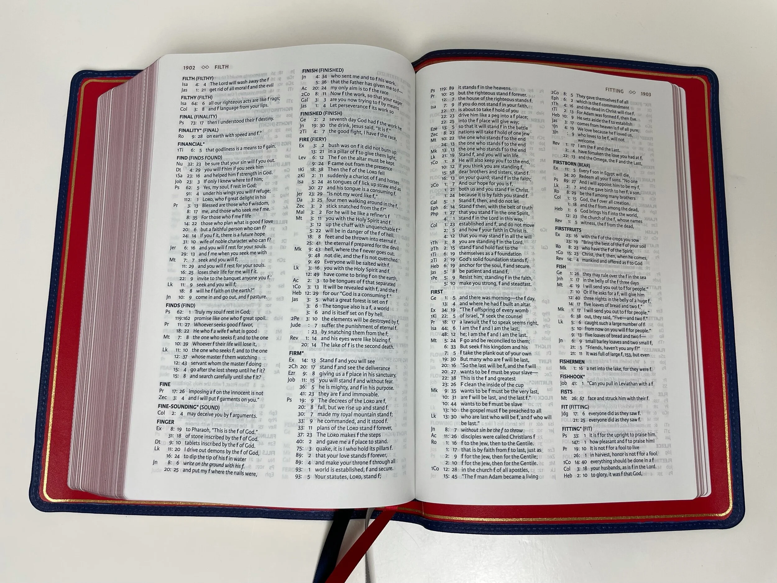
The inside of this Bible is a show stopper. The bright red liner is just incredible! You open the Bible and you’re greeted by a red calfskin liner and red end sheets. It also has a gold perimeter gilt line and is edge-lined so you get the nice blue bordering the red as well. I love that they went bold with this thing.
In sharing my initial pictures of this Bible online, someone pointed out that these are Southern Seminary’s colors. I hadn’t considered this before that, but with Mohler being the general editor, this had to be on purpose. As a Southern grad, I have to say that I think this is a really cool touch. I was sold on this idea when I considered that the presentation page is red with a gold fleur-de-lis pattern. If you’ve been to the city of Louisville (where Southern is located) then you know there are fleurs-de-lis everywhere. This is most definitely a hat tip to the seminary and I love it. These are just such neat touches from the designers of this Bible. This isn’t just a study Bible, it’s a piece of art in my opinion. It truly has earned the name “premier.”
The paper in this Bible is a lovely 36 gsm Premium European Bible Paper. It’s really nice, feels good to the touch, and there is almost no ghosting. I’ve been getting used to 28 gsm on many premium Bibles offered these days, but when you interact with the 36 gsm there really is no comparison. It’s just so nice even if it adds some thickness.
I’ve talked about all the Southern Seminary things, but I should clarify that all the notes in this Bible are not written by Mohler. Not all of the notes are written by Southern Seminary professors. In fact, not all of the notes in this Bible are from Baptists. This isn’t a Southern Seminary Bible and it’s not a Southern Baptist Bible. You get the list of contributors at the beginning of the Bible and you’ll find an impressive list of great scholars. Study Bibles are all about content and the content certainly won’t be lacking here.
According to the introduction, the goal of this Bible is to help readers “learn to see grace and truth revealed on every page of God’s Word.” It goes on to say, “This study Bible will benefit new believers who are looking to understand the Christian faith for the first time, and it will help maturing Christians who are eager to dig deeper into biblical truth.”
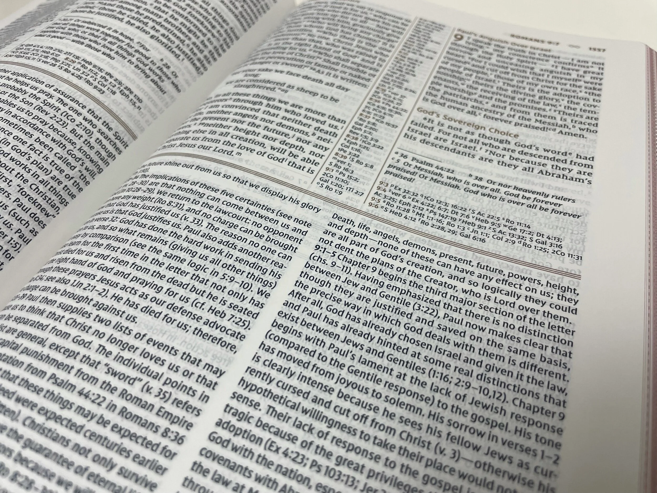
The page layout is very nice. It has a double column layout for both Scripture and study notes. It uses a tan/copper accent color for page headings, section headings, chapter numbers, line dividers, and verse numbers for cross references. There are center column cross references marked out by vertical lines running down the page. There are also textual in the bottom right corner of the Scripture section of the page. Below those are more cross references if there is need for more room for them. Also of note is that poetry sections are versified in a poetic setting.
The font for Scripture is a 9 point in the NIV Comfort Print and the study notes are probably about an 8 or 7.5 point font. The font really looks great in this Bible. The text is black letter and I’m so glad. In my hardback copy, the words of Christ are in red and it clashes very badly with the accent color of this Bible. The black letter looks great though and it helps this Bible keep that premium feel.
From what I’ve read, the book introductions and notes in this Bible are fantastic. Both new believers and seasoned Christians will find themselves benefiting from the content on these pages. As I said, the NIV isn’t my translation of choice, but I am glad to have this Bible because the content will definitely benefit me in study for years to come. Full disclaimer, this content does have a Reformed leaning and it is stated in the introduction. “This project is graciously evangelical, Reformed, and complementarian.” You should know what you’re getting here and I want to help you do that.
In the back of the Bible you’ll find a robust NIV Concordance and 16 full color maps on glossy card stock. I would’ve loved for these maps to be printed on Bible paper, but that’s just my preference.
This Bible is incredible. It’s truly a work of art with helpful study tips. I am so impressed with Zondervan for taking a chance and creating something so beautiful and unique. This Bible isn’t cheap, but I truly believe it’s worth the cost whether you’re a fan of the NIV or looking for some good, solid Bible commentary. I highly recommend the Premier Collection Grace & Truth Study Bible.
You can pick up your copy of The Grace and Truth Study Bible at Christianbook.com (cheapest I’ve found it) or Amazon. (Affiliate)
Disclaimer: I received a complimentary copy of this Bible from Zondervan in exchange for a fair and honest review.


